Quick Answer: An English country color palette is warm and layered, built on plaster pink, faded terracotta, sage and olive greens, indigo and faded blues, plum, butter yellow, and cream, with hand-blocked floral pattern counting as a color of its own. The 15 palettes below give hex codes and paint names, and show where modern English country lightens the old, heavy scheme.
There are two versions of English country color, and they are easy to confuse. The stuffy version is dark, heavy, and dim: deep burgundy walls, brown furniture, chintz on every surface, a room that feels closed-in even at noon. The modern version uses the same warm, layered family of colors but at a lighter scale, fewer patterns at once, brighter bases, more breathing room.
The distinction matters because it is the difference between a room that feels current and one that feels like a museum. Modern English country keeps the warm earthy palette, plum, faded terracotta, sage, indigo, but treats it with restraint. The 15 palettes below give you the exact hex codes and paint names, and each one notes how the modern approach lightens the traditional scheme, so the result reads as a warm, layered home rather than a heavy period recreation.
Picking an English country palette and worried it will read heavy and dated?
The Aesthetic Apartment Makeover Guide walks you through choosing and placing color room by room, so a warm, layered English country palette lands fresh instead of stuffy.

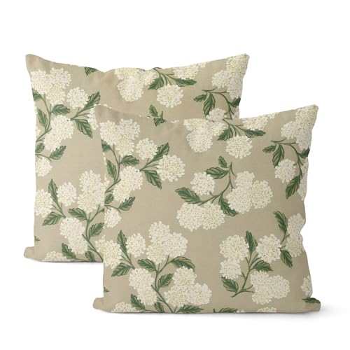
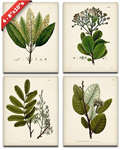
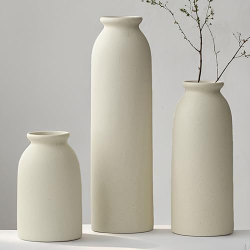
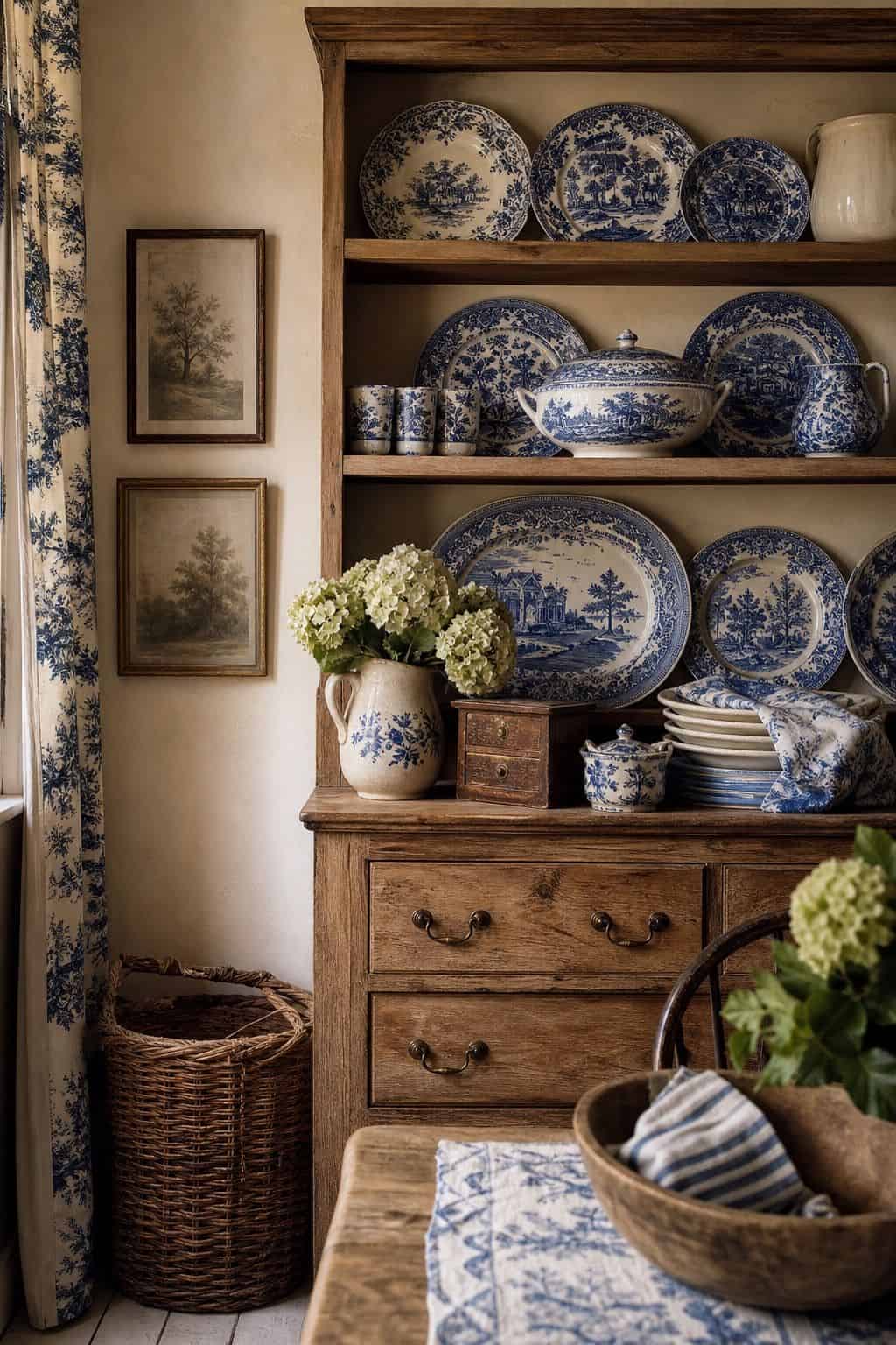
Recommended English Country Color Decor
Six pieces that carry a warm, layered English country palette into a room, from floral cushions to a vintage floral rug.


Recommended blogs to read:
- the french country aesthetic
- a cottagecore bedroom
- french country styling
- a soft coastal bedroom
- a calm, chic palette
What Makes a Palette English Country
An English country palette is warm, earthy, and layered. The colors come from the garden and the landscape: plaster pink and faded terracotta from old walls, sage and olive from foliage, indigo and faded blue from painted shutters and willow china, plum from the orchard, butter yellow from sunlight. Cream and oatmeal hold it all together as the base.
Pattern functions as a color here. A hand-blocked floral, a faded chintz, a small check, all bring several tones at once and count as a layer of the palette, not just a print. The modern version uses fewer patterns at one time and brighter bases. For the same warm-base, lighter-scale thinking applied to a quieter room, our guide to a mid-century modern bedroom shows how a warm scheme stays calm.
One rule before the palettes: lighten the base, keep the accents warm. The single biggest difference between modern and stuffy English country is the base color. A bright cream or oatmeal base lets the warm accents read as charming, while a dark base makes the same accents read as heavy and closed-in.
15 English Country Color Palettes With Hex Codes
Each palette pairs a warm base with one or two layered accents. The section after the list covers how modern English country lightens the traditional scheme.
1. Plaster Pink and Cream

The softest, most flattering English country palette. A warm cream base (#EFE7D6) with plaster pink (#D9B5A4), the dusty, clay-toned pink of old lime-washed walls, never a sweet pink. The modern move is to color-drench the plaster pink across walls and trim together for an enveloping, sun-warmed effect, then keep everything else calm. It reads warm and serene at once, which makes it ideal for a bedroom or a snug sitting room. The clay undertone is what keeps it adult; test swatches in the actual room light and reject anything that drifts toward candy. Add a little sage and warm wood to ground it.
2. Faded Terracotta and Sage

A warm, earthy palette pulled straight from a country garden. A faded terracotta (#C07B5C), softened and dusty rather than bright, paired with a muted sage (#9AA384) and a cream base. The two accents come from clay and foliage, so they sit together naturally. The modern version keeps the terracotta to soft furnishings, a rug, cushions, a painted piece, rather than four walls, with the sage on cabinetry or a single wall. It is a forgiving, grounded palette that works in almost any room and feels warm without being dark. Cream keeps it light, and the terracotta and sage do the layering.
3. Indigo and Warm White

The crispest English country palette, drawn from indigo-dyed fabric and blue-and-white willow china. A warm white base (#F2EDDF) with a deep but soft indigo (#3A4A6B) as the accent on a painted dresser, a run of china, or a single feature wall. The warm white keeps it from going cold, and the indigo brings a calm, traditional depth. The modern version keeps the indigo to accents rather than drowning the room in it, around ten to fifteen percent of the space. It pairs beautifully with natural wood and a touch of faded floral, and it suits a kitchen or a bright sitting room especially well.
4. Plum and Oatmeal

An elegant, slightly richer English country palette. A warm oatmeal base (#E5DCC6) with plum (#5E3A4A), the deep, dusty purple of damsons and old velvet, as a single layered accent. Plum is best used sparingly here, on a velvet cushion, a rug, a painted cabinet, against the calm oatmeal base, since a little goes a long way. It brings a depth the brighter palettes do not, and it pairs naturally with sage and butter yellow, all garden colors. The modern version keeps the plum as the jewel of the room rather than spreading it across walls, so the scheme stays warm and layered without tipping heavy.
5. Espresso and Butter Yellow

A warm, cheerful palette built on contrast. A soft butter yellow (#E8CE8B) as the light, sunlit note, balanced against espresso brown (#43352B) in the wood furniture and a few dark accents. The yellow does the work of a base or a major accent, bringing warmth and light, while the espresso grounds it in the antique wood the style depends on. The modern version keeps the yellow soft and buttery rather than bright, and lets the espresso come mostly from furniture rather than walls. It is a happy, welcoming palette that suits a kitchen, a breakfast room, or any space that needs warming up.
6. Faded Floral Multi-Tone
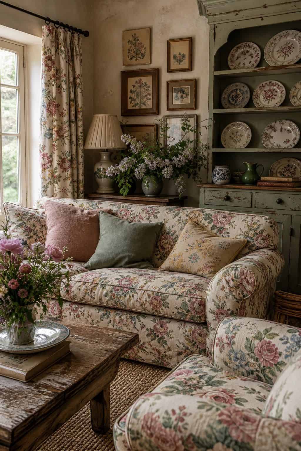
Here the pattern is the palette. A faded floral, hand-blocked or chintz-style, in soft rose, sage, butter, and faded blue on a cream ground, becomes the whole color scheme for a room. Pull the wall color, the trim, and the solid textiles from tones within the floral, so everything relates. The modern move is to use one faded floral as the hero, on curtains, a headboard, or one chair, rather than layering chintz on every surface the way the stuffy version did. The faded, low-contrast version of the print is what keeps it current; a bright, busy floral reads dated.
7. Sage and Cream
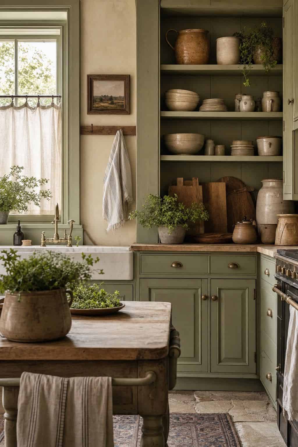
A fresh, gentle, very livable English country palette. A warm cream base (#EFE8D7) with a soft sage (#A4AC8E) on cabinetry, a painted piece, or a single wall. Sage is one of the most forgiving English country colors, calming, warm-leaning, and easy to live with long-term, and it reads modern as readily as traditional. The modern version uses sage generously, since it behaves almost like a neutral, while keeping the cream bright. Add warm wood, a touch of faded floral, and a little butter yellow, and the sage feels like sun-faded foliage. It suits a bedroom, a kitchen, or a bathroom.
8. Faded Blue and Buttercream
A soft, sunny take on English country blue. A buttercream base (#F0E6C8) with a faded, chalky blue (#8FA3B0), gentler than indigo and reading like old painted wood and worn fabric. The warmth of the buttercream keeps the blue from going cold, and the pairing feels like a cottage kitchen on a bright morning. The modern version can use a little more of the faded blue than a saturated one, on cabinetry or a large piece, since the muted tone stays easy. It is a relaxed, welcoming palette, ideal for a kitchen, a child’s room, or a casual sitting room, and it forgives the everyday wear of a busy household better than a darker scheme would.
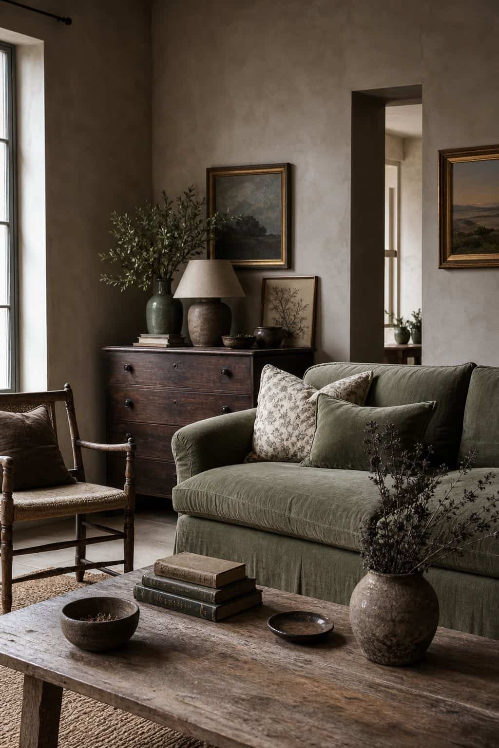
9. Olive and Warm White
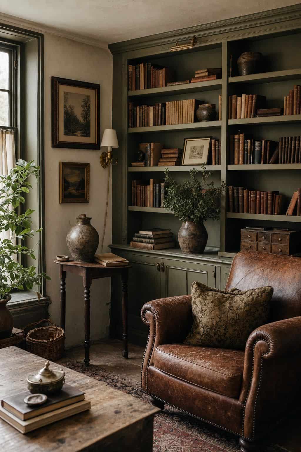
A deeper, more grown-up green palette than sage. A warm white base (#F1ECDD) with a muted olive (#6E6E45) on cabinetry, a sofa, or an accent wall. Olive is having a real moment, and the dusty, greyed-down version reads sophisticated rather than military, and very English country when paired with antique wood and a little faded floral. The modern version uses olive confidently, even on joinery or a large piece, since the muted tone holds up. Add aged brass and warm wood and the olive starts to feel like the foliage of an old garden. It suits a study, a snug, or a dining room.
10. Dusty Rose and Sage
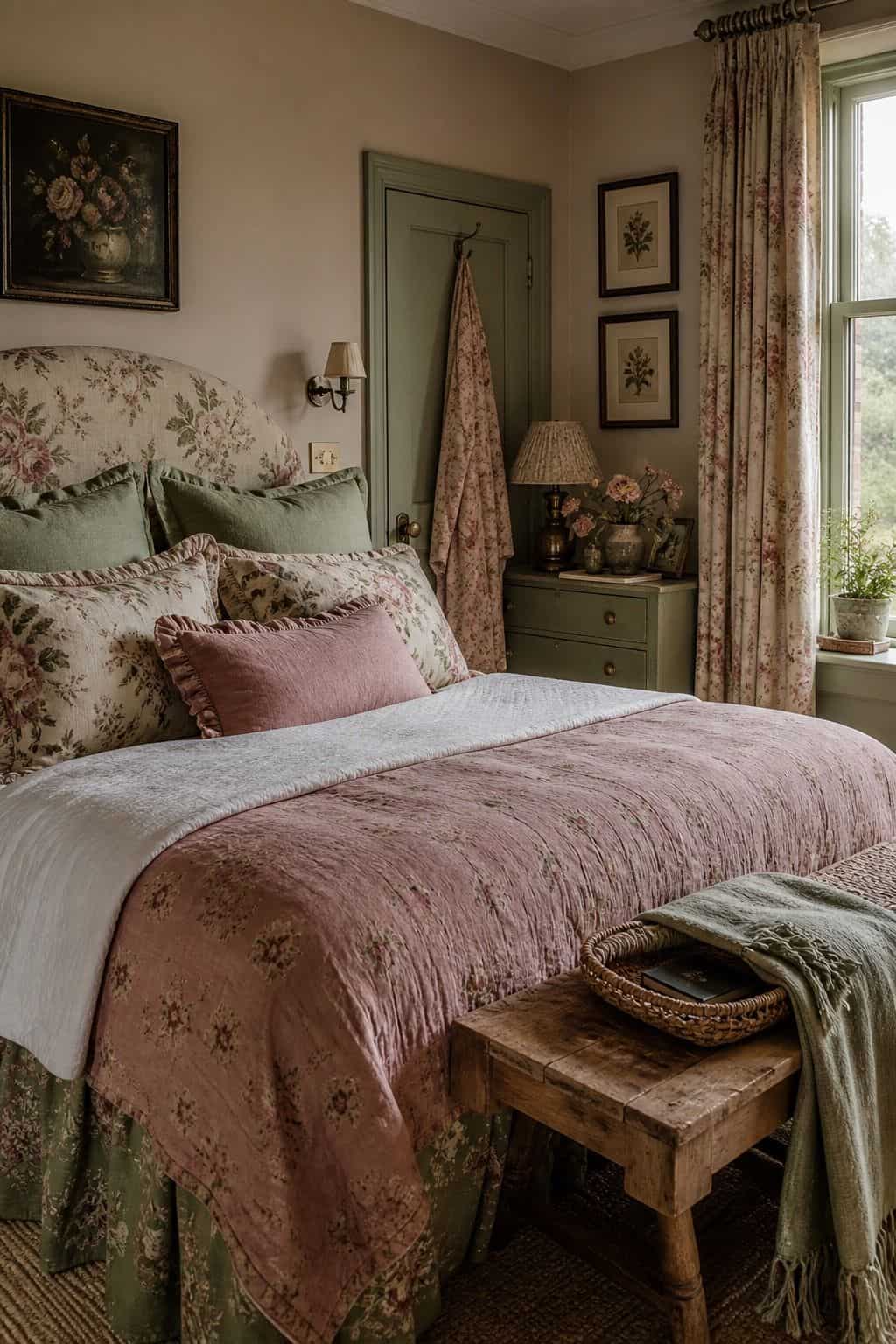
A classic English country garden pairing, rose and green together. A dusty rose (#CDA0A0), soft and a little greyed, with a muted sage (#9AA384), both on a cream base. The rose and sage are the colors of an old rose bed, so they sit together effortlessly. The modern version keeps both as accents, cushions, a rug, a painted piece, against the cream rather than committing whole walls to either, so the room stays light. It is a soft, romantic palette that still reads adult thanks to the dustiness of both tones. It suits a bedroom or a feminine-leaning sitting room beautifully.
11. Aubergine and Oatmeal
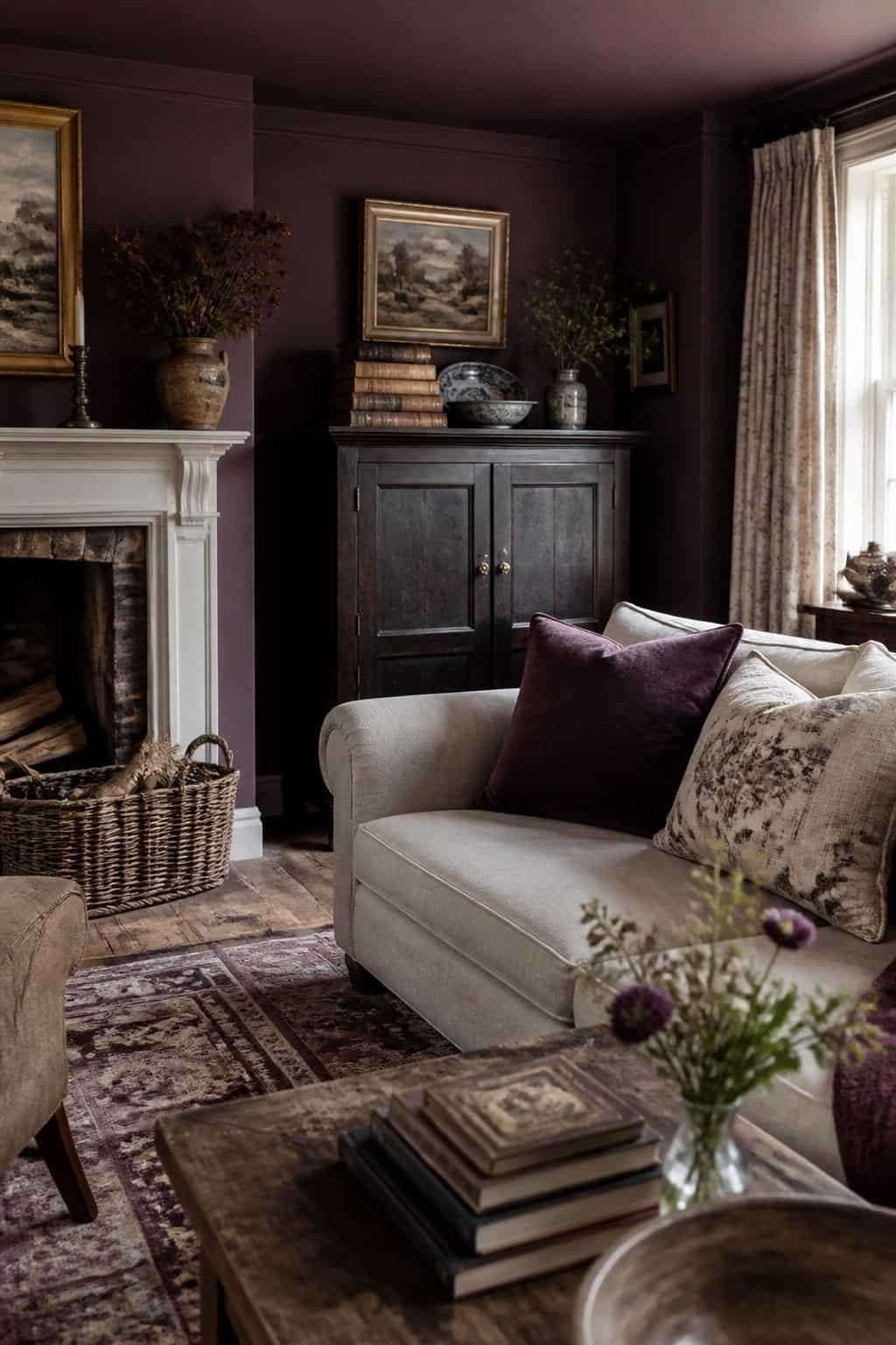
A rich, dramatic English country palette for a room that wants depth. A warm oatmeal base (#E4DBC4) with aubergine (#4A3340), the deep, near-black purple of the vegetable garden, as a single bold accent. Aubergine is the deepest color on this list, so the modern version uses it with real restraint, on one painted cabinet, a velvet chair, or a small feature, never the whole room. Against the warm oatmeal it reads as a considered, jewel-like accent rather than a heavy wash. Pair it with brass, warm wood, and a touch of butter yellow to keep it from feeling somber, and reserve it for a dining room or a study.
12. Buttercream and Faded Red
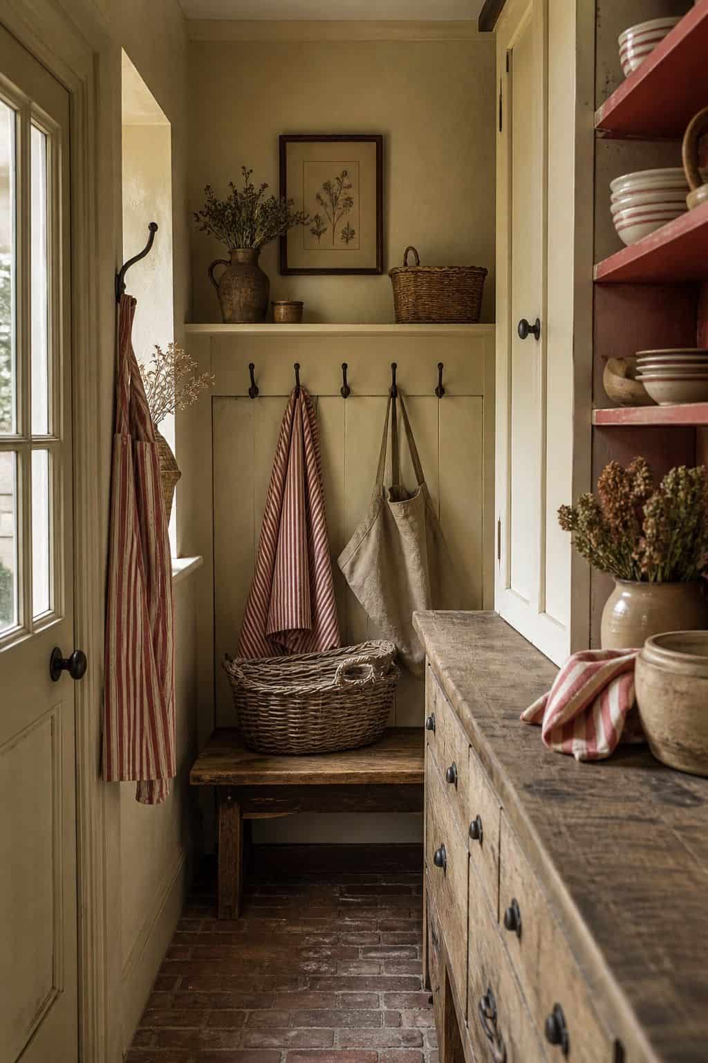
A warm, traditional English country palette with a cheerful edge. A buttercream base (#F0E6C7) with a faded, brick-toned red (#A8584A) as the accent, the soft red of old ticking stripe and faded checks rather than a bright primary. The two are classic kitchen colors, warm and inviting. The modern version keeps the faded red to textiles and small painted pieces, a check cushion, a runner, a stool, rather than walls, so the room stays light and bright. The faded, dusty quality of the red is essential; a bright pillar-box red reads loud and undoes the gentle, layered effect. Used as a small accent against all that buttercream, the faded red warms the room without ever shouting for attention.
13. Mushroom and Sage
A quiet, modern-leaning English country palette built on two soft near-neutrals. A warm mushroom base (#C9BCA8), a greige-brown with real warmth, paired with a soft sage (#A4AC8E) on joinery or a wall. This is the most restrained palette on the list, and it is where modern English country comes closest to a calm contemporary scheme while still reading warm and layered. Add antique wood, a single faded floral, and a touch of brass to keep it firmly English country rather than plain modern. It is endlessly livable, suits any room, and is the easiest palette here to commit to long-term.
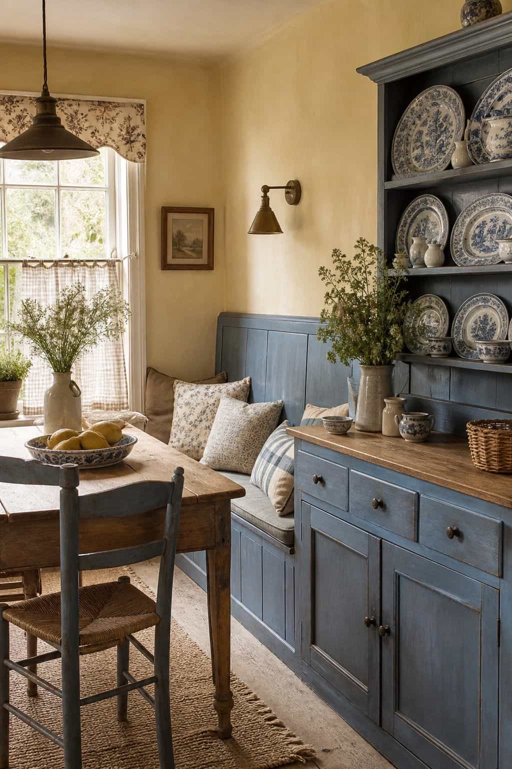
14. Cream and Willow Blue
A bright, classic palette drawn straight from blue-and-white English china. A clean warm cream base (#F1EBDB) with willow blue (#6D8BA8), the soft, slightly greyed blue of old transferware. It is crisp and traditional but, with the warm cream, never cold. The modern version leans on the china itself, a plate wall, a dresser of stacked blue-and-white, as the source of the color rather than painting whole walls blue, which keeps the room light. It is a fresh, timeless palette that suits a kitchen or dining room especially well, and it is one of the easiest to assemble through thrifted china.
15. Honey Oak and Soft White

The most pared-back English country palette, where the wood itself is the color. A soft warm white base (#F2EEE2) lets honey oak (#C39A5E), the warm mid-tone of antique pine and oak furniture, become the main accent through the furniture rather than paint. This is the modern English country palette at its lightest and most contemporary: bright walls, warm wood, and just a whisper of faded floral or sage to keep it from reading plain. It suits anyone who wants the warmth and the antique furniture of English country without committing to colored walls, and it makes a small or dark room feel notably lighter.
How Modern English Country Lightens the Scale
Every palette above is recognisably English country, the same warm, garden-derived family the style has always used. What separates the modern versions from the stuffy ones is not the colors themselves but how they are handled. Modern English country lightens the base, brightening it to cream, oatmeal, mushroom, or warm white, so the warm accents have somewhere bright to sit. It also reduces the number of patterns in play at once, one hero floral rather than chintz on every surface.
The other shift is restraint with the deep accents. Plum, aubergine, indigo, faded red, these stay as accents, on a cushion, a painted cabinet, a rug, rather than being drenched across whole rooms the way the heavy version did. And the modern approach leaves negative space: a clear surface, a bare patch of wall, room for the eye to rest. Apply those three moves, lighter base, fewer patterns at once, deep colors as accents only, to any palette above, and a warm English country scheme reads fresh and current rather than like a period recreation. For the gentlest, calmest end of this approach, our guide to a calm, natural home shows where the look quiets down furthest.
Ready to take an English country palette from swatch to a whole finished room?
The Aesthetic Apartment Makeover Guide gives you a room-by-room plan for applying color, pattern, and wood tone, so an English country scheme comes together as one warm, layered home.
Frequently Asked Questions
What colors are English country?
English country color is warm and layered, drawn from the garden and landscape: plaster pink, faded terracotta, sage and olive greens, indigo and faded blues, plum and aubergine, butter yellow, and faded red, all held together by cream and oatmeal bases. Hand-blocked floral pattern counts as a color of its own.
Is English country dark or light?
Both versions exist. The stuffy traditional version is dark and heavy, deep walls, brown furniture, chintz everywhere. The modern version uses the same warm color family but lightens the base to cream or oatmeal, reduces the patterns in play, and keeps deep colors as accents, so the room reads fresh and warm rather than dim.
What is modern English country color?
Modern English country keeps the warm, garden-derived palette but applies three edits: a lighter, brighter base (cream, oatmeal, mushroom, warm white), fewer patterns at once (one hero floral instead of chintz on everything), and deep colors like plum and indigo used only as accents rather than drenched across whole rooms.
How do I do an English country palette on a budget?
Paint is the cheapest, highest-impact move, a warm cream or sage base costs the same as any other paint. Then bring accent color in through thrifted floral textiles, blue-and-white china, vintage rugs, and a painted secondhand cabinet rather than expensive furniture. One faded floral fabric can set a whole room’s scheme.
What is the best English country paint color?
There is no single best, it depends on the room and the light, but a warm cream or oatmeal is the safest base for any English country room. For an accent, sage is the most forgiving and livable, plaster pink the most flattering, and indigo or willow blue the crispest. Match the accent to how much warmth versus freshness the room needs.
Key Takeaways
- An English country palette is warm and layered, drawn from the garden: plaster pink, faded terracotta, sage and olive, indigo and faded blue, plum, butter yellow, on cream and oatmeal bases.
- Hand-blocked floral pattern counts as a color of its own, bringing several tones at once as a layer of the palette.
- The 15 palettes give hex codes and paint names; each notes how the modern approach lightens the traditional, heavier scheme.
- Modern English country applies three edits: a lighter base, fewer patterns at once, and deep colors used only as accents rather than drenched on walls.
- Lighten the base, keep the accents warm, the base color is the single biggest difference between a fresh modern room and a stuffy dated one.
Final Thoughts
An English country color palette is less about specific colors and more about how warmly and how lightly you handle them. Start with a bright, warm base, choose one or two layered accents from the garden-derived palettes above, treat hand-blocked floral as a color in its own right, and keep the deepest tones as accents. Handle it that way and a warm English country scheme reads fresh and current rather than heavy and dated. When you are ready to furnish the scheme, our guide to the furniture pieces to build these palettes around covers the antique wood and slipcovered seating that complete the look.