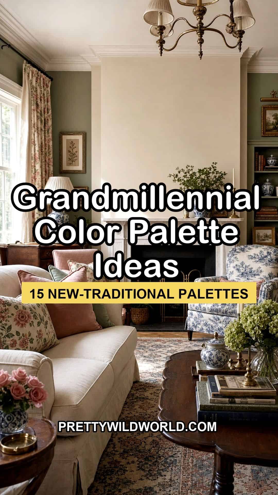
Quick Answer: A grandmillennial color palette is new-traditional, not your grandmother’s living room. It keeps the soft, warm classics, dusty rose, sage green, robin’s-egg blue, butter yellow, navy, but uses them lighter, brighter, and with more white space than the heavy traditional version. Hand-blocked floral and toile patterns count as colors of their own. The 15 palettes below give hex codes and paint names, and each one shows where the modern, new-traditional approach lightens the old scheme.
There are two ways to read “grandmillennial color,” and they are easy to confuse. The first is your grandmother’s actual living room: deep, heavy hues, dark wood everywhere, chintz layered on chintz, a room that feels dim and closed-in even with the curtains open. The second is new-traditional, the same beloved color family, but lifted, with brighter bases, fewer competing patterns, and real breathing room around each piece.
The distinction is the whole game. New-traditional grandmillennial uses dusty rose, sage, robin’s-egg blue, and navy with the same affection the old scheme did, but it treats them with a lighter hand. The colors get more white space, the patterns get edited down, and the wood tones get balanced with painted pieces. The result reads collected and current rather than inherited and tired.
The 15 palettes below give you exact hex codes and paint names, and each one notes how the new-traditional approach lightens the traditional version. They pull from the same world as the soft, romantic coquette bedroom look and lean on the same logic as building a coquette aesthetic, just in a more classic, new-traditional register.
Picking a grandmillennial palette and worried it will read dated instead of new-traditional?
The Aesthetic Apartment Makeover Guide walks you through choosing and placing color room by room, so a warm grandmillennial palette lands fresh and collected rather than heavy and inherited.
Recommended Grandmillennial Color Decor
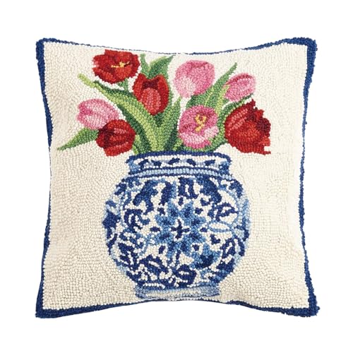
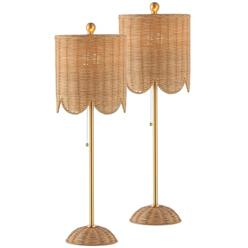
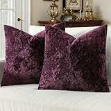
Six pieces that carry a warm, new-traditional grandmillennial palette into a room, from floral textiles to scalloped accents.


Recommended blogs to read:
- the french country aesthetic
- a soft coquette palette
- a cottagecore bedroom
- coquette home decor
- french country styling
What Makes a Palette New-Traditional, Not Old
The difference between a grandmillennial palette and a genuinely dated one is rarely the colors themselves, it is how they are used. Traditional schemes pile saturated hues together at full strength, layer pattern on pattern, and leave almost no plain surface to rest the eye. New-traditional keeps the exact same color family, dusty rose, sage, robin’s-egg blue, butter yellow, navy, but lifts the bases lighter, edits the patterns down to one or two per room, and lets white walls or cream upholstery carry the negative space.
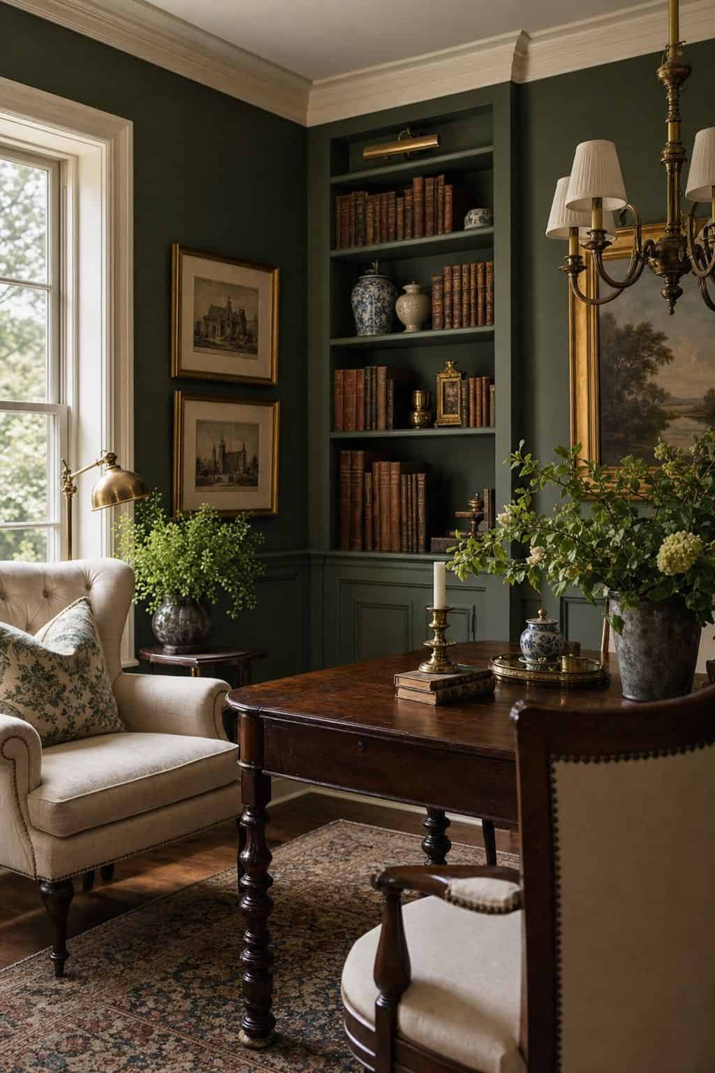
The other shift is balance. The old version leans hard on dark wood and heavy florals; the new version pairs warm brown antiques with painted pieces, white trim, and lighter textiles so nothing feels weighed down. Pattern still matters, a hand-blocked floral or a blue-and-white toile is essentially a color in grandmillennial decor, but it is used as a deliberate accent rather than wallpaper-floor-curtains all at once. Every palette below is built on that lifted, edited, balanced approach.
1. Dusty Rose, Cream, and Warm Brown
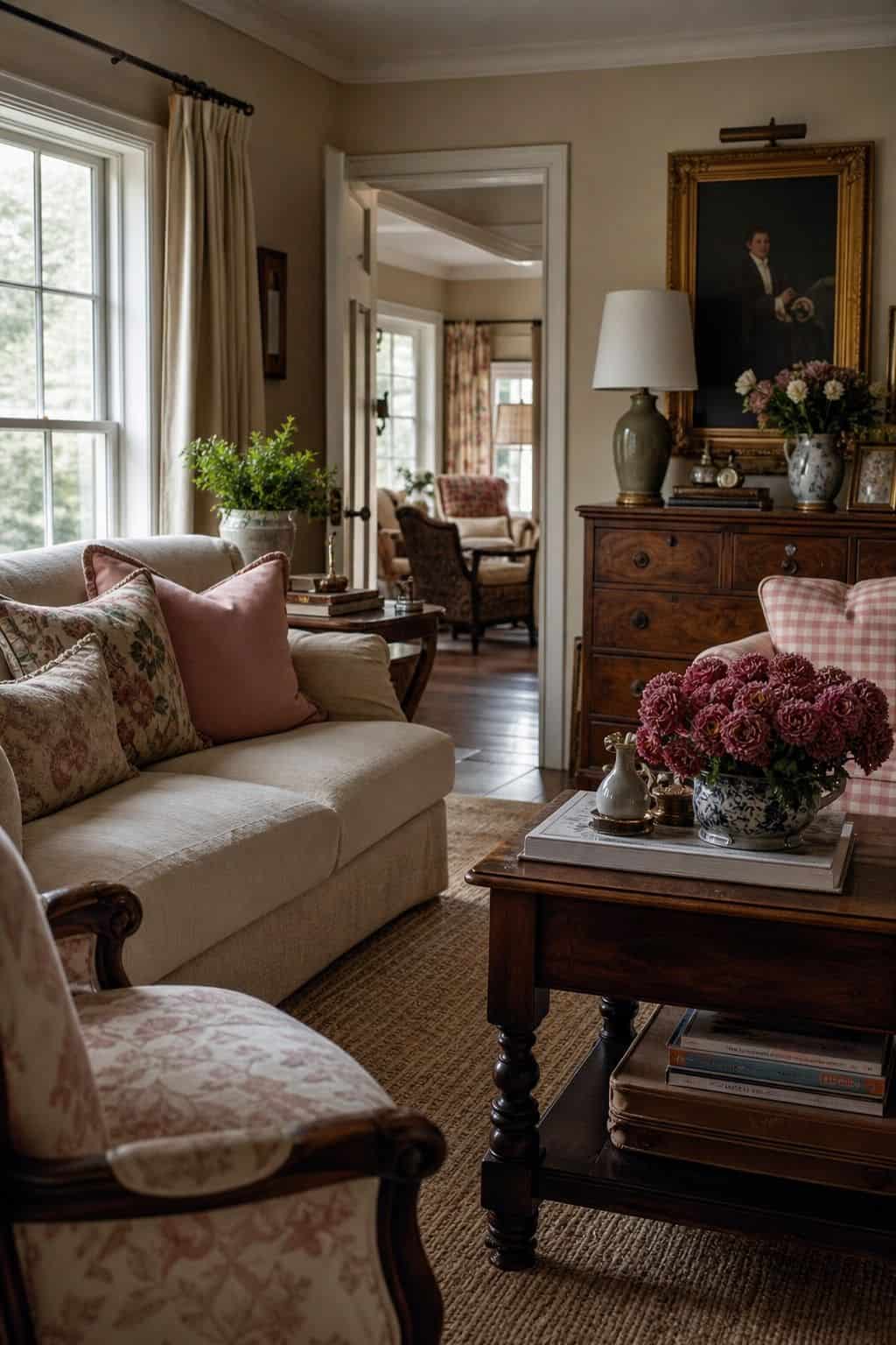


This is the softest, most approachable grandmillennial palette, and it is the clearest example of new-traditional lightening the old scheme. Dusty rose (around #D9A5A0) is the warm anchor, a muted, slightly grayed pink that reads classic rather than sweet. Cream (#F5EFE3) carries the walls and the bulk of the upholstery, giving the rose plenty of white space to breathe instead of crowding it. Warm brown wood (#6B4F3A) grounds the room through antique furniture and frames. The traditional version of this scheme would have used a deeper rose at full saturation on the walls; the new-traditional move is to keep the rose to cushions, a chair, or a single painted piece, and let cream do the heavy lifting. The result is romantic and warm without tipping into a heavy period look.
2. Sage Green, White, and Soft Black
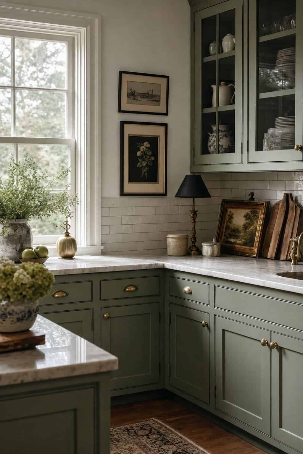


Sage green is one of grandmillennial decor’s most useful colors because it behaves like a warm neutral while still reading as a real hue. Use a soft sage (#A8B59B) on cabinetry, a painted hutch, or an accent wall, pair it with crisp white (#FBFAF6) for the bulk of the room, and add a soft, warm black (#2E2B28) in small doses, lampshades, picture frames, a bit of trim, for definition. The traditional version would have gone darker and heavier with the green and skipped the white relief; the new-traditional approach keeps the sage muted and lets white space carry most of the room. This palette suits a kitchen or a living room beautifully, and it is one of the easiest grandmillennial schemes to live with day to day because sage is so forgiving.
3. Robin’s-Egg Blue, Cream, and Brass
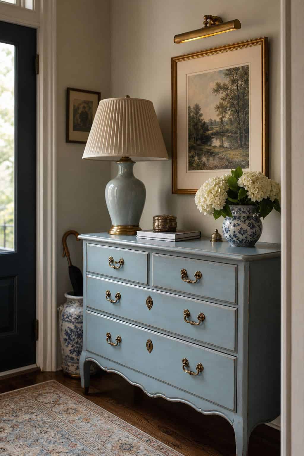


Robin’s-egg blue (#A7CEDC) is a quintessential grandmillennial color, soft, cheerful, and instantly nostalgic. The new-traditional way to use it is as a clear accent against a cream (#F4EEE0) base, on a painted dresser, a set of lamps, or a band of cushions, rather than washing whole walls in it. Brass (#B08D57) ties it together through hardware, picture lights, and small decorative objects, adding warmth that keeps the blue from feeling cold. The traditional version often used this blue at full strength across walls and ceilings; lightening the base to cream and reserving the blue for furniture and textiles is what makes it feel current. This palette is bright and optimistic, and it works especially well in a bedroom or an entryway where you want an immediate lift.
4. Navy, White, and Warm Wood
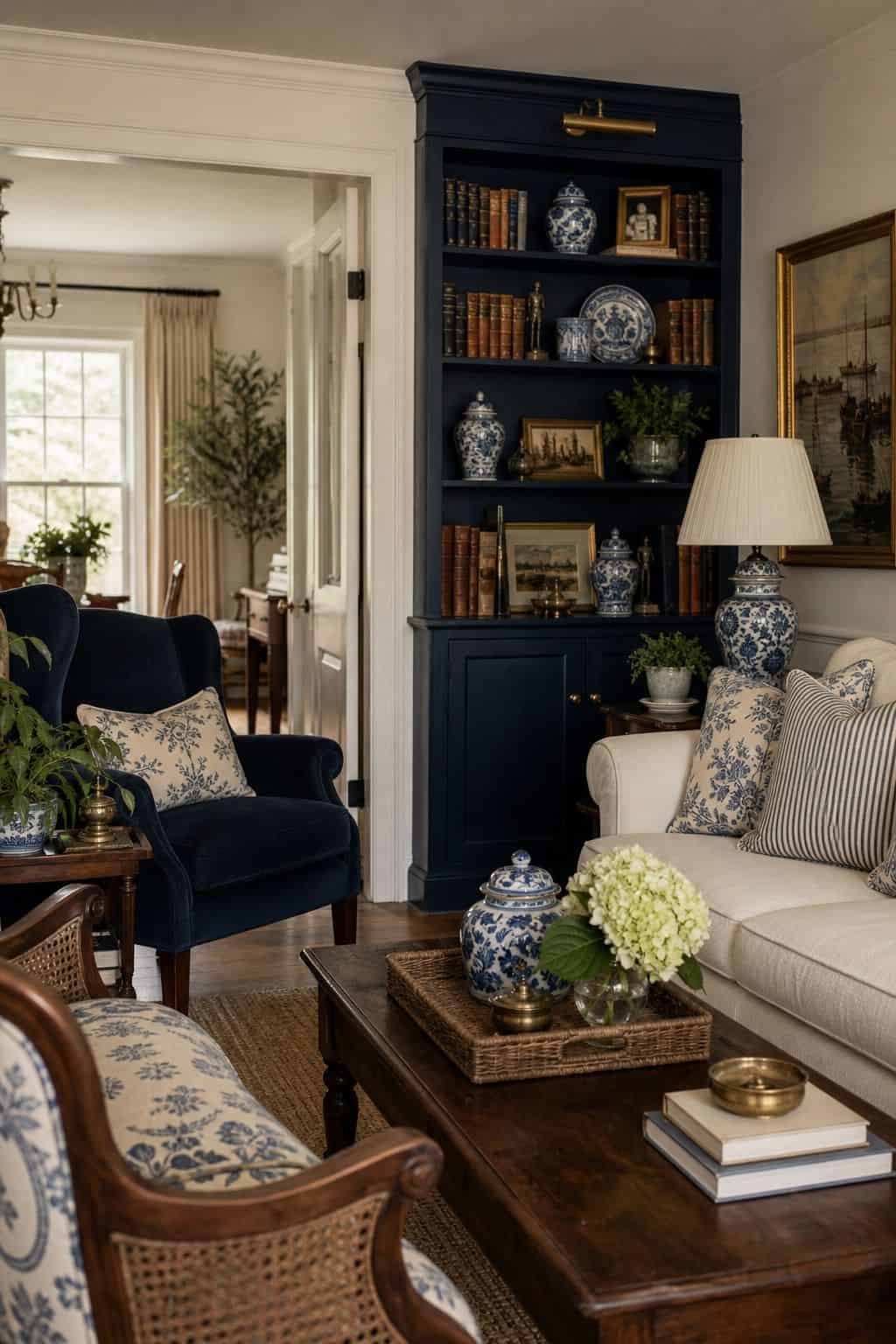


Navy is the grandmillennial palette’s anchor when you want depth without darkness, and the new-traditional approach is all about placement. Use navy (#2A3A52) on a single statement, a painted bookcase, a sofa, an accent wall behind a bed, and surround it with generous white (#FBFAF6) so it reads as a rich punctuation rather than a heavy box. Warm wood (#6B4F3A) in antique pieces keeps it from feeling stark. The traditional version of a navy room tends to layer dark on dark; the new-traditional move is to let navy be the one deep note in an otherwise light, airy room. Blue-and-white porcelain is the natural pattern partner here. This palette is crisp, classic, and very livable, and it is a strong choice for a study, a dining room, or a living room.
5. Butter Yellow, White, and Sage
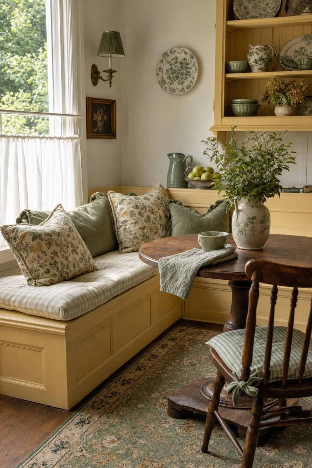


Butter yellow (#F0E2A8) is a joyful, slightly retro grandmillennial color, and the new-traditional version keeps it soft and sunny rather than acidic or heavy. Use it on a painted piece, a band of cushions, or a cheerful accent wall in a smaller room, set against plenty of white (#F8F5EC), with sage green (#A8B59B) as the gentle secondary color in textiles and ceramics. The traditional version often pushed the yellow deeper and warmer to the point of feeling dim; keeping it pale and pairing it with white and sage is what makes it read fresh. This palette is wonderful for a kitchen, a breakfast nook, or a child’s room, anywhere you want warmth and a bit of cheer without the scheme ever feeling loud or dated.
Grandmillennial Palettes That Mix Pattern as Color
One thing that separates grandmillennial decor from plain traditional is that pattern is treated as a color. A blue-and-white toile, a hand-blocked floral, a chinoiserie print, these are not just texture, they carry hue and personality the way a paint color does, and a grandmillennial palette has to plan for them. The new-traditional approach is to choose one hero pattern per room and build the solid colors around it.
The trap the old version fell into was using every pattern at once, floral wallpaper, plaid upholstery, striped curtains, in the same space. The new-traditional fix is restraint: a single statement pattern, supported by solids drawn from its own color story, with the rest of the room kept calm. The palettes below show how to let a pattern lead while the solid colors stay in a supporting role.
6. Blue-and-White Toile With Cream and Navy
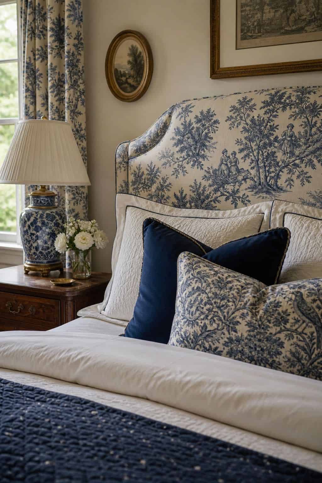


Blue-and-white toile is one of grandmillennial decor’s signature patterns, and built into a palette it works best as the hero with everything else in support. Let the toile lead, on a headboard, curtains, or a single upholstered chair, then pull its two colors out as your solids: a soft navy (#2A3A52) for accents and a warm cream (#F4EEE0) for the walls and larger upholstery. The new-traditional discipline here is using the toile in exactly one place, not on the walls and the bedding and the lampshades. That single, deliberate placement is what keeps it feeling collected rather than overwhelming. This palette is classic and a little bit storybook, and it is especially lovely in a bedroom or a powder room where one statement pattern can carry the whole space.
7. Floral Chintz With Sage and Soft Pink
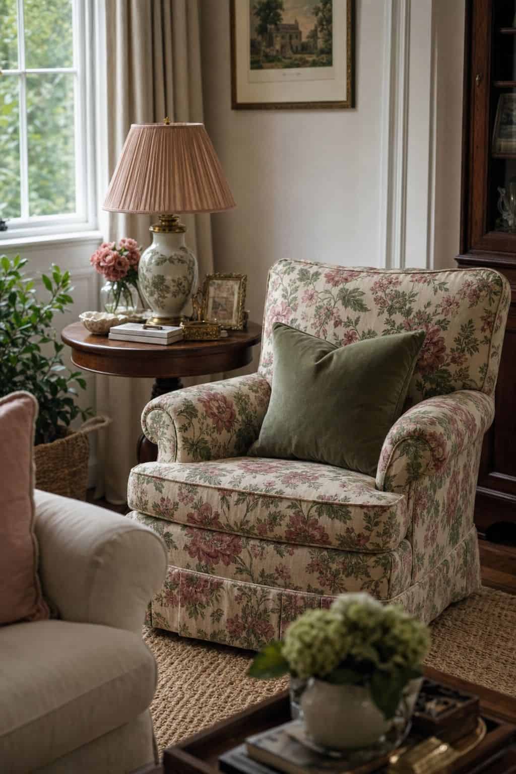


A hand-blocked floral chintz is the most grandmillennial pattern there is, and the new-traditional way to use it is as a considered accent rather than a full environment. Choose a chintz with sage green and soft pink in it, use it on cushions, a slipcovered chair, or a lampshade pair, and then echo those tones as your solids: sage green (#A8B59B) and a muted soft pink (#E3C4C0) in textiles, with white (#FBFAF6) carrying the room. The traditional version drowned a room in chintz; the new-traditional move is one chintz piece, supported by its own colors in solid form. This palette is warm, soft, and unmistakably grandmillennial, and it suits a living room or a bedroom where you want a gentle, garden-inspired feel.
8. Chinoiserie Print With Robin’s-Egg Blue and Gold
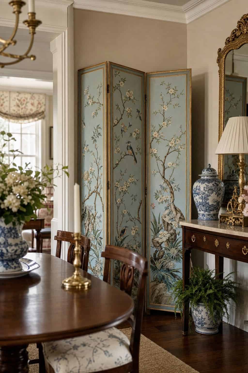


Chinoiserie, the hand-painted-style print of birds, branches, and blossoms, is a grandmillennial favorite, and it carries so much color and detail that the rest of the palette has to stay quiet. Let a chinoiserie print be the hero on a folding screen, a set of framed panels, or a single accent wall, then build solids from its palette: robin’s-egg blue (#A7CEDC) for accents and a touch of soft gold (#C9A66B) for warmth, with cream (#F4EEE0) everywhere else. The new-traditional approach uses the print in one architectural spot and keeps everything else calm and light. This palette feels elegant and a little bit special, and it works beautifully in a dining room or an entryway where a single chinoiserie moment can set the tone for the whole home.
9. Gingham With Butter Yellow and White
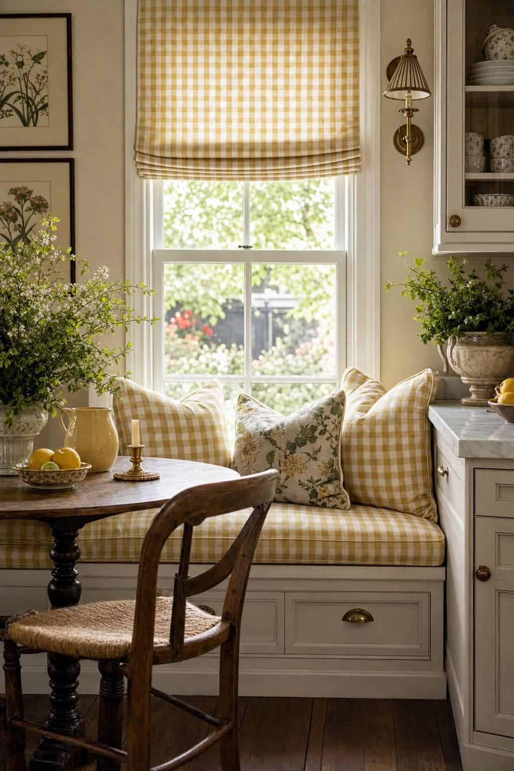


Gingham is the most casual grandmillennial pattern, and it brings a fresh, cheerful, slightly countrified feeling to a palette. Use a gingham, in sage, blue, or a soft red, on cushions, a bench, or a roman shade, and keep the solids light and sunny: butter yellow (#F0E2A8) as a gentle accent and white (#F8F5EC) as the main color. The new-traditional approach treats gingham as a friendly supporting pattern rather than covering every surface in it. Because gingham is a small, regular check, it reads almost like a textured solid from a distance, which makes it easy to live with. This palette is bright, happy, and unfussy, and it is a wonderful choice for a kitchen, a breakfast room, or a child’s bedroom that you want to feel warm and welcoming.
10. Block-Print Floral With Navy and Cream
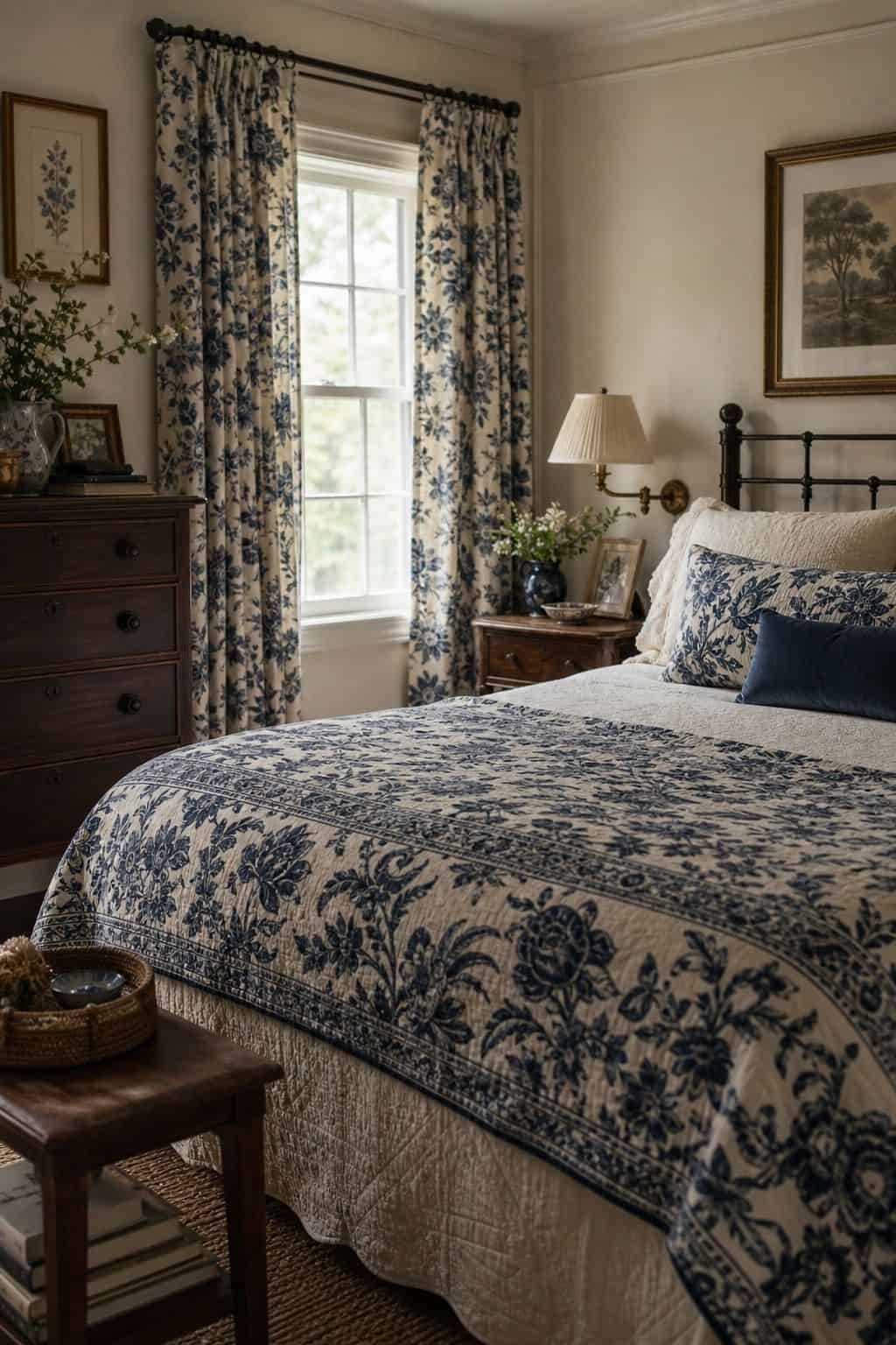


An Indian-style block-print floral brings a slightly worldly, collected feeling to a grandmillennial palette, and it pairs beautifully with the scheme’s love of navy. Let a navy-and-cream block print lead on curtains, a quilt, or an upholstered headboard, then use navy (#2A3A52) as your accent solid and cream (#F4EEE0) as the base. The new-traditional discipline is the same as always, one statement use of the pattern, supported by its own colors in solid form, with the rest of the room kept airy. Block prints have a handmade irregularity that keeps the look from feeling stiff or overly formal. This palette is classic with a relaxed edge, and it suits a bedroom or a sitting room where you want grandmillennial warmth without any starchiness.
Not sure how to balance pattern and solid color in one room without it tipping heavy?
The Aesthetic Apartment Makeover Guide shows you how to place a hero pattern and build a calm solid palette around it, so a grandmillennial room reads collected instead of cluttered.
Deeper Grandmillennial Palettes for Cozy Rooms
Not every grandmillennial room needs to be pale and airy. Some rooms, a study, a dining room, a snug sitting room, want depth and enclosure, and grandmillennial decor has a deeper end of the palette for exactly that. The new-traditional approach to deep color is still about restraint, but here the white space gets traded for richer, warmer enclosure done deliberately.
The difference from the old, heavy version is intention. A traditional dark room often felt dim by accident, layers of dark wood and dark fabric with no relief. A new-traditional deep room is darker on purpose, with one or two rich colors used confidently, balanced by warm metals, lighter accents, and good lighting. The palettes below show how to go deep without going dated.
11. Deep Green, Cream, and Brass

A deep, warm green is the most livable of the rich grandmillennial colors, and the new-traditional approach uses it with confidence rather than caution. Take a deep green (#3A4A3C) onto the walls of a study or a dining room, then keep the trim, ceiling, and a good share of the furnishings in cream (#F4EEE0) so the green reads as a rich envelope rather than a dark hole. Brass (#B08D57) in lighting, frames, and hardware adds the warm glow that keeps a deep green room feeling alive. The old version would have paired the green with equally dark wood and skipped the cream relief; the new-traditional move is the cream trim and the brass warmth. This palette is enveloping and elegant, perfect for a room you want to feel like a retreat.
12. Burgundy, Soft Pink, and Cream


Burgundy is a classic traditional color that can easily feel dated, but the new-traditional way to use it is in small, deliberate doses against soft, light company. Keep burgundy (#6E3B3F) to accents, a pair of lampshades, a single chair, the welt on a cushion, and surround it with soft pink (#E3C4C0) and cream (#F4EEE0). The unexpected pairing of burgundy with a gentle pink is exactly what pulls it out of the dim, heavy past and into something current and a little bit charming. The old version used burgundy on walls and heavy drapes; the new-traditional approach treats it as a jewel-tone punctuation in an otherwise soft room. This palette is warm and quietly sophisticated, and it suits a bedroom or a sitting room beautifully.
13. Navy, Sage, and Warm White
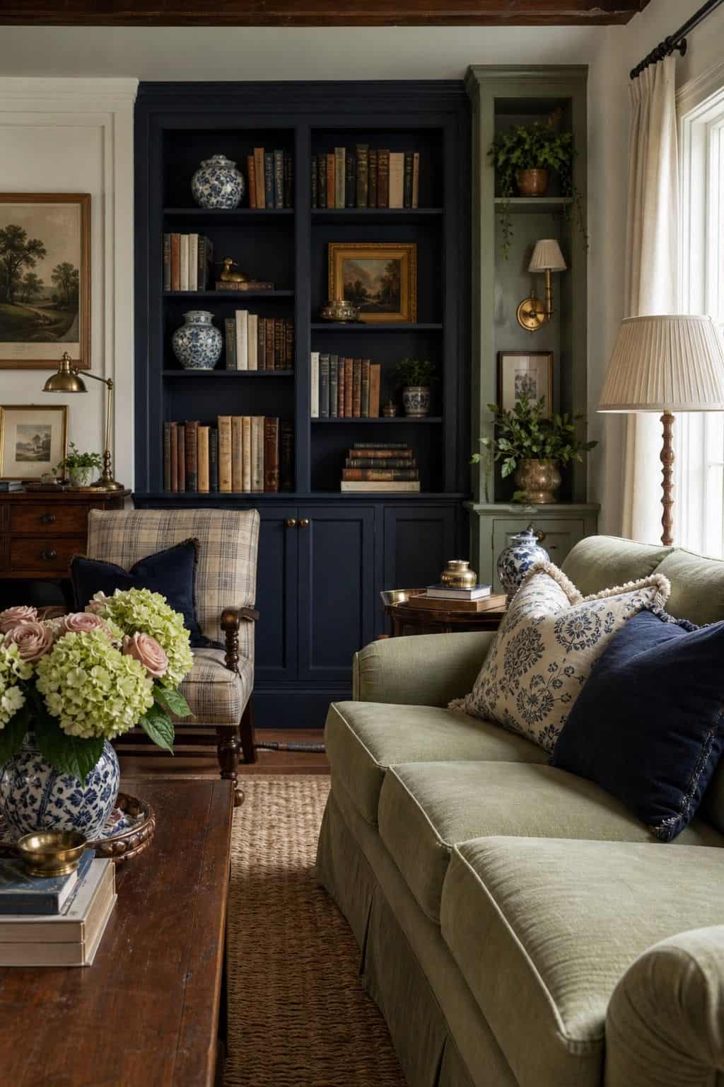


Pairing two of grandmillennial decor’s anchor colors, navy and sage, creates a deeper, more layered palette that still feels balanced. Use navy (#2A3A52) on a major piece or an accent wall and sage green (#A8B59B) on cabinetry or a second set of furnishings, then let warm white (#FBFAF6) hold the room together and keep it from feeling closed-in. The new-traditional approach is what makes two deeper colors coexist: each one gets its own clear territory, and the warm white provides the breathing room between them. The old version might have muddled the two together with dark wood; here they stay distinct and intentional. This palette has real depth and a collected, layered quality, and it works wonderfully in a living room or a study.
14. Plum, Cream, and Sage


Plum is a softer, dustier alternative to burgundy, and it gives a grandmillennial palette a gentle richness without going fully dark. Use a muted plum (#7A5C6E) as an accent, on a velvet cushion, a painted side table, a band of trim, against a cream (#F4EEE0) base, with sage green (#A8B59B) as the calming secondary color in textiles and ceramics. The new-traditional approach keeps the plum dusty rather than saturated and uses it sparingly, so it reads as a soft, sophisticated note rather than a heavy one. The old version would have pushed the plum darker and used it more widely; restraint and a dusty tone are what make it feel current. This palette is warm and a little romantic, lovely for a bedroom or a reading corner.
15. Charcoal, Cream, and Robin’s-Egg Blue


For a grandmillennial room that wants a modern edge, charcoal is the deep color to reach for instead of black or brown. Use a soft charcoal (#3D3B38) on a built-in, a painted bookcase, or trim and doors, keep cream (#F4EEE0) as the main color, and bring in robin’s-egg blue (#A7CEDC) as the cheerful accent that lifts the whole scheme. The contrast of the deep, slightly contemporary charcoal with the soft, nostalgic blue is what makes this palette feel both grandmillennial and current. The old version would have used true black and heavier woods; charcoal is gentler and reads as new-traditional. This palette is crisp, a little bit sharp, and very livable, and it suits a home office, an entryway, or a living room that wants classic warmth with a slightly updated feel.
How to Use a Grandmillennial Palette in a Room
The single rule that keeps a grandmillennial palette new-traditional rather than dated is the lifted-and-edited approach: lighter bases, fewer patterns at once, more white space, and warm wood balanced with painted pieces. Pick one or two of the soft classic colors, dusty rose, sage, robin’s-egg blue, butter yellow, navy, choose one hero pattern, and let cream or white carry most of the room. That restraint is the entire difference between the modern version and your grandmother’s actual living room.
From there, the palette comes alive through the right pieces and the right balance of old and new. Antique brown-wood furniture grounds the scheme, painted pieces and white trim lighten it, and a single statement pattern carries the personality. To see the furniture side of this, the grandmillennial furniture guide shows which pieces to build these palettes around, and the grandmillennial wall decor ideas cover how a framed print or a plate cluster counts as a color of its own.
Frequently Asked Questions
What colors define a grandmillennial palette?
Grandmillennial palettes are built on soft, warm classics: dusty rose, sage green, robin’s-egg blue, butter yellow, and navy, with cream and white carrying the negative space. Deeper rooms add green, burgundy, plum, and charcoal. Hand-blocked floral, toile, chinoiserie, and gingham patterns count as colors of their own. The new-traditional approach uses all of these lighter and more edited than the heavy traditional version did.
How is grandmillennial different from traditional decor?
Grandmillennial, or new-traditional, decor uses the same beloved color family as traditional decor but with a lighter hand. The bases are brighter, the patterns are edited down to one or two per room, there is far more white space, and warm wood antiques are balanced with painted pieces and white trim. Traditional decor tends to layer saturated colors and multiple patterns with little relief; grandmillennial lifts and edits that same scheme.
Does pattern count as color in a grandmillennial palette?
Yes. In grandmillennial decor, a pattern like blue-and-white toile, a hand-blocked floral, or a chinoiserie print carries hue and personality the way a paint color does, so the palette has to plan for it. The new-traditional approach is to choose one hero pattern per room and build the solid colors around it, pulling the solids directly from the pattern’s own color story.
Can a grandmillennial room use deep, dark colors?
Yes, for rooms that want depth and enclosure, like a study or dining room. The new-traditional approach uses one or two rich colors, deep green, burgundy, plum, or charcoal, confidently, balanced with cream trim, warm brass, lighter accents, and good lighting. The difference from a dated dark room is intention: the depth is deliberate and relieved, not the accidental result of layered dark wood and fabric.
How do I keep a grandmillennial palette from looking dated?
Follow the lifted-and-edited rule: keep the soft classic colors but use lighter bases, limit yourself to one hero pattern per room, leave plenty of white space, and balance warm wood antiques with painted pieces and white trim. Use deep colors deliberately and sparingly. The dated look comes from saturated color everywhere, pattern on pattern, and dark wood with no relief, so restraint in all three is the fix.
Key Takeaways
- A grandmillennial palette is new-traditional: the same soft classic colors as traditional decor, used lighter and more edited.
- The core colors are dusty rose, sage, robin’s-egg blue, butter yellow, and navy, with cream and white carrying the white space.
- Pattern counts as color: choose one hero pattern per room and build the solid colors from its own palette.
- Deep colors like green, burgundy, plum, and charcoal work for cozy rooms when used deliberately and relieved with cream and brass.
- The dated look comes from saturated color everywhere and pattern on pattern, so lighter bases, one pattern, and white space are the fix.
Final Thoughts
A grandmillennial palette is not about avoiding the colors your grandmother loved, it is about using them with a lighter, more edited hand. Keep the dusty rose, the sage, the robin’s-egg blue, the navy, but lift the bases, limit the patterns, leave white space, and balance the brown wood with painted pieces. That restraint is the whole difference between new-traditional and dated.
Start with one or two of the soft classics and one hero pattern, and build out from there. If you want the look without a big budget, the grandmillennial on a budget guide shows how to get there with thrifted and secondhand finds, and for a softer, more romantic cousin of this palette, the coquette living room look uses many of the same gentle tones. Choose your colors with restraint, and a grandmillennial room reads collected, warm, and entirely current.