A coquette color palette pairs soft warm pinks with cream, ivory, and a touch of gold, with white and blue variants for a more grown-up read. The 15 palettes below come with hex codes and real paint names, plus how to use them so a room feels romantic rather than like a nursery.
Coquette lives or dies by its color. The right soft pink reads vintage Parisian. The wrong one reads toy aisle. The gap between them is narrow, and it is all about warmth and muting.
Most coquette color advice stops at a pretty swatch with no paint names and no guidance. This guide fixes that. Fifteen full coquette color palettes, each with hex codes and a real paint starting point, plus how to keep the pink grown-up.
Picked your coquette palette and not sure how to roll it out?
The Aesthetic Apartment Makeover Guide shows you how to apply a palette in the right order, so the room comes together instead of fighting itself.

Recommended Coquette Color and Decor Products
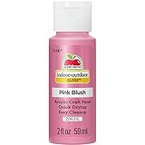
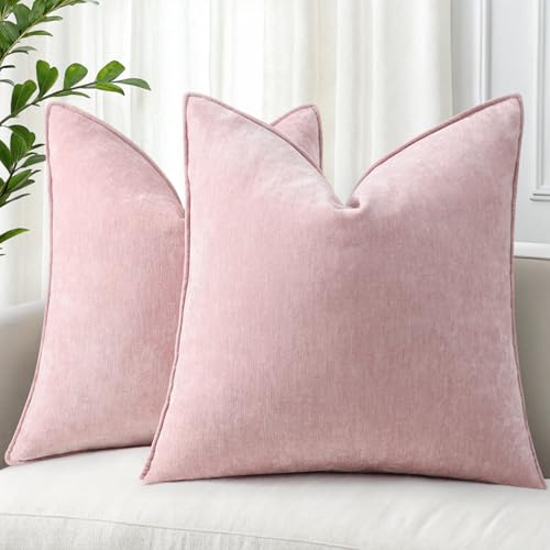
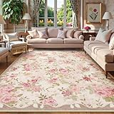
Six pieces that help you put a coquette palette into a room, from paint samples to the textiles that carry the soft tones.


Recommended blogs to read:
- a soft cottagecore palette
- muted French country colors
- a light coastal color scheme
- the bolder 70s color palette
- a calmer neutral palette
What Makes a Color Coquette
A coquette color is soft, warm, and slightly muted. Warm matters most. A pink with a cool blue undertone reads candy and juvenile. A pink with a warm undertone, leaning toward peach or rose, reads vintage and grown-up. The palette also needs a neutral to rest on, usually cream or ivory, and a small metallic, soft gold or pearl, for the jewelry-box glow. For the wider context, here is what makes the coquette aesthetic tick.
15 Coquette Color Palettes With Hex Codes and Paint Names
Each palette below lists a dominant color, supporting tones, and an accent, with hex codes and a real paint name to start from. Always test a sample in your own light before committing.
1. Classic Ballet


The signature coquette palette. Ballet pink (around #F4D9DD) as the lead, warm cream (#F5EFE6) as the neutral, pearl white (#FBF8F3) as the lift, and soft gold for the accent. It is the most recognizably coquette scheme and the safest place to start. Paint starting points: a ballet pink like Benjamin Moore Pink Bliss, a cream like Behr Swiss Coffee.
2. Whisper of Rose


A touch deeper and dustier than Classic Ballet. Dusty rose (#D9A9A9) leads, ivory (#F3EDE2) is the neutral, soft gold runs through, and a hint of sage (#C3C7B4) keeps it from going too sweet. This is the grown-up everyday coquette palette. Paint starting points: a dusty rose like Behr Crystal Apple gone muted, an ivory like Sherwin-Williams Alabaster.
3. White Coquette


For people who love coquette but not a pink room. Warm white (#F6F1E9) dominates, with blush (#EBD3D3) and champagne (#E8D9BE) as accents only, in textiles, art, and a single piece of furniture. It reads coquette through shape and texture rather than color. Paint starting points: a warm white like Benjamin Moore White Dove.
4. Blue Coquette


The other grown-up variant. Powder blue (#CBD7E0) as the lead, cream (#F3EDE2) as the neutral, soft pink (#EBD3D3) as the small warm accent, and pearl for the glow. It keeps the softness and the romance and swaps the pink for a calmer base. Paint starting points: a powder blue like Behr Cumberland Fog, a cream like Behr Swiss Coffee.
5. Vintage Coquette


The most antique-leaning palette. Faded rose (#CFAFAE), antique cream (#EDE3CE), a hint of soft sage, and aged gold. Everything reads slightly faded, like a palette pulled from old wallpaper. It suits a room built around vintage florals and thrifted furniture. Paint starting points: a faded rose like Behr Rose Heath, an antique cream like Benjamin Moore Manchester Tan.
6. Cherry Coquette


The bolder, trending take. Cherry red (around #A23B40) as the accent, soft pink (#F4D9DD) as the base, cream as the neutral, and white for the lift. The red gives coquette an edge and keeps it from feeling precious. Use the red sparingly, in a bow, a cushion, a piece of art. Paint starting points: keep red as an accent only, base in a ballet pink like Benjamin Moore Pink Bliss.
7. Pearl and Cream


The most neutral, most grown-up coquette palette. Pearl white (#FBF8F3) and warm cream (#F5EFE6) carry the whole room, with the softest blush (#F0E0E0) and gold used only in details. It is coquette stripped back to its quietest, and it ages beautifully. Paint starting points: a pearl white like Sherwin-Williams Greek Villa.
8. Dusty Mauve


Mauve gives coquette a slightly moodier, more sophisticated edge. Dusty mauve (a soft greyed pink-purple around #B89BA2) as the lead, cream as the neutral, soft gold as the accent. It is coquette for someone who wants romance without brightness. Paint starting points: a dusty mauve like Behr Plumage gone softer.
9. Peach Blush


The warmest coquette palette. Soft peach (#F2D6C3) as the lead, warm cream as the neutral, ivory as the lift, and gold running through. The peach undertone makes the whole room feel sunlit, which suits a room with poor natural light. Paint starting points: a soft peach like Benjamin Moore Soft Satin.
10. Powder and Gold


Built around the metallic. Powder pink (#EFD9DC) as the base, cream as the neutral, and an unusually generous amount of soft gold, in frames, hardware, lighting, and small objects, so gold reads as the second color. Dressy and a little glamorous. Paint starting points: a powder pink like Behr Sweet Tart gone muted.
11. Soft Strawberry


A warmer, slightly fruitier pink than ballet. Soft strawberry (#E8B4B8) as the lead, cream as the neutral, white for the lift, and gold for the glow. It is cheerful without being loud, and it suits a younger, brighter coquette room. Paint starting points: a soft strawberry like Behr Coral Bells gone muted.
12. Lavender Bow


Lavender pulls coquette toward soft and dreamy. Soft lavender (#D7CCE0) as the lead, cream as the neutral, the softest pink as a warm accent, and pearl for the glow. It is the most ethereal coquette palette. Paint starting points: a soft lavender like Behr Lilac Sachet.
13. Champagne Rose


The most elegant, dinner-party coquette palette. Champagne (#E8D9BE) and warm rose (#E0BCBC) together, with ivory as the breather and gold for the glow. It reads grown-up and a little luxe, good for a living room rather than a bedroom. Paint starting points: a champagne like Benjamin Moore Manchester Tan, a warm rose like Behr Rose Heath.
14. Antique Pink


The most faded, gentlest palette. Antique pink (#E3CACA), aged cream (#EDE3CE), a whisper of sage, and aged gold. Everything looks as if it has gently faded over decades, which is exactly the vintage-boudoir feel coquette wants. Paint starting points: an antique pink like Behr Heirloom.
15. Ribbon Red


The boldest palette, for a coquette room with confidence. Soft red (#C46B6B) and pink (#F4D9DD) together, cream as the neutral, white for the lift. The red is bigger here than in Cherry Coquette, used on a feature wall or a major piece. It is coquette that does not whisper. Paint starting points: keep the red as a feature, base in a ballet pink like Benjamin Moore Pink Bliss.
Got your palette and want the rest of the room to follow it?
The Aesthetic Apartment Makeover Guide takes you from palette to finished room with a clear order of operations.
How to Use a Coquette Palette Without It Feeling Like a Nursery
The nursery problem is real, and it comes from three mistakes. Too much pink with nothing to break it. A cool, candy-toned pink instead of a warm, muted one. And no grown-up materials, just plastic-gold and synthetic frills.
The fixes follow. Let the neutral do real work, cream or ivory covering a meaningful share of the room so the pink reads as an accent rather than the whole envelope. Choose warm, muted pinks every time. And spend on grown-up materials: aged brass over plastic gold, real lace, vintage florals, velvet. A coquette room built on warm muted color, a generous neutral, and good materials reads Parisian boudoir. Skip those and it reads toy aisle. The coquette furniture you choose carries a lot of this, since the materials live there.
Coquette Colors by Room
A quick guide to which palette suits which space.
- Bedroom: Classic Ballet, Whisper of Rose, or Vintage Coquette. The bedroom can take the most pink.
- Living room: White Coquette, Blue Coquette, or Champagne Rose for shared, grown-up spaces.
- Bathroom: Pearl and Cream or Powder and Gold. Soft and dressy in a small room.
- A bolder statement: Cherry Coquette or Ribbon Red, used with restraint.
- Whole-home mood: Whisper of Rose or Pearl and Cream, which carry room to room without overwhelming.
Read also: how to achieve the coquette aesthetic, a soft, romantic coquette bedroom, a soft coquette living room.
Frequently Asked Questions
What colors are coquette?
Coquette colors are soft, warm, slightly muted pinks, grounded by cream or ivory and lifted with soft gold or pearl. White, blue, lavender, and faded-rose variants all fit. The pink should have a warm undertone, never a cool candy one.
What is the main coquette color?
Soft warm pink, especially ballet pink, is the signature. But the palette is broader than pink alone, including cream, ivory, champagne, and the white and blue variants that read more grown-up.
Can coquette be blue or white instead of pink?
Yes. White coquette uses warm white as the base with blush only as an accent, and blue coquette swaps the pink lead for powder blue. Both keep the softness and romance while reading more grown-up than full pink.
What are the coquette aesthetic hex codes?
Core coquette hex codes include ballet pink around #F4D9DD, warm cream around #F5EFE6, pearl white around #FBF8F3, and champagne around #E8D9BE. The 15 palettes in this guide each list a full set.
How do I make coquette colors look grown-up?
Let a cream or ivory neutral cover a meaningful share of the room, choose warm muted pinks over cool candy ones, and spend on grown-up materials like aged brass, real lace, and velvet. The white, blue, and pearl variants also read more mature.
Key Takeaways
- A coquette color is soft, warm, and slightly muted, never a cool candy pink.
- Every palette needs a generous cream or ivory neutral and a small gold or pearl accent alongside the pink.
- The 15 palettes range from Classic Ballet to bolder Cherry Coquette and Ribbon Red, plus grown-up White, Blue, and Pearl variants, each with hex codes and paint starting points.
- To avoid the nursery effect, let the neutral do real work, choose warm muted pinks, and spend on grown-up materials.
- Match the palette to the room: the most pink in bedrooms, the calmer variants in shared living spaces.
Final Thoughts
Color is the fastest lever in a coquette room and the easiest one to get wrong. Pick a warm, muted palette, give it a generous neutral to rest on, and back it with grown-up materials. Test real samples before you commit. Get the color right and the room reads romantic and Parisian rather than juvenile. When you are ready for the rest, the full coquette home decor guide maps every room.