Quick Answer: A Mediterranean color palette is built on a warm white or cream base layered with terracotta, olive, ochre, and Greek blue, plus the occasional deeper note like burgundy or cobalt. The 15 palettes below give you hex codes and paint names for a warm, sun-washed home, organized by the Tuscan, Greek, and coastal Mediterranean sub-styles.
There is a particular hour in a Mediterranean room, late afternoon, when the sun drops low and the warm walls do all the work. A plain white room goes flat at that hour. A room painted in warm Mediterranean tones glows, because the color was chosen to hold light rather than bounce it back cold. That glow is the whole point of the palette.
The 2026 take on Mediterranean color goes deeper and warmer than the old blue-and-white postcard version. Designers are layering in forest green, intense terracotta, and warm cocoa, then color-drenching, taking one tone across walls, trim, and textiles, so the room reads enveloping rather than decorated. What unites every Mediterranean palette, old or new, is that warm base, and what separates them is which earth tone or blue gets layered on top, a choice that comes down to whether your home leans Tuscan, Greek, or coastal.
Picking a Mediterranean palette and not sure which tones go where?
The Aesthetic Apartment Makeover Guide walks you through choosing and placing a color scheme room by room, so a warm, sun-washed palette lands cohesive instead of patchy.
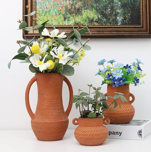
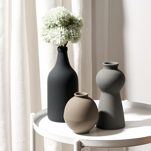
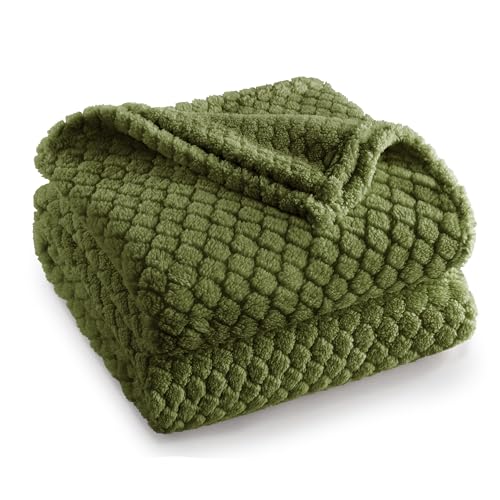
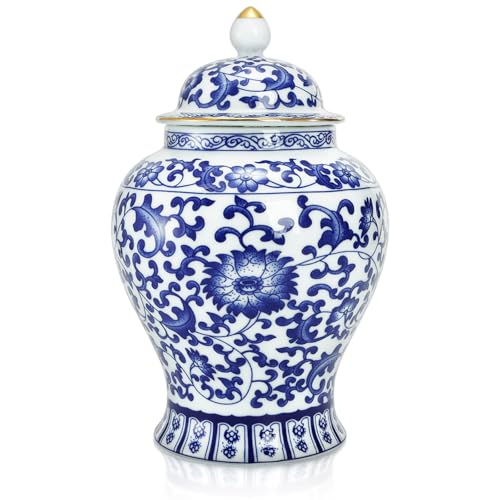
Recommended Mediterranean Color Decor
Six pieces that carry a warm, sun-washed palette into a room, from terracotta accents to blue-and-white ceramics.


Recommended blogs to read:
- a coastal home look
- a coastal living room
- the french country aesthetic
- a calm, natural home
- a coastal kitchen
What Makes a Palette Mediterranean
A Mediterranean palette starts with a warm base, never a cool one. Warm white, cream, sand, and plaster are the canvas, and they are warm enough to glow in low light rather than going grey. Against that base sit the earth tones the region is built on: terracotta, ochre, olive, and warm brown, all pulled from clay, foliage, and stone.
The blues are the second signature, but they are deeper and warmer than a beachy aqua. Greek blue, cobalt, and a soft denim read like the sea and the painted shutters of the region. The trick is restraint: one or two saturated accents against the warm neutral base, never a whole room of bright color. Tie the colors to your furniture choices with our guide to the furniture that carries these colors.
One rule before the palettes: warm wins every tie. When you are choosing between two versions of a color, the warmer, slightly muted one is the Mediterranean choice. A cool, clean version of the same hue reads modern and a little hard, which is the opposite of the sun-washed feeling the palette is built for.
15 Mediterranean Color Palettes With Hex Codes
Each palette below pairs a warm base with one or two accents. The section after the list covers how Tuscan, Greek, and coastal Mediterranean each shift the mix.
1. Greek Blue and Warm White
The classic for a reason. A warm white like Benjamin Moore White Dove (#F2EFE4) on the walls, paired with a true Greek blue (#1B5E8C) on shutters, a door, or a run of ceramics. The contrast is crisp but the warm white keeps it from going cold. This is the palette that reads instantly Mediterranean, and it suits a bright room with good natural light. Keep the blue to accents, around ten percent of the room, so it stays a punctuation mark rather than the whole sentence. Add unglazed terracotta somewhere, a stack of pots, a tiled tray, to warm the scheme back down and stop the blue and white from feeling clinical. If you only ever try one Mediterranean palette, this is the safe, reliable starting point, and it photographs beautifully in a sunlit room.
2. Terracotta and Cream
The warmest, most grounded Mediterranean palette. A soft cream base (#EDE4D3) with terracotta (#C66B3D) carried across textiles, pots, and maybe a plaster accent wall. This is the Tuscan-leaning scheme, and it glows beautifully in afternoon light. Terracotta is a big color, so let the cream do most of the room and bring the terracotta in through a rug, cushions, and clay vessels rather than four walls. A little olive green as a third note keeps it from feeling one-tone. It is a forgiving palette that works in almost any room, since the cream base does the heavy lifting and the terracotta accents can be swapped or shifted around without repainting. For a richer version, take the terracotta onto one accent wall and keep everything else cream.
3. Olive Green and Sand
A quieter, more grown-up Mediterranean scheme. A sand or oat base (#E3D8C3) with a muted olive (#6B6B3E) on cabinetry, a sofa, or an accent wall. Olive is having a real moment in 2026, and the dusty, greyed-down version reads sophisticated rather than military. This palette suits a room where you want warmth without brightness, a study, a bedroom, a snug living room. Add aged brass and warm wood, and the green starts to feel like sun-faded foliage. Skip the bright blues here; this scheme wants to stay in the earth tones. Because olive is a near-neutral once it is greyed down, you can use a lot of it without the room feeling loud, which makes it an easy long-term choice rather than a trend you tire of.
4. Ochre and Warm White
Ochre is the color of sun on old stone, and it brings instant warmth. A warm white base (#F1ECE0) with ochre (#C9962E) on textiles, ceramics, and a single painted piece. Ochre is bold, so it works best as the one saturated accent in an otherwise neutral room. It pairs naturally with terracotta and olive, so you can build a whole warm scheme from those three plus the white. This palette is especially good in a north-facing room that needs warming up, since ochre adds the golden cast the room is missing. Try it first on a smaller surface, a painted cabinet or a bank of cushions, and live with it before committing to a wall, since ochre reads very differently in morning versus evening light.
5. Cobalt and Lime-Wash White
A bolder coastal Mediterranean scheme. A lime-wash-textured white (#EFEBE0) with cobalt (#1B3A7A) as a strong accent on a door, a tiled surface, or a statement piece of pottery. The lime-wash texture matters here; it gives the white movement so the cobalt has something alive to sit against. This is a confident palette, so it suits a room you want to feel a little dramatic. Keep the cobalt contained to one or two surfaces and let the textured white carry the rest, with warm wood to soften the contrast. Cobalt is more saturated than Greek blue, so use even less of it, a single door or a tiled niche is plenty, and let the rest of the room stay calm so the cobalt stays a deliberate shock of color.
6. Plaster Pink and Sand
The softest Mediterranean palette, and a 2026 favorite. A warm sand base (#E5D9C6) with a plaster pink (#D8AF9A), the dusty, clay-toned pink of old Mediterranean walls, not a sweet pink. Color-drench this one: take the plaster pink across the walls and trim together for an enveloping, sun-faded effect. It reads warm and serene at once, which makes it ideal for a bedroom. Add terracotta and a little olive to keep it from drifting too pretty, and the scheme stays grounded and adult. The clay undertone is what separates this from a nursery pink, so test swatches in the actual room light and reject anything that reads candy rather than weathered plaster.
7. Forest Green and Cream
The deepest, most enveloping Mediterranean scheme, and very much a 2026 direction. A cream base (#EBE2CF) with a deep forest green (#2E4032) on cabinetry, a built-in, or a color-drenched accent wall. Forest green reads like cypress and dark foliage, and it gives a Mediterranean room real depth and richness. This palette suits a dining room or a library-style space where you want intimacy. Warm it with brass, terracotta, and natural wood so the green feels sun-dappled rather than cold and corporate. Because forest green is so dark, it works best in a room you use mostly in the evening, where lamplight can play off it, rather than a bright everyday space that would feel weighed down by it.
8. Burgundy and Warm White
An elegant, slightly unexpected Mediterranean palette. A warm white base (#F2EDE1) with burgundy (#6E2A2E), the color of wine and dried roses, as a single rich accent. Burgundy is best used sparingly here, on a velvet cushion, a rug, a piece of pottery, against a calm neutral room. It brings a depth that the brighter palettes do not, and it pairs beautifully with terracotta and ochre, since they are all in the warm-earth family. Use it where you want the Mediterranean look to feel a touch more formal. A little burgundy goes a long way, so think of it as the jewelry of the room, one or two considered pieces, rather than a color you spread across multiple surfaces.
9. Sea Glass and Sand
The most coastal-leaning palette on the list, but still warm. A sand base (#E4D9C5) with a soft, greyed sea-glass green-blue (#9BB5AC). This is gentler than Greek blue, and it reads like sun-bleached shutters rather than bright paint. It suits a coastal Mediterranean home, a bright living room or a sunroom, where you want the sea reference without high contrast. Layer in plenty of natural texture, linen, rattan, jute, and let the sea glass be a quiet wash of color rather than a bold statement. Because the sea glass is so soft, you can use it generously, on walls and textiles both, without the room ever feeling cold, which makes it one of the easier palettes to live with day to day.
10. Caramel and Cream
A cozy, golden Mediterranean palette. A cream base (#ECE3D1) with caramel (#A9743C), a warm mid-brown with a honeyed cast, on leather, wood, and textiles. This scheme leans into the natural-materials side of Mediterranean style rather than painted color, so the caramel often comes from the furniture itself, a leather chair, a wood table, rather than the walls. It is a calm, warm, low-contrast palette that works anywhere in the home and pairs easily with terracotta and olive accents. Because the color lives in the materials, this palette ages gracefully, leather and wood only deepen with time, so the room looks better in five years rather than dated.
11. Saffron and Warm White
A vivid, joyful palette for a brave room. A warm white base (#F1ECDF) with saffron (#E0A52B), a golden-orange that captures Mediterranean sun at its strongest. Saffron is a true statement color, so it works as the single bold accent, a run of cushions, a painted door, a stack of ceramics, in an otherwise restrained room. It pairs well with cobalt for a high-energy scheme or with olive for something more grounded. Use it in a space that gets good light, where the saffron can really glow. In a dim room saffron can read muddy and orange, so this is one palette where the room’s natural light genuinely decides whether it works, test before you commit.
12. Charcoal and Lime-Wash White
A modern Mediterranean palette with edge. A lime-wash-textured white (#EEE9DD) with charcoal (#3A3A38) on iron, a fireplace surround, window frames, or a single dark piece. Charcoal is the one near-neutral dark the palette allows, and against textured white it reads architectural rather than gloomy. This scheme suits a modern Mediterranean home where you want crisp definition. Keep the charcoal to linear elements, frames and iron, and let warm wood and terracotta keep the room from feeling cold. The trick is using charcoal as an outline rather than a fill, it should trace the architecture and the ironwork, not sit as a block of dark color, so the room stays light and sun-washed overall.
13. Dusty Coral and Cream
A warm, soft palette that sits between terracotta and pink. A cream base (#EDE4D2) with a dusty coral (#CE8B72), the muted, clay-leaning coral of faded Mediterranean stucco. It is warmer than plaster pink and softer than terracotta, which makes it a flattering wall color in a living room or bedroom. Color-drench it or use it on a single accent wall. Pair it with olive and warm wood, and the coral reads like sun-warmed plaster rather than a bold design choice. Dusty coral is one of the most universally flattering wall colors in this whole list, it casts a warm light back onto skin and furnishings, which is why it works so well in rooms where people actually gather.
14. Denim Blue and Sand
A relaxed, faded take on Mediterranean blue. A sand base (#E3D8C4) with a soft, washed denim blue (#6E89A6). This is the most casual of the blue palettes, reading like sun-faded fabric and old painted wood rather than crisp Greek blue. It suits a relaxed family room or a coastal Mediterranean kitchen. Because the denim is muted, you can use a little more of it than you would a saturated blue, on cabinetry or a large piece of furniture, and still keep the room warm and easy. It is the blue palette to choose if Greek blue feels too sharp for your space, all the sea reference, none of the high contrast, and it forgives the wear of a busy household.
15. Sage and Plaster White
A fresh, gentle Mediterranean palette. A plaster-textured white (#EFEADE) with a soft sage (#A3AB8E), lighter and cooler than olive but still firmly in the herb-garden family. Sage is a calming wall color and reads modern Mediterranean, especially with plaster texture and arched details. It suits a bathroom, a bedroom, or a kitchen. Keep the warmth coming through wood, rattan, and a touch of terracotta, so the sage stays sun-washed rather than tipping cool. It is an easy palette to live with long-term, since sage is gentle enough not to tire of, and it bridges Mediterranean and modern style cleanly if you ever want to shift the room’s direction.
Tuscan vs. Greek vs. Coastal Mediterranean
The three sub-styles pull the same base tones in different directions, and knowing which one you are after makes the palette choice obvious. Tuscan Mediterranean is the warmest and earthiest: terracotta, ochre, olive, caramel, deep warm whites, almost no blue. It reads rustic and sun-baked, and it suits the terracotta-and-cream, olive-and-sand, and caramel palettes above.
Greek Mediterranean is the crisp one: warm whites with saturated Greek blue and cobalt, high contrast, very little earth tone. It reads bright and graphic, and it lives in the Greek-blue and cobalt palettes. Coastal Mediterranean sits between them, softer and sun-faded: sand and plaster bases with sea glass, denim blue, and dusty coral, plus a lot of natural texture. It is the most relaxed of the three and overlaps with our guide to these palettes room by room. Pick the sub-style first, then the palette, and the rest of the room follows. A color-washed accent wall in any of these tones, covered in our guide to a color-washed accent wall, anchors the whole scheme.
Ready to take a palette from swatch to a whole finished room?
The Aesthetic Apartment Makeover Guide gives you a room-by-room plan for applying color, texture, and materials, so a Mediterranean scheme comes together as one warm, considered home.
Frequently Asked Questions
What colors are Mediterranean?
Mediterranean color starts with a warm base of white, cream, sand, or plaster, then layers in earth tones like terracotta, ochre, olive, and warm brown, plus warmer-than-beachy blues like Greek blue and cobalt. The 2026 version goes deeper, adding forest green, intense terracotta, and burgundy.
Is Mediterranean style only blue and white?
No. Blue and white is the Greek sub-style, but Tuscan Mediterranean is almost all earth tones, terracotta, ochre, olive, with little or no blue, and coastal Mediterranean uses softer sea glass and denim blues. Blue and white is one of three directions, not the whole palette.
What is the 2026 Mediterranean color trend?
The 2026 direction is deeper and warmer: forest green, intense terracotta, burgundy, and cocoa instead of the old bright blue-and-white postcard look. Color-drenching, taking one tone across walls, trim, and textiles, is also popular, creating an enveloping, sun-faded effect.
How do I do a Mediterranean palette on a budget?
Paint is the cheapest, highest-impact move, a warm white or plaster tone base costs the same as any other paint. Then bring accent color in through thrifted terracotta pots, blue-and-white ceramics, and linen textiles rather than expensive furniture. Lime-wash effects can be done with budget paint techniques.
What is the best Mediterranean paint color?
There is no single best, it depends on the sub-style and the light. A warm white like White Dove is the safest base for any Mediterranean room. For an accent, terracotta suits a Tuscan look, Greek blue suits a crisp coastal look, and plaster pink or sage suit a soft modern Mediterranean room.
Key Takeaways
- A Mediterranean palette always starts with a warm base, white, cream, sand, or plaster, that glows in low light rather than going grey.
- The accents are earth tones (terracotta, ochre, olive, caramel) plus warmer-than-beachy blues (Greek blue, cobalt, denim), used sparingly against the neutral base.
- The 15 palettes give hex codes and paint names; the 2026 direction goes deeper with forest green, burgundy, and intense terracotta, often color-drenched.
- Tuscan is earthy with no blue, Greek is crisp white-and-blue, coastal sits between with soft sea glass and denim, pick the sub-style first.
- When choosing between two versions of a color, the warmer, slightly muted one is always the Mediterranean choice.
Final Thoughts
A Mediterranean color palette is less about specific colors and more about warmth and light. Start with a warm white or plaster base, choose your sub-style, Tuscan, Greek, or coastal, and layer in one or two earth-tone or blue accents from the palettes above. Keep every choice on the warm side, and the room will hold afternoon light the way a Mediterranean room is supposed to. When you are ready to build the rest of the scheme, our guide to warm Mediterranean lighting and our guide to doing Mediterranean decor on a budget cover the glow and the low-cost route.