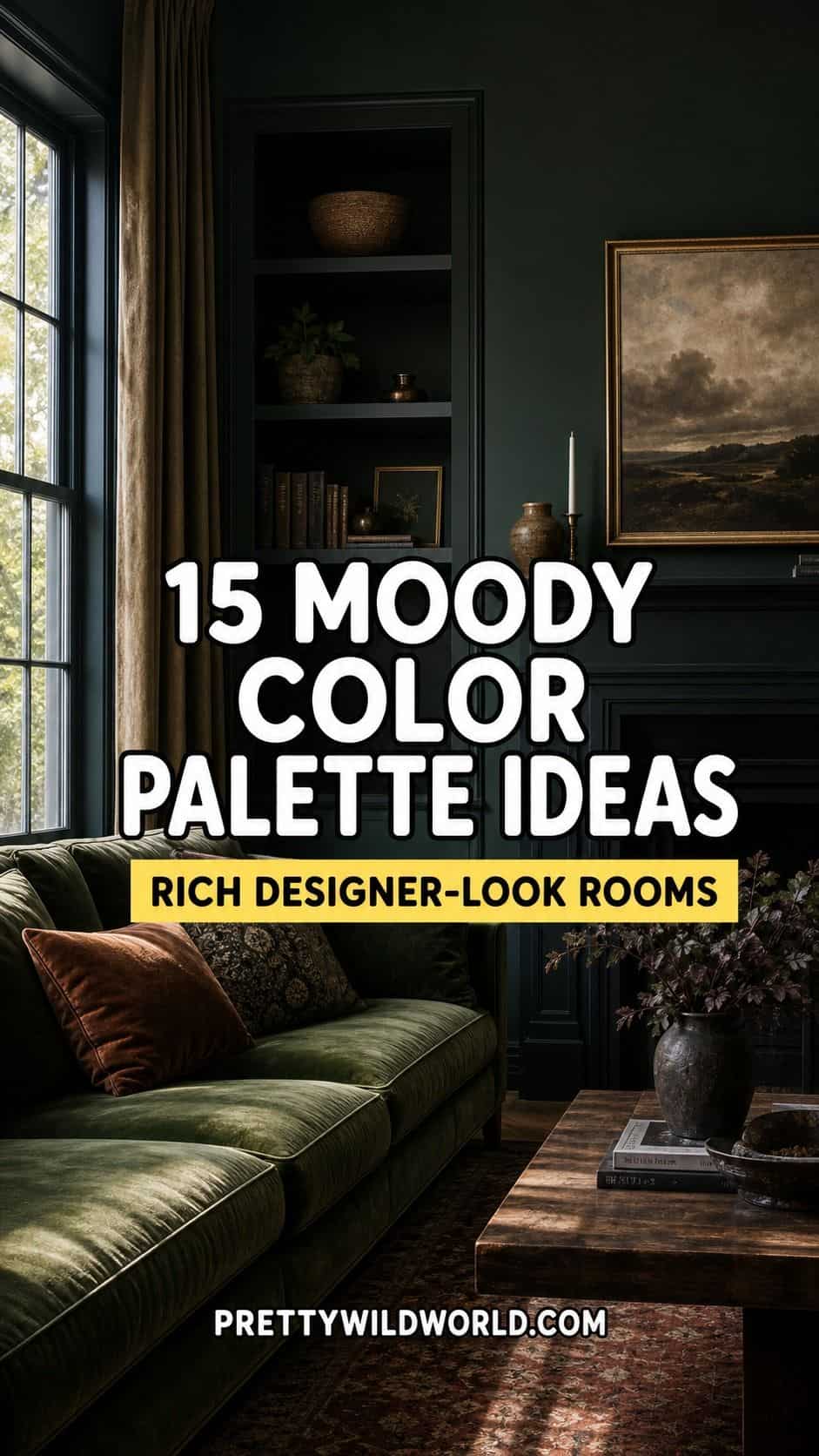
A moody color palette uses deep, saturated tones to make a room feel rich and designer rather than dark and cave-like. The 15 palettes below come with hex codes, real paint names, and the warm-tone trick that keeps a dark room feeling cozy.
Moody color is having a real moment, and not by accident. After years of grey-and-white minimalism, deep saturated rooms feel personal and enveloping in a way a pale room never quite does. The look reads expensive because depth of color is one of the few things a small budget cannot fake with a single object.
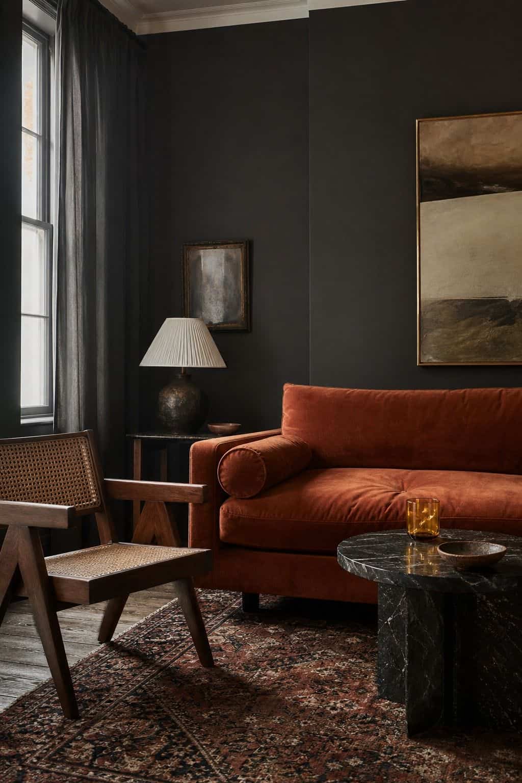
The fear that stops most people is that a dark room will feel like a cave. It will, if you go dark and cold. It will not, if you go dark and warm, and that distinction runs through every palette below. Each one pairs its deep tone with a warmer color so the room stays cocooning instead of gloomy.
Picked a deep palette and not sure how to roll it out?
The Aesthetic Apartment Makeover Guide walks you through applying a palette in the right order, so a moody room comes together as one rich space instead of a set of dark walls.
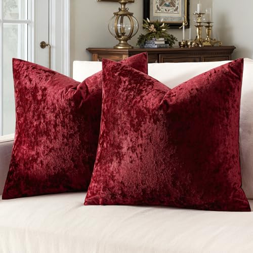
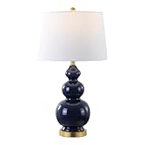
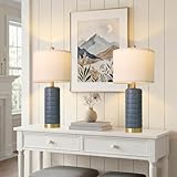
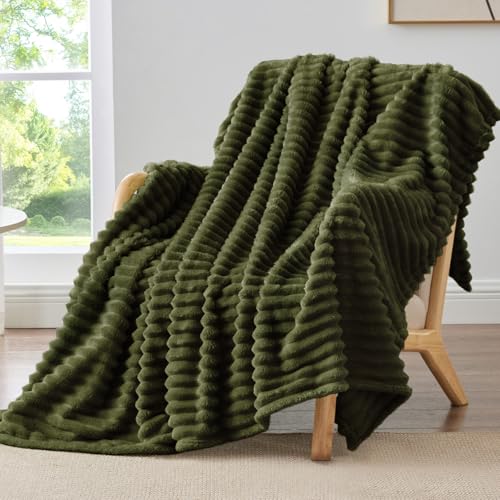
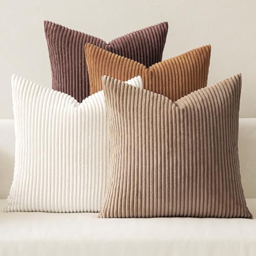
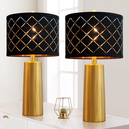
Recommended Moody Color and Decor Products
Six pieces that help you put a moody palette into a room, from paint samples to the warm lighting and textiles that keep a dark space from feeling flat.


Recommended blogs to read:
- a rich 70s living room
- the retro 70s color palette
- mid-century modern color
- a calmer muted palette
- softer French country tones
What Makes a Color Palette Moody
A moody palette is built on depth and warmth, not just darkness. The dominant color is deep and saturated, a forest green, an oxblood, an aubergine, covering roughly 60 percent of the room on walls or large furniture. The secondary color, about 30 percent, is usually a warm mid-tone that stops the room going cold. The last 10 percent is a bright warm accent, brass, ochre, cognac, that lifts the whole scheme.
The single trick that keeps a dark room from reading as a cave is warm undertones. A deep green with a yellow base feels enveloping; the same green with a blue base feels chilly. When you test samples, this is the thing to watch. Every palette below is built around a warm-leaning deep tone for exactly this reason.
One more piece of practical advice before the palettes: a moody room needs more light, not less. Going dark on the walls means layering in warm lamplight at several heights so the room glows rather than dims. If you want the pieces that carry these colors, our moody furniture guide covers the sofas, case goods, and lighting that build the look.
15 Moody Color Palettes With Hex Codes
Each palette below lists a dominant, a secondary, and an accent, with hex codes and a real paint name to start from. Always test paint samples in your own light before committing, because deep colors shift more than pale ones.
1. Forest and Cognac
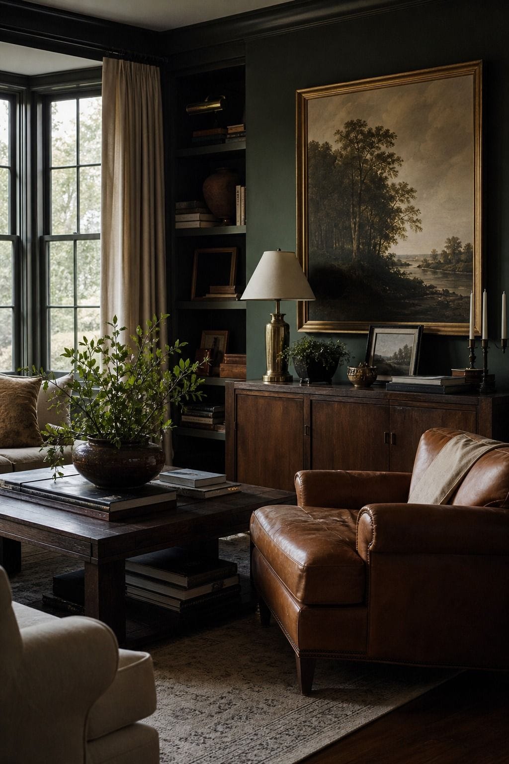


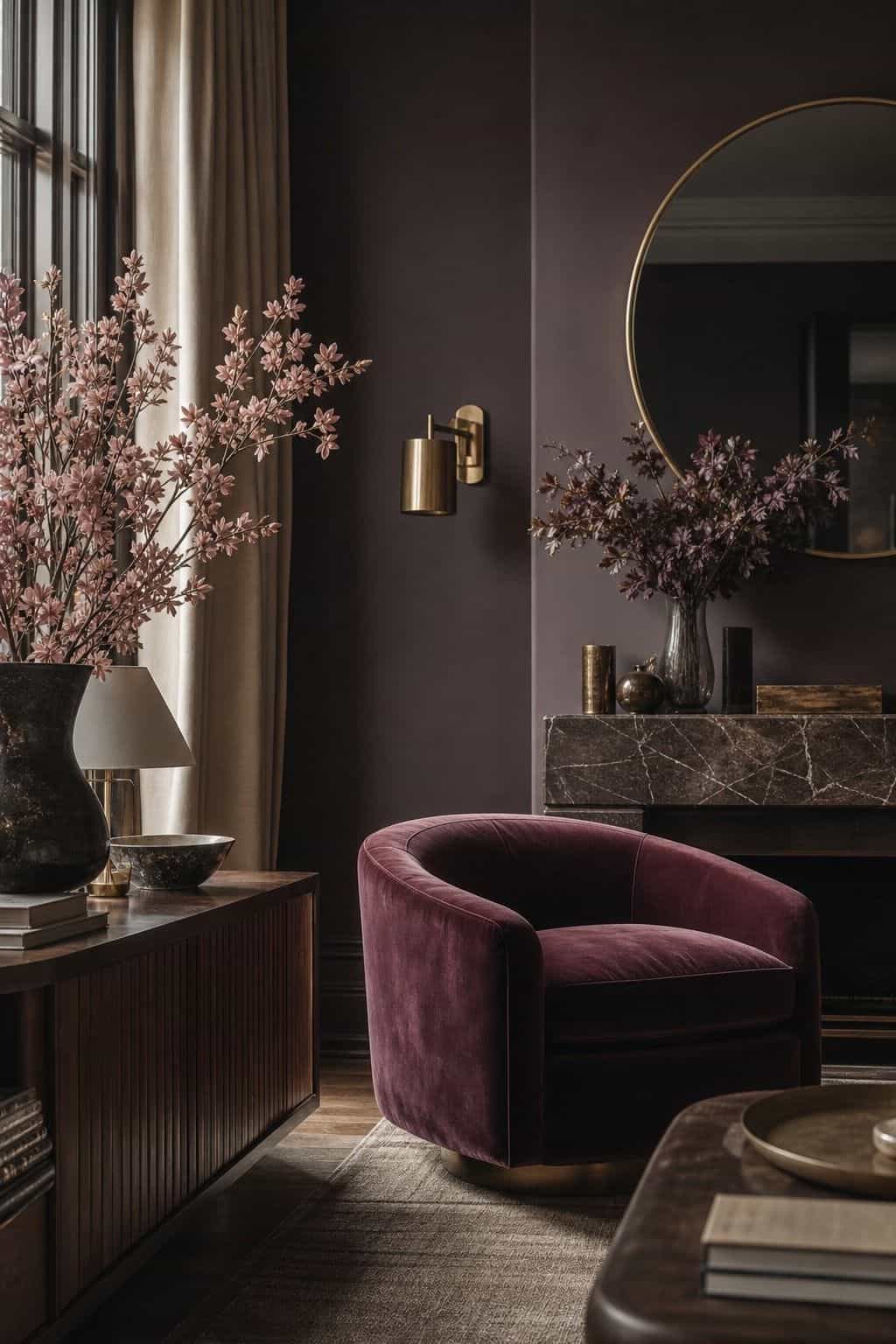
The most livable moody palette, and the best starting point. Deep forest green (#2C3A2E), close to Farrow & Ball Studio Green, dominates on walls. Warm cognac (#9C5A35) is the secondary, carried in leather and a rug. Cream (#E8E0D0) and a touch of brass are the accents. The green reads rich and the cognac keeps it warm, which is why this pairing has become the default for a moody living room. It works in almost any light because both heroes lean warm.
2. Oxblood Library
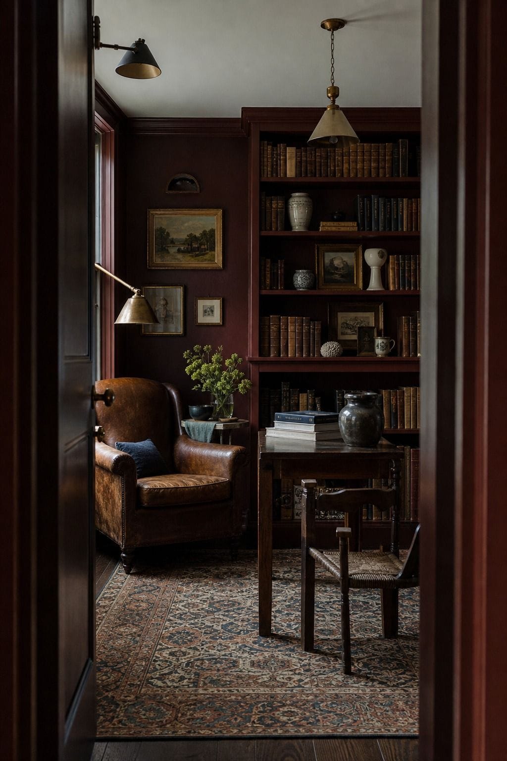


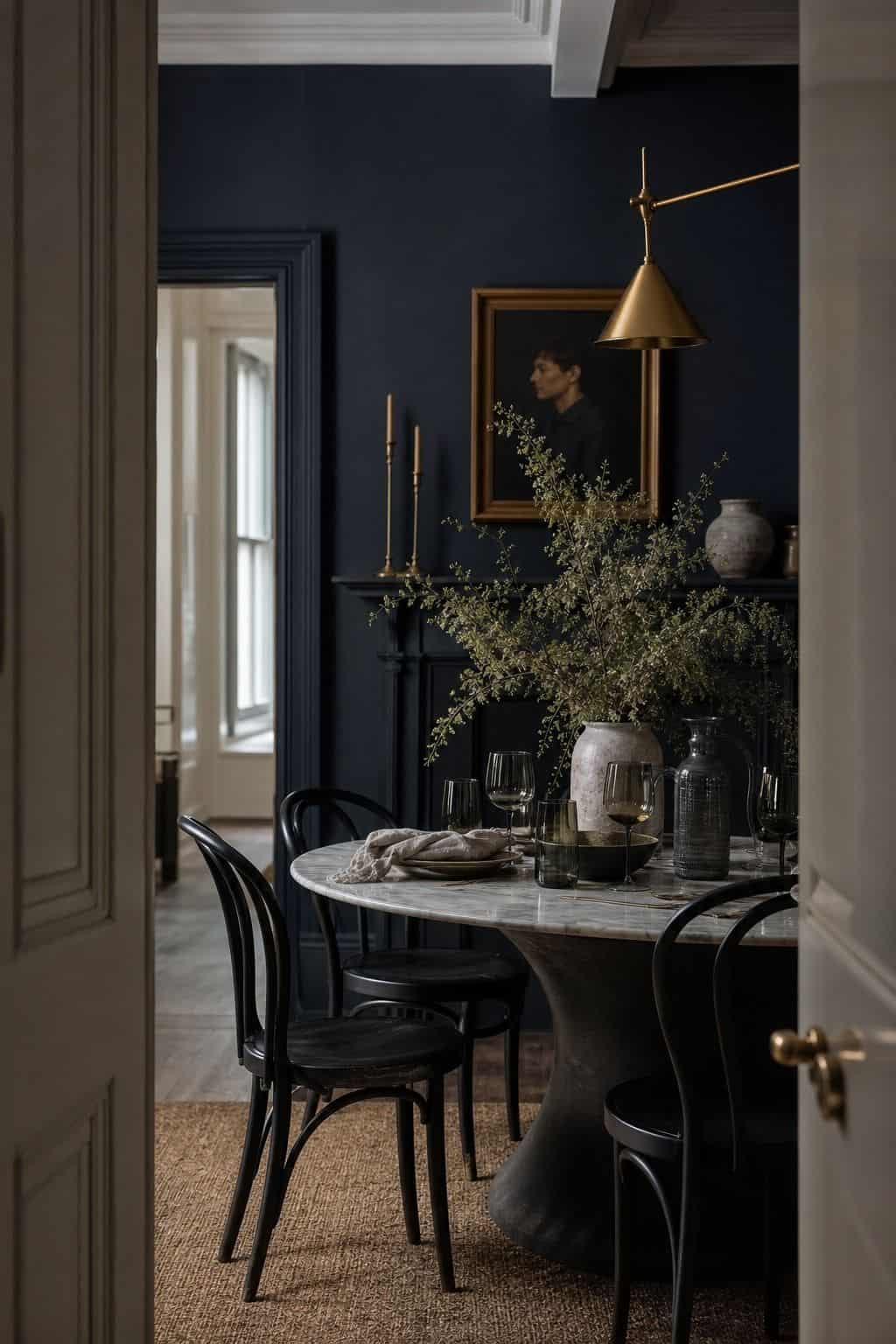
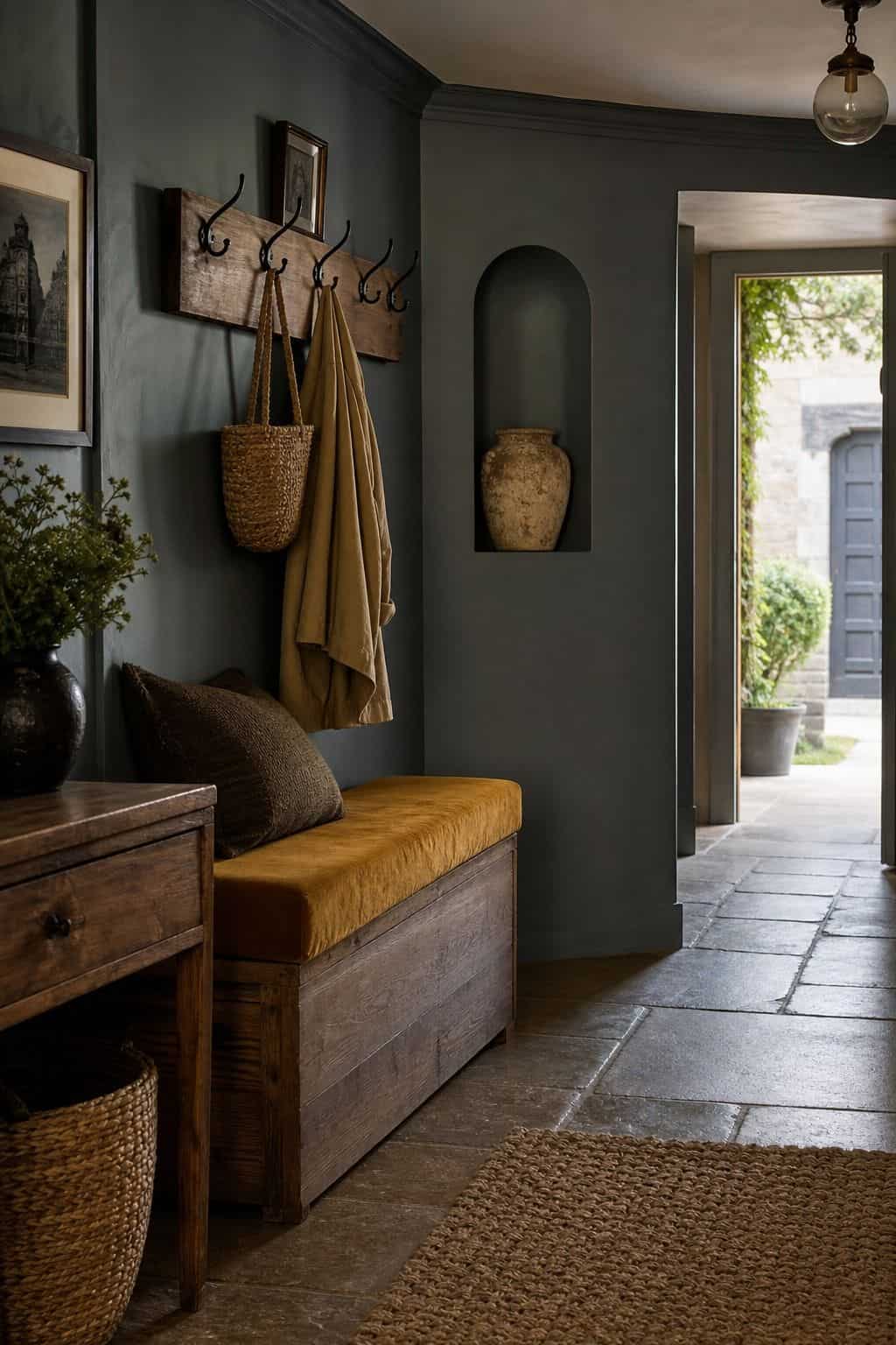
The dressiest, most enveloping palette here. Oxblood (#5C2A2A), near Benjamin Moore Caliente, dominates. Warm camel (#B89B6F) is the secondary, and antique gold (#C2A14A) plus bone (#EAE2D2) are the accents. It reads like an old library, which makes it perfect for a study, a dining room, or any space you want to feel cocooning and a little grand. Pair it with warm wood and brass and the room glows.
3. Midnight and Brass

The crispest, most modern moody palette. Midnight blue-black (#1E2433), close to Sherwin-Williams Inkwell, dominates. Warm putty (#CFC3AE) is the secondary that keeps it from feeling severe, and generous brass acts as the third color rather than just an accent. It is moody in a tailored, graphic way rather than a cozy one, which suits a bedroom or a powder room where you want drama with clean lines.
4. Chocolate and Plaster
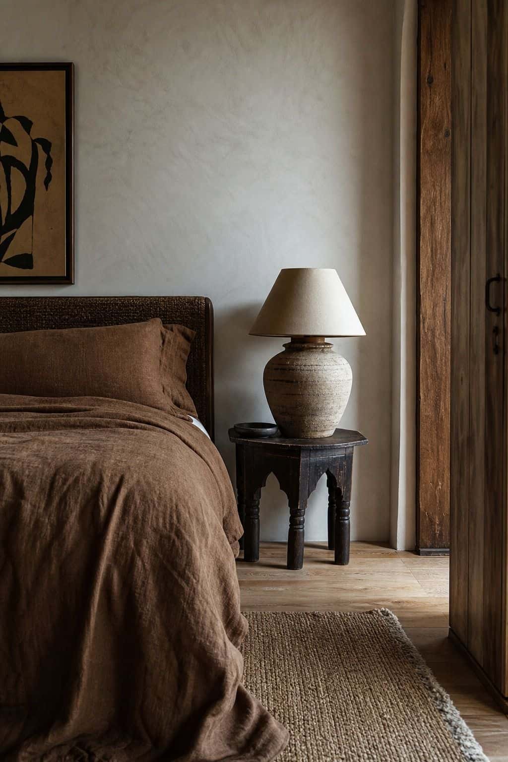

The warmest, softest moody palette. Deep chocolate brown (#3D2A22) dominates, warm plaster pink (#D8C4B0) is the secondary, and cream plus a small brass accent finish it. Brown has quietly become the moody color of the moment because it is enveloping without the heaviness of black. The plaster tone keeps it gentle, making this one of the easiest deep palettes to live with long-term.
5. Slate and Ochre


A cooler moody palette that stays warm thanks to its accent. Deep slate grey-blue (#3A4248) dominates, warm ochre (#C08A3E) is the secondary that does the heavy lifting, and oat (#DDD2BE) is the breather. The ochre is what saves this from feeling cold, so do not be shy with it. It suits a north-facing room where you want depth but the light is already cool.
6. Aubergine Evening


The most romantic, jewel-like palette. Deep aubergine (#3E2A3A) dominates, dusty mauve (#B196A0) is the secondary, and warm gold plus cream are the accents. Aubergine sits between purple and brown, so it feels rich without being obvious. It is gorgeous in a bedroom, where the low light makes the color feel velvety, and it overlaps neatly with a whimsigoth-leaning space.
7. Deep Teal and Camel
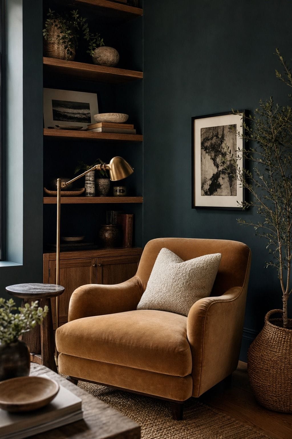


A balanced warm-and-cool moody palette. Deep teal (#1F4444) dominates, warm camel (#B89B6F) is the secondary, and cream plus brass finish it. The teal is dramatic and the camel keeps it grounded, so the room feels collected rather than cold. It is one of the most forgiving deep palettes because the two heroes hold each other in check, good for a living room or a home office.
8. Charcoal and Rust


The moodiest near-neutral palette. Warm charcoal (#33302C), a brown-leaning charcoal rather than a blue one, dominates. Rust (#9C4A2E) is the secondary that brings the heat, and warm cream is the breather. Because the charcoal leans brown, the room feels soft and smoky rather than hard. It is a strong choice for a moody bedroom or a snug where you want dark but still want to relax.
9. Bottle Green and Bone


A high-contrast moody palette with a fresh edge. Bottle green (#1F3D2E) dominates, bone (#E8E0D2) is a generous secondary that keeps it crisp, and cognac plus brass are the accents. The bone stops the green feeling heavy, so this is a good palette if you love deep color but worry about a room feeling closed-in. It reads polished and a little preppy, nice in a dining room.
10. Plum and Olive


An unexpected moody pairing that works beautifully. Deep plum (#43293D) dominates, warm olive (#6B6B47) is the secondary, and cream plus gold are the accents. The olive grounds the plum so the room feels earthy rather than purple, and the two together read collected and a little artistic. It suits a creative space, a reading room, or a moody bedroom with personality.
11. Espresso and Cream


The simplest moody palette, built on two tones. Espresso brown (#2E211B) dominates and warm cream (#E6DCC8) is the generous secondary, with a small brass accent. It is moody minimalism, depth without a single bright color, which makes it the easiest palette here for someone nervous about color. The contrast between the deep brown and the cream is what gives the room its quiet drama.
12. Navy and Mustard


A classic moody palette with a retro undertone. Deep navy (#23314A) dominates, warm mustard (#C99A3B) is the secondary, and oat plus brass finish it. The mustard is essential here, since navy alone runs cold, and the warm yellow turns the whole room cozy. It has a 70s lean, so it doubles as a retro scheme, and it is reliably handsome in a living room or study.
13. Burgundy and Stone


A rich palette that stays soft. Burgundy (#5A1F2E) dominates, warm stone grey (#B5AC9C) is the secondary that calms it, and cream plus a touch of gold are the accents. The stone keeps the burgundy from feeling heavy or dated, giving the room a modern, grounded richness. It is a strong, livable choice for a moody living room you want to feel current rather than traditional.
14. Ink and Brass


The most dramatic, graphic moody palette. Ink blue-black (#23262E) dominates, warm putty (#CFC3AE) is the breather, and brass is so generous it counts as the third color. It is bold and tailored, best in a small contained space, a powder room or an entry, where the drama is intense but brief. Keep the wood and metals warm so the ink reads luxe rather than harsh.
15. Moss and Clay


The most organic, earthy moody palette. Deep moss green (#3A4031) dominates, warm clay (#A8602F) is the secondary, and cream plus a small brass accent finish it. Both heroes are pulled straight from nature, so the room feels grounded and calm despite the depth of color. It is a lovely palette for a moody bedroom or a sunroom that you want to feel like a retreat.
Got your palette and want the whole room to follow it?
The Aesthetic Apartment Makeover Guide takes you from palette to finished room with a clear order of operations, so a moody scheme lands as one cohesive space.
How to Go Dark Without the Room Feeling Like a Cave
Three habits keep a moody room rich instead of gloomy. First, layer warm light at several heights. A dark room lit by one overhead fixture feels grim; the same room lit by three or four warm lamps glows. Use bulbs in the 2700K range and skip cool white entirely.
Second, paint more than the walls. The cave effect usually comes from dark walls fighting a white ceiling and white trim. Carry the color onto the ceiling and trim, or at least a soft tone close to it, and the room reads intentional and immersive rather than half-finished. Third, add contrast through texture and the warm accent, not through white. A moody room wants its breather to be cream, bone, or oat, not bright white, which pokes a cold hole in the scheme. If you want the deep look on a smaller budget, our guide to doing the moody look on a budget covers the no-paint version.
Moody Color by Room
A quick guide to which palette suits which space.
- Living room: Forest and Cognac, Deep Teal and Camel, or Burgundy and Stone for rich but livable depth.
- Bedroom: Aubergine Evening, Charcoal and Rust, or Moss and Clay for a cocooning, velvety feel.
- Dining room or study: Oxblood Library or Navy and Mustard for a grand, enveloping mood.
- Powder room or entry: Midnight and Brass or Ink and Brass, where intense drama stays contained.
- Nervous about color: Espresso and Cream or Chocolate and Plaster, the gentlest entry points.
Read also: moody home decor for every room, the dark moody aesthetic explained, a warm, inviting dark living room.
Frequently Asked Questions
What colors are considered moody?
Moody colors are deep, saturated tones: forest green, oxblood, aubergine, navy, charcoal, deep teal, and rich brown. What makes a palette moody is depth plus warm undertones, paired with a warmer secondary color so the room feels enveloping rather than cold.
How do I make a dark room not feel like a cave?
Layer warm lamplight at several heights with 2700K bulbs, carry the dark color onto the ceiling and trim instead of leaving them white, and use a cream or bone breather rather than bright white. The cave effect comes from cold light and a white ceiling fighting dark walls.
What is the best moody paint color?
Forest and cognac is the most livable starting point: a warm-leaning deep green like Farrow and Ball Studio Green on the walls, with cognac leather and brass. It is rich without being severe and works in almost any light because both heroes lean warm.
Do moody rooms make a space feel smaller?
Not the way people expect. A deep color blurs the edges of a room so the walls recede, which can make a small space feel cozy and boundless rather than boxed-in. The key is warm light and carrying the color across walls, ceiling, and trim.
How many colors should a moody palette have?
Three is the sweet spot: one deep dominant at roughly 60 percent, a warm mid-tone secondary at 30 percent, and a bright warm accent like brass or ochre at 10 percent. The secondary and accent are what stop the dominant from reading cold.
Key Takeaways
- A moody palette is built on depth plus warmth, not just darkness. A warm-leaning deep tone is what keeps a dark room cozy instead of cold.
- The structure is one deep dominant at 60 percent, a warm mid-tone secondary at 30 percent, and a bright warm accent like brass at 10 percent.
- The 15 palettes range from livable Forest and Cognac to dramatic Ink and Brass to gentle Espresso and Cream, each with hex codes and a paint name.
- Avoid the cave effect with warm lamplight at several heights, color carried onto ceiling and trim, and a cream breather instead of white.
- Match the palette to the room: livable deep tones for living rooms, velvety ones for bedrooms, intense drama for small contained spaces.
Final Thoughts
A moody room only feels like a cave when the color goes dark and cold. Choose a deep tone with a warm undertone, pair it with a warmer secondary, layer in warm light, and carry the color past the walls, and a dark room reads rich, designer, and enveloping instead of gloomy. Pick the palette that matches your room and your nerve, test real samples in your own light, and commit. When you are ready for the rest, the moody furniture guide and the guide to doing the moody look on a budget cover the next steps.