A whimsigoth color palette pairs warm jewel tones like emerald, plum, and oxblood with celestial neutrals and a hint of antique gold. The darks always read warm, never cold, which is what keeps a whimsigoth room cozy instead of spooky. Below are 15 palettes with hex codes and real paint names.
Whimsigoth is what happens when goth grows up, moves into a sunlit apartment, and refuses to give up the moon motifs. And the single fastest way to get a room there is color. Before the vintage furniture, before the celestial art, the palette does most of the work.
The problem with most whimsigoth color advice is that it stops at a pretty swatch image. No paint names. No hex codes. No guidance on which palette belongs in which room. This guide fixes that. Fifteen full palettes, each with real colors you can buy, plus how to use them without your home tipping into haunted-house territory.
Picked your whimsigoth palette but not sure how to roll it out across a room?
The Aesthetic Apartment Makeover Guide shows you how to apply a palette in the right order, walls first, then textiles, then accents, so the room comes together instead of fighting itself.

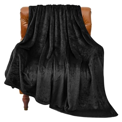
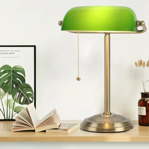
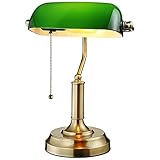
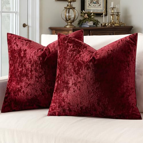
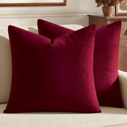
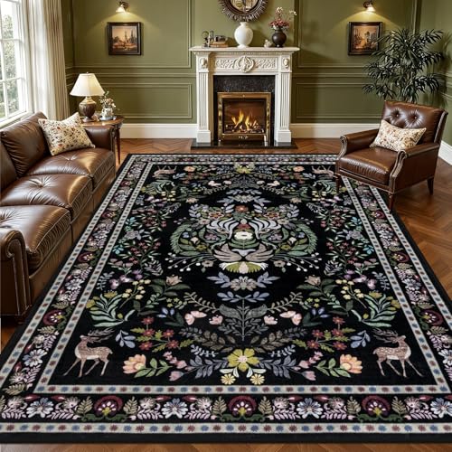
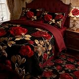
Recommended Whimsigoth Color and Decor Products
The pieces that help you put a whimsigoth palette into a room, from the wall treatment to the textiles that carry the jewel tones.


Recommended blogs to read:
- the 70s color palette guide
- a more muted zen palette
- soft French country colors
- a moody retro bedroom
- the cooler coastal palette
What Makes a Color Whimsigoth
A whimsigoth color is dark, but it has warmth living underneath it. That is the whole distinction. A cold charcoal or a flat true black reads goth. A charcoal with brown in it, a black that leans aubergine, a green that leans forest rather than emerald-on-ice, those read whimsigoth. If you want the wider context first, here is what makes the whimsigoth aesthetic tick.
The palette has three jobs to fill. The jewel tones, emerald, plum, oxblood, midnight blue, do the drama. The warm neutrals, mushroom, bone, warm grey, give your eye somewhere to rest so the room is not relentless. And a metallic, almost always antique or aged gold, adds the glow. Cover all three roles and the palette works. Skip the neutral and the room feels heavy. Skip the metallic and it feels flat.
15 Whimsigoth Color Palettes With Hex Codes and Paint Names
Each palette below lists a dominant color, supporting tones, and a metallic, with hex codes and a real paint name to start from. Paint names are widely available shades. Always test a sample in your own light before committing.
1. Moonlit Manor


The most classic whimsigoth palette. Deep plum (around #4A2C40) on the walls or a feature piece, warm charcoal (#36343B) as the grounding dark, soft bone (#E8E0D5) as the breather, and antique gold (#B08D57) for the glow. It is dramatic but warm, and it suits a bedroom or a moody living room. Paint starting points: a plum like Behr Exclusive Plum, a charcoal like Sherwin-Williams Iron Ore.
2. Emerald Apothecary


Green-led and rich, this one feels like an old apothecary or a Victorian study. Forest green (#2D4030) carries the room, oxblood (#5C2A2A) adds a second jewel tone in textiles or art, warm cream (#EDE4D3) keeps it from closing in, and aged brass ties it together. Excellent in a home office or dining room. Paint starting points: a deep forest like Behr Vine Leaf, or a Sherwin-Williams Pewter Green gone darker.
3. Celestial Dusk


The most celestial-leaning palette, and the easiest sell if someone in the house is nervous about dark walls. Midnight blue (#1F2A44) reads like a night sky, dusty mauve (#9E8088) softens it, warm grey (#C9C0B6) is the neutral, and brass adds the starlight. Beautiful in a bedroom. Paint starting points: a midnight blue like Benjamin Moore Hale Navy deepened, or Behr Very Navy.
4. Witchy Cottage


The lightest palette here, and the bridge between whimsigoth and dark cottagecore. Mushroom taupe (#A39B8B) as the base, muted sage (#7E876F) and dried rose (#9C6B6B) as the color, warm white as the lift, and aged gold for warmth. This is the palette for renters and the dark-curious, since it works without painting anything truly dark. Paint starting points: a mushroom like Sherwin-Williams Accessible Beige gone moodier, sage like Behr Sage Gray.
5. Velvet Tarot


The boldest, most saturated palette. Deep burgundy (#5A1F2E) leads, near-black (#1C1A1D) grounds it, ochre (#C08A3E) is both the warm accent and the metallic stand-in, and a touch of cream keeps it breathing. This one wants a smaller, lower-light room: a powder room, a snug, a reading corner, where richness reads as cozy. Paint starting points: a burgundy like Behr Chic Bordeaux, a soft black like Benjamin Moore Soot.
6. Smoky Quartz


The most flexible everyday palette. Warm grey (#8E8479) does the bulk of the work, plum (#5B3A52) is the single jewel accent, bone (#E5DCCE) lifts it, and antique gold finishes it. Because grey is doing the heavy lifting rather than a saturated dark, this palette suits open-plan spaces and homes where you want whimsigoth as a mood rather than a statement. Paint starting points: a warm grey like Sherwin-Williams Dovetail, a plum accent like Behr Royal Raisin.
7. Forest and Brass


A cleaner, more architectural take. Deep pine green (#26352B) on the walls, warm tan (#C2A878) as the neutral, off-black (#211F1E) for trim and grounding, and brass everywhere it can catch light. This palette photographs beautifully and works well in a room with good natural light, since the green stays rich without going murky. Paint starting points: a pine green like Sherwin-Williams Rosemary, a tan like Behr Almond Wisp.
8. Oxblood Velvet


Warm and enveloping. Oxblood (#612A2A) as the hero color, charcoal-brown (#3A322C) as the grounding dark, oat (#DDD2BE) as the breather, and aged gold for the glow. Oxblood is having a real moment in interiors, and the whimsigoth version keeps it from feeling corporate by pairing it with thrifted texture. Paint starting points: an oxblood like Behr Dark Crimson, a warm dark like Sherwin-Williams Black Fox.
9. Midnight Garden


Blue and green together, which sounds risky and works beautifully in the whimsigoth context. Deep teal-blue (#1E3A3A) as the base, blackened green (#2A3328) as the second dark, warm bone (#E6DCC8) as the neutral, and brass to lift it. This one feels like a conservatory at night. Best in a room you want to feel a little secret. Paint starting points: a teal-blue like Behr Dragonfly, a blackened green like Sherwin-Williams Dark Night.
10. Dusty Amethyst


Purple done in a grown-up, dusty way. Muted amethyst (#6A5470) as the lead, warm grey-taupe (#9A9088) as the neutral, deep aubergine (#33272F) for grounding, and antique gold for warmth. The dustiness is what keeps purple from reading juvenile. This palette is lovely in a bedroom or a creative corner. Paint starting points: a muted purple like Behr Plumage, a grey-taupe like Sherwin-Williams Mega Greige.
11. Candlelit Cream


The whimsigoth palette for people who do not want a dark room at all. Warm cream (#E9DFC9) dominates, with deep plum (#4A2C40) and forest green (#2D4030) used only as accents in art, textiles, and a single piece of furniture. Brass and candlelight do the rest. It proves whimsigoth is a mood, not a darkness level. Paint starting points: a warm cream like Benjamin Moore Manchester Tan, accents pulled from Moonlit Manor.
12. Raven and Rose


The most overtly romantic palette. Soft black (#1E1C1E) as the dramatic base, dried rose (#A07478) as the unexpected warm color, bone (#E5DCCE) as the breather, and aged gold for the glow. The rose is what keeps the black from feeling severe. This one suits a bedroom that wants to feel a little gothic-romance. Paint starting points: a soft black like Benjamin Moore Soot, a dried rose like Behr Rose Heath.
13. Aged Gold and Ink


A near-monochrome palette built on contrast. Ink blue-black (#23262E) on the walls, warm putty (#CFC3AE) as the neutral, and an unusually generous amount of aged gold, in frames, hardware, lighting, and small objects, so the gold reads as the second color rather than just an accent. Dramatic and tailored. Paint starting points: an ink like Behr Cracked Pepper, a putty like Sherwin-Williams Shiitake.
14. Mushroom and Moss


The earthiest, most organic palette, and another renter-friendly one. Mushroom taupe (#A39B8B) and mossy green (#5F6A4E) carry the room, deep brown (#3A2F28) grounds it, and warm cream lifts it. This palette leans into the plant-and-apothecary side of whimsigoth and feels calm rather than dramatic. Paint starting points: a mushroom like Behr Mushroom Basket, a moss like Sherwin-Williams Artichoke.
15. Deep Teal Mystic


Teal as the hero, which feels fresh in a whimsigoth context dominated by plum and green. Deep teal (#1F3D3D) on the walls, warm rust (#9C5A3C) as the jewel accent, bone (#E8E0D5) as the neutral, and brass for the glow. The rust-and-teal pairing has a vintage, slightly 70s undertone, which is no accident, since whimsigoth and the 70s revival share a lot of DNA. Paint starting points: a deep teal like Behr Mythic Forest, a rust like Sherwin-Williams Cavern Clay.
Got your palette and want the rest of the room to follow it properly?
The Aesthetic Apartment Makeover Guide takes you from palette to finished room with a clear order of operations, so the color actually lands.
How to Use a Whimsigoth Palette Without Going Full Haunted House
The fear with any dark palette is the same: that the room ends up oppressive. A few rules keep whimsigoth on the right side of the line.
Let the neutral do real work. The warm neutral in each palette is not a footnote. It should cover a meaningful share of the room, on a wall, in bedding, in a rug, so your eye has somewhere to rest. Use the deepest jewel tone as an accent, not the whole envelope, unless the room is small and you want it cocooning on purpose.
Then pay the colors back with light and metal. Warm, layered warm, layered whimsigoth lighting makes dark tones glow rather than swallow a room, and the antique gold or brass in each palette catches that light and lifts everything. A whimsigoth room that feels heavy is almost always under-lit, not over-colored.
Whimsigoth Colors by Room
A quick guide to which palette suits which space, based on light levels and how much drama a room can take.
- Bedroom: Moonlit Manor, Celestial Dusk, or Raven and Rose. Cocooning is welcome here, and celestial tones suit the room you sleep in. The full whimsigoth bedroom guide goes deeper.
- Living room: Smoky Quartz or Forest and Brass for open-plan spaces, Moonlit Manor if it is a snug, low-light room you want dramatic. See the whimsigoth living room for the full build.
- Home office or dining room: Emerald Apothecary or Aged Gold and Ink. Focused and rich without being sleepy.
- Bathroom or powder room: Velvet Tarot or Midnight Garden. Small, low-light rooms are where the boldest palettes pay off.
- Rental or whole-home mood: Witchy Cottage, Candlelit Cream, or Mushroom and Moss. They deliver the aesthetic without committing to truly dark walls.
Read also: the dark moody aesthetic explained, dark academia color palettes, moody home decor for every room.
Frequently Asked Questions
What colors are whimsigoth?
Whimsigoth colors are warm jewel tones like emerald, plum, oxblood, and midnight blue, grounded by warm neutrals like mushroom, bone, and warm grey, and lifted with antique or aged gold. The darks always read warm rather than cold.
Is whimsigoth always dark?
No. While whimsigoth leans moody, lighter palettes like Witchy Cottage, Candlelit Cream, and Mushroom and Moss deliver the aesthetic without truly dark walls. This makes whimsigoth workable for renters and anyone nervous about dark paint.
What is the difference between whimsigoth and dark academia colors?
Dark academia colors are scholarly and earthy: oxblood, brown, forest green, and tan, built around leather and old libraries. Whimsigoth shares some of those tones but adds more jewel tones like plum and midnight blue, plus celestial and mystical warmth.
Can you do whimsigoth in a rental?
Yes. Use a lighter whimsigoth palette like Witchy Cottage so you do not need to paint dark, or bring the jewel tones in through textiles, rugs, curtains, and art instead of the walls. Peel-and-stick wallpaper is another renter-friendly route.
What neutral goes with a whimsigoth palette?
Warm neutrals: mushroom taupe, bone, warm cream, and warm grey. Avoid cool greys and stark whites, which fight the warmth that defines the aesthetic. The neutral should cover enough of the room to give the eye a place to rest.
Key Takeaways
- A whimsigoth color is a dark with warmth underneath it, never a cold charcoal or flat black.
- Every palette needs three roles filled: jewel tones for drama, warm neutrals to rest the eye, and an aged gold or brass for glow.
- The 15 palettes range from bold (Velvet Tarot, Oxblood Velvet) to renter-safe (Witchy Cottage, Candlelit Cream, Mushroom and Moss), each with hex codes and real paint starting points.
- To avoid a haunted-house effect, let the neutral do real work, keep the deepest tone as an accent, and pay the colors back with warm 2700K lighting.
- Match the palette to the room: cocooning darks for bedrooms and powder rooms, lighter schemes for open-plan and rentals.
Final Thoughts
Color is the cheapest, fastest lever in a whimsigoth room, and the one most worth getting right first. Pick the palette that matches your room’s light and how much drama it can carry, test real samples before you commit, and remember the three roles: drama, rest, glow. Nail those and the rest of the aesthetic has a foundation to land on. When you are ready to take it further, the full whimsigoth home decor guide maps out every room.