A dark academia color palette runs deep, warm, and scholarly: forest green, oxblood, deep brown, charcoal, and ink. The 15 palettes below come with hex codes and real paint names, plus how to use them in a rental.
Color is what carries the dark academia look more than any single object. Get the palette right and a room reads scholarly before you add a book or a lamp. Get it wrong, too cold, too bright, too flat, and even a room full of the right furniture misses the mark.
The 15 palettes below each pair a few deep scholarly colors that work together, with hex codes and real paint names to take to the store. The section at the end covers how to bring a dark academia palette into a rental where you cannot paint.
Choosing a dark academia palette and not sure where to start?
The Aesthetic Apartment Makeover Guide walks you through a room in the right order, so the palette anchors the whole scholarly scheme rather than fighting it.

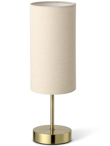
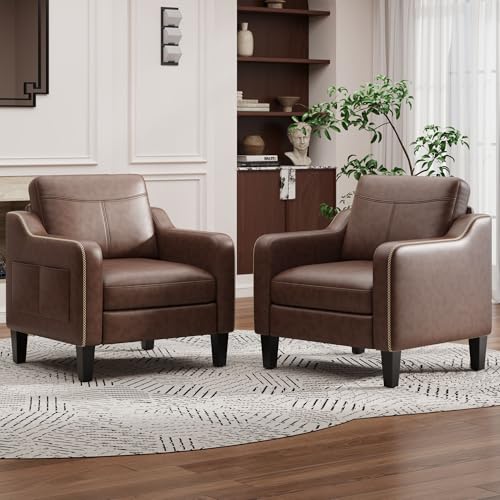
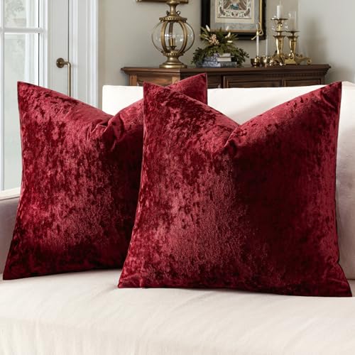
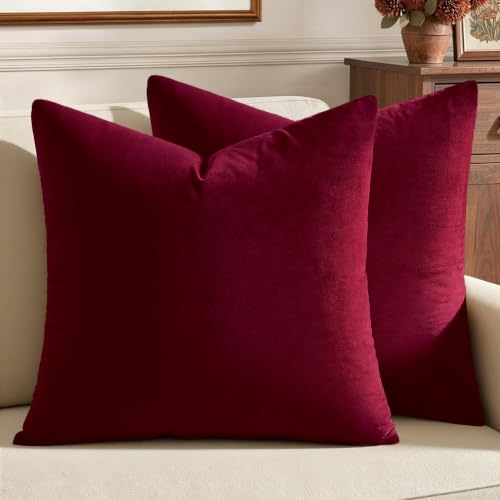
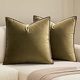
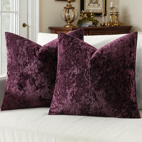
Recommended Dark Academia Color Decor
Six pieces that carry a dark academia palette, from paint samples to deep velvet cushions.


Recommended blogs to read:
- a moody color palette
- a whimsigoth color palette
- a bolder maximalist palette
- a warmer retro palette
- mid-century living room styling
What Makes a Palette Dark Academia
A dark academia palette is deep, warm, and muted. The colors are saturated but not bright, forest green rather than emerald, oxblood rather than red, deep brown rather than tan. They lean warm, with brown and gold undertones rather than cool blue ones, which is what keeps a dark academia room reading cozy and scholarly rather than cold.
The palettes also stay tight, two or three deep colors plus warm wood and brass, not a wide rainbow. The restraint is part of the look. It shares a lot with the moody palette, so our guide to a moody color palette is a useful companion, and a whimsigoth color palette covers the witchier dark cousin.
One rule before the list: warm undertones only. The single fastest way to get dark academia wrong is a cold-leaning dark, a blue-black, a cool grey. Every color below leans warm, which is what separates a scholarly room from a chilly one.
15 Dark Academia Color Palettes With Hex Codes
Each palette below works as a complete scheme. The section after covers using them in a rental.
1. Classic Library


Deep forest green (#2C3A2E), warm brown (#5C4332), and aged brass (#A8884C) over a cream base (#E8E0CE). This is the quintessential dark academia palette, the colors of an old library, and it suits any room. Try Farrow & Ball Studio Green or Benjamin Moore Forest Green on the walls, with brown leather and brass accents. It is the safest place to start if you are unsure, since these three colors flatter almost any furniture and art you already own.
2. Oxblood Study


Deep oxblood (#5B2A2A), charcoal (#33302C), and warm gold (#B5904E) over soft parchment (#DDD3BE). The oxblood brings a rich, scholarly warmth, and it reads dramatic without going cold. Sherwin-Williams Fireweed or Farrow & Ball Preference Red give you the oxblood, balanced with charcoal woodwork and gold-toned brass. Use the oxblood on one feature wall rather than the whole room, so the depth reads dramatic without closing the space in.
3. Ink and Leather


Deep ink blue (#2A3140), cognac leather brown (#7A4E2D), and brass (#A8884C) over warm grey (#C9C0B0). The ink blue is the one cool-leaning color that still works in dark academia, kept warm by the leather and brass around it. Benjamin Moore Hale Navy or Farrow & Ball Stiffkey Blue give the ink, grounded with cognac leather seating. This is the palette for someone who wants dark academia without committing to brown or green, since the ink reads scholarly while still feeling a little cooler and crisper.
4. Forest and Cream


Deep forest green (#2F3B30) and warm cream (#E5DCC6), with walnut wood (#4A3526) as the bridge. This is the gentlest dark academia palette, the cream keeps it from going heavy, so it suits smaller or darker rooms. Use the forest on a feature wall or the woodwork and let cream walls carry the light, with walnut furniture between them. Lean on the cream as the dominant color and let the forest green appear on woodwork, a feature wall, or textiles, so a small room still feels open.
5. Chocolate and Brass


Rich chocolate brown (#3D2B1F), warm tan (#A5825A), and bright brass (#B89048) over soft ivory (#E6DDC8). An all-brown scheme reads deeply scholarly and enveloping, and the brass keeps it from feeling flat. Farrow & Ball Tanner’s Brown or Benjamin Moore English Brown give the chocolate, layered with tan textiles and brass throughout. Vary the brown tones across the room, a darker wall, a mid-tone leather, a lighter wood, so the all-brown scheme reads layered rather than flat.
6. Charcoal Scholar


Warm charcoal (#36322D), deep brown (#4F3B2A), and aged gold (#A8884C) over greige (#CFC6B5). A charcoal-led palette is the moodiest dark academia option, kept warm by the brown undertone in the charcoal itself. Farrow & Ball Tanner’s Brown or Benjamin Moore Kendall Charcoal, chosen in their warmest version, anchor the scheme. Pair it with plenty of warm wood and brass, since charcoal needs those warm notes nearby to keep it from sliding toward cold and grey.
7. Burgundy and Green


Deep burgundy (#4E2230), forest green (#2C3A2E), and warm brass (#A8884C) over parchment (#DDD3BE). Pairing the two richest dark academia colors makes a bold, layered scheme, used as a feature wall and woodwork respectively, or split between two connecting rooms. Keep the parchment base generous so the two deep colors have room to breathe. These two colors are strong enough that the room needs little else, so keep the furniture and textiles simple and let the palette do the talking.
8. Olive and Tobacco


Muted olive green (#54583E), tobacco brown (#6B4E33), and brass (#B5904E) over warm oat (#D8CDB6). Olive is a softer, dustier green than forest, and with tobacco brown it reads vintage and scholarly. Farrow & Ball Bancha or Sherwin-Williams Pewter Green give the olive, layered with tobacco-toned leather and wood. Olive is the most forgiving dark academia green for a north-facing or low-light room, since its dusty, muted quality still reads well without much sun.
9. Deep Teal Library


Warm-leaning deep teal (#27403E), cognac brown (#7A4E2D), and brass (#A8884C) over cream (#E5DCC6). Teal works in dark academia when it leans warm and deep rather than bright, balanced heavily by cognac leather and brass. Farrow & Ball Inchyra Blue or Benjamin Moore Dark Harbor give a teal that reads scholarly, not coastal. Keep the cognac and brass generous here, because teal needs a clear majority of warm tones around it to stay on the scholarly side rather than the coastal one.
10. Aubergine and Gold


Deep aubergine (#3A2A35), warm brown (#5C4332), and gold (#B5904E) over greige (#CFC6B5). Aubergine is the moody, slightly unexpected dark academia color, and the warm brown and gold keep it grounded and scholarly. Farrow & Ball Brinjal or Benjamin Moore Shadow give the aubergine, used on a feature wall with brown and gold accents. Aubergine works best in a study or a bedroom, smaller rooms where its moody depth reads cocooning rather than overwhelming.
11. Warm Black and Wood


Warm-toned soft black (#2A2622), walnut brown (#4A3526), and brass (#A8884C) over warm white (#E8E0CE). A warm black, never a cold one, makes the most dramatic dark academia base, lifted by walnut wood and brass. Farrow & Ball Off-Black or Benjamin Moore Soot give the warm black, kept from feeling severe by generous wood tones. Reserve the warm black for one wall or the woodwork rather than the whole room, and let the walnut and brass keep it from feeling severe.
12. Sage and Cream Scholar


Muted sage (#7C8169), warm cream (#E5DCC6), and aged brass (#A8884C) over soft white (#EFE9DA). The lightest dark academia palette, sage and cream, suits a small or low-light room while keeping the scholarly feel through brass and wood accents. Farrow & Ball Lichen or Sherwin-Williams Evergreen Fog give the sage. This is the dark academia palette for renters and the commitment-shy, since it reads scholarly while staying light enough to suit almost any space.
13. Rust and Brown


Deep rust (#7A4226), chocolate brown (#3D2B1F), and brass (#B5904E) over warm oat (#D8CDB6). Rust brings a warm, slightly autumnal note that suits the bookish, lived-in feeling of dark academia. Benjamin Moore Audubon Russet or Farrow & Ball Bamboozle give the rust, layered over a deep brown base. Rust suits autumn-leaning rooms and works beautifully with leather and aged wood, so build the textiles and furniture in those warm materials.
14. Slate and Cognac


Warm slate grey (#45433E), cognac brown (#7A4E2D), and brass (#A8884C) over greige (#CFC6B5). A warm slate is the most restrained dark academia neutral, scholarly without committing to a strong color, and cognac leather warms it up. Farrow & Ball Mole’s Breath or Benjamin Moore Chelsea Gray give the slate. Choose this when you want a dark academia neutral that will not date, since warm slate is quietly timeless in a way a strong color is not.
15. Full Jewel Scholar


Forest green (#2C3A2E), oxblood (#5B2A2A), ink blue (#2A3140), and brass (#A8884C) over parchment (#DDD3BE). The most maximal dark academia palette uses all three jewel-toned darks, spread across rooms or layered in textiles and books rather than all on one wall. The parchment base and brass thread keep the rich mix cohesive. The key to making it work is restraint in placement, one wall per color, or one color per room, rather than all three competing on a single surface.
Want the palette to tie the whole home together?
The Aesthetic Apartment Makeover Guide breaks the whole home down room by room, so every space ties into one cohesive scheme. Worth every penny at $17, and the price goes up to $27 soon.
How to Use a Dark Academia Palette in a Rental
When you cannot paint, the palette still works, it just lives in the layers instead of the walls. Dark peel-and-stick wallpaper in a deep color brings the wall tone and comes off clean, or a large draped fabric backdrop behind a bed or desk does the same job. From there, the palette carries through everything else: deep velvet cushions, a vintage-toned rug, dark-framed art, faux leather books, brass lamps.
The trick in a rental is to commit to the palette in volume even without paint, enough deep-colored textiles, books, and objects that the eye reads the room as dark academia anyway. Pull every soft furnishing and object into the two or three chosen colors. For the full budget approach to building the look this way, our guide to dark academia on a budget covers it in detail, and the dark academia furniture guide covers the wood tones that complete the palette.
Frequently Asked Questions
What colors are dark academia?
Dark academia colors are deep, warm, and muted: forest green, oxblood, deep brown, charcoal, and warm-leaning ink blue, accented with brass and warm wood tones. The colors are saturated but not bright, and they lean warm so the room reads cozy and scholarly rather than cold.
What is the best dark academia paint color?
Deep forest green is the most classic and versatile dark academia paint color, the color of an old library. Farrow & Ball Studio Green or Benjamin Moore Forest Green work well. Deep brown and oxblood are strong alternatives, all chosen in their warmest, most muted versions.
Can dark academia colors work in a small room?
Yes. Deep color can make a small room feel enveloping rather than cramped. For the smallest or darkest rooms, the gentler palettes like Forest and Cream or Sage and Cream Scholar keep the scholarly feel while letting a lighter base carry more of the light.
How do I do a dark academia color palette on a budget?
Paint is the cheapest high-impact way to bring the palette in, one can on a feature wall. If you cannot paint, build the palette through cheap layers instead: deep-toned thrifted textiles, faux leather books, a vintage-toned rug, and dark-framed printable art, all in the two or three chosen colors.
How do I add color without painting?
Use dark peel-and-stick wallpaper or a large draped fabric backdrop for the wall tone, then carry the palette through deep velvet cushions, a vintage-toned rug, dark-framed art, faux leather books, and brass lamps. Commit to the colors in enough volume that the room reads dark academia anyway.
Key Takeaways
- A dark academia color palette is deep, warm, and muted: forest green, oxblood, deep brown, charcoal, and ink, with brass and wood.
- The 15 palettes each pair a few scholarly colors with hex codes and real paint names, from Classic Library to Full Jewel Scholar.
- Warm undertones only, the fastest way to get dark academia wrong is a cold-leaning dark like a blue-black or cool grey.
- Keep palettes tight, two or three deep colors plus warm wood and brass, since the restraint is part of the look.
- In a rental, the palette lives in the layers, dark peel-and-stick wallpaper, deep textiles, books, and art instead of paint.
Final Thoughts
A dark academia color palette is what makes a room read scholarly before anything else goes in. Choose two or three deep, warm, muted colors, forest green, oxblood, deep brown, charcoal, ink, keep the undertones warm, and let brass and wood thread through. Whether you paint or build the palette through layers in a rental, the colors carry the whole look. When you are ready for the rest of the room, the dark academia aesthetic guide and the dark academia furniture guide cover the full look and the pieces in full.
To carry the moody, scholarly mood through the home, dark academia rug ideas use the same rich, layered approach.