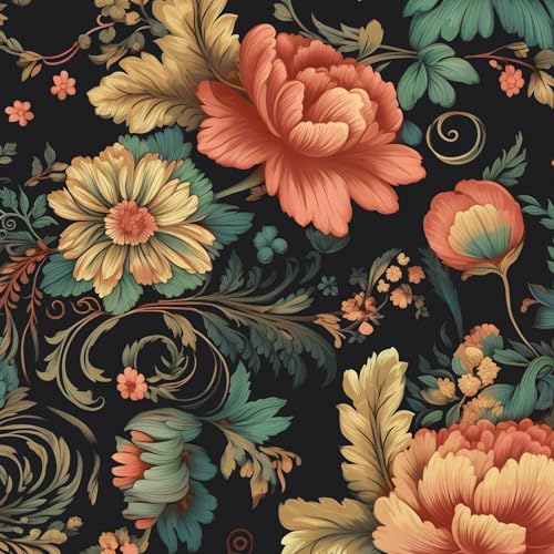
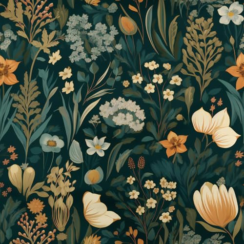
A maximalist color palette layers three or four bold colors using a simple ratio rule so the room reads rich, not chaotic. The 15 palettes below come with hex codes and the dominant-secondary-accent breakdown that keeps bold color working in any room.
Maximalist color is not about throwing every color at the wall. It is about throwing the right ones, in the right proportions. Get the proportions wrong and a maximalist room looks like a junk drawer. Get them right and it looks collected and intentional.
The thing that scares people off maximalist color is the fear of chaos. So this guide leads with the rule that prevents it, then gives you 15 maximalist color palettes that already work, each with hex codes and a clear breakdown of which color does what.
Picked a bold palette and not sure how to roll it out?
The Aesthetic Apartment Makeover Guide shows you how to apply a palette in the right order, so a maximalist room comes together instead of competing with itself.

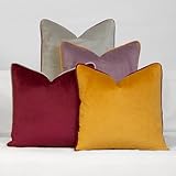
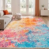
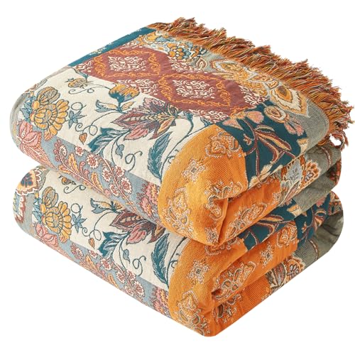
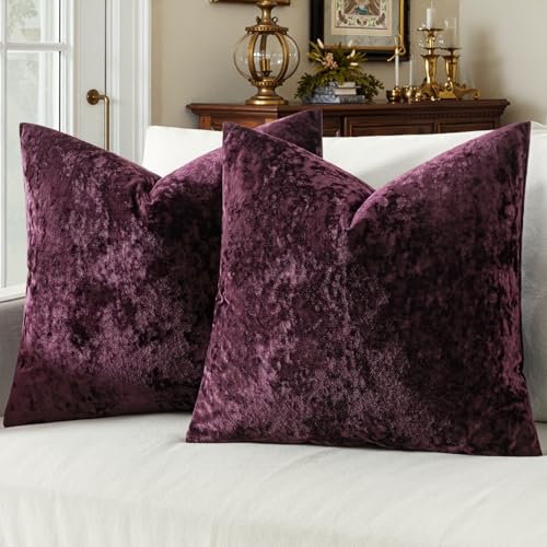
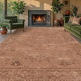
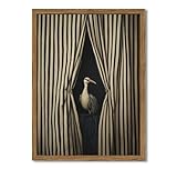
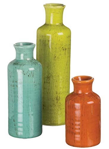
Recommended Maximalist Color and Decor Products
Six pieces that help you put a maximalist palette into a room, from bold wallpaper to the textiles that carry the color.

Recommended blogs to read:
- a bold 70s living room
- the retro 70s color palette
- mid-century modern color
- softer French country color
- an eclectic zen boho mix
The Rule That Makes Maximalist Color Work
One rule prevents maximalist chaos: dominant, secondary, accent. Pick one color to dominate, roughly 60 percent of the room, on walls or large furniture. Pick a secondary color for about 30 percent, in upholstery, curtains, a rug. And pick one or two accent colors for the last 10 percent, in cushions, art, and small objects. The colors can be loud. The proportions are what keep the room composed. Every palette below is built to that breakdown.
The second rule: repeat each color at least three times around the room. A color used once looks like a mistake. The same color echoed in a cushion, a piece of art, and a vase reads intentional. That repetition is what separates collected maximalism from a cluttered room.
One more piece of practical advice before the palettes: build from a piece you already love. If you have a rug, an artwork, or a sofa you are keeping, pull your dominant, secondary, and accent colors straight out of it. That guarantees the room hangs together, and it means the palette is grounded in something real rather than chosen in the abstract. The 15 palettes below work on their own, but they work even better when one of their colors is already in the room.
15 Maximalist Color Palettes With Hex Codes
Each palette below lists a dominant, a secondary, and an accent, with hex codes. Always test paint samples in your own light before committing.
1. Jewel Box


The richest maximalist palette. Emerald (#1F4E3D) dominates, sapphire (#27416B) is the secondary, and amethyst (#5E3A6B) plus gold (#C2A14A) are the accents. It is deep, saturated, and a little opulent, best in a low-light room you want to feel jewel-lined, where the saturated tones read cozy rather than dark.
2. Warm Spice


The cozy, autumnal maximalist palette. Terracotta (#B5613C) dominates, mustard (#C99A3B) is the secondary, and rust (#8E3B25) plus warm cream (#EDE2CC) are the accents. It feels enveloping and warm, and it suits a room with poor natural light, since the warm tones add the warmth the room is missing.
3. Garden Party


The fresh, cheerful maximalist palette. Soft green (#7C9A6B) dominates, pink (#D98E9A) is the secondary, and coral (#E2785A) plus sky blue (#8FB3C7) are the accents. It reads garden, spring, and joyful, and it stays light despite using four colors, because every tone in it is on the softer, brighter end.
4. Moody Eclectic


The dark, collected maximalist palette. Oxblood (#5C2A2A) dominates, forest green (#2D4030) is the secondary, and navy (#1F2A44) plus ochre (#C08A3E) are the accents. It is maximalism for someone who wants rich and a little gothic rather than bright, and it overlaps neatly with a moody or whimsigoth-leaning space.
5. Citrus Pop


The boldest, brightest palette. Orange (#E07A2F) dominates, pink (#E08AA8) is the secondary, and chartreuse (#B5C040) plus white (#F4F1E8) are the accents. It is loud and confident, best used in a small room like a powder room where the energy is contained and a bold scheme reads as a fun surprise rather than overwhelming.
6. Cozy Maximalism


The warmest, softest maximalist palette, and the most beginner-friendly. Warm rust (#9C5A3C) dominates, olive (#6B6B47) is the secondary, and plum (#5B3A52) plus caramel (#C18F5A) are the accents. It is maximalism turned down to a cozy hum, which makes it the easiest palette here to live with long-term.
7. Emerald and Coral


A high-contrast two-hero palette. Emerald (#1F4E3D) and coral (#E2785A) split the room, with cream (#EDE2CC) as the breather and gold as the small accent. The green and coral are opposites, which gives the room a lively, deliberate tension that keeps the room feeling energetic without tipping into loud.
8. Mustard and Plum


A retro-leaning maximalist palette. Mustard (#C99A3B) dominates, plum (#5B3A52) is the secondary, and burnt orange (#B5613C) plus oat (#DDD2BE) are the accents. It has a 70s undertone, which is no accident, since maximalism and the 70s revival overlap heavily, so this palette doubles as a retro scheme.
9. Pink and Forest


An unexpected pairing that works. Forest green (#2D4030) dominates, dusty pink (#D1A0A4) is the secondary, and cream plus a touch of gold are the accents. The pink keeps the green from feeling heavy, and the green keeps the pink from feeling sweet, which is why this unexpected pairing has become a maximalist favorite.
10. Terracotta and Teal


A warm-and-cool balance. Terracotta (#B5613C) and deep teal (#1F4E4E) split the room, with bone (#E8E0D5) as the neutral and a small gold accent. The two heroes are opposites on the wheel, so the room feels energetic and balanced at once, since the warm and cool heroes hold each other in check.
11. Berry and Brass


A dressy, jewel-toned palette. Deep berry (#6B2C3E) dominates, dusty rose (#C99A9F) is the secondary, and an unusually generous amount of brass acts as the third color rather than just an accent. It reads luxe and a little dramatic.
12. Ochre and Ink


A high-contrast palette built on two strong colors. Ochre (#C08A3E) and ink blue-black (#23262E) split the room, with warm putty (#CFC3AE) as the neutral. It is bold and graphic, and it suits a room where you want maximalism to feel tailored.
13. Sapphire and Rust


A rich, warm-and-cool jewel palette. Sapphire (#27416B) dominates, rust (#8E3B25) is the secondary, and cream plus gold are the accents. The deep blue and warm rust together feel sophisticated rather than loud, good for a living room.
14. Olive and Magenta


The most daring palette here. Olive (#6B6B47) dominates, magenta (#9C3B6B) is the secondary, and cream plus gold are the accents. The olive grounds the magenta so it reads bold and intentional rather than shocking. For confident maximalists.
15. Burgundy and Gold


The most classic, timeless maximalist palette. Burgundy (#5A1F2E) dominates, warm gold (#C2A14A) is a generous secondary, and cream (#EDE2CC) plus a touch of forest green are the accents. It is rich, warm, and the safest bold palette to commit to long-term, since burgundy and gold have read as elegant for centuries.
Got your palette and want the rest of the room to follow it?
The Aesthetic Apartment Makeover Guide takes you from palette to finished room with a clear order of operations.
How to Layer Maximalist Color Without Chaos
Beyond the ratio rule, three habits keep a maximalist room composed. First, give the eye somewhere to rest. Even a maximalist room needs a quieter zone, a stretch of neutral wall, a plain rug border, so the bold areas read as deliberate rather than relentless.
Second, vary the pattern scale. If you are layering patterns alongside the color, mix a large-scale pattern with a medium and a small. Three patterns at the same scale fight; three at different scales harmonize. Third, repeat your metals the way you repeat your colors. One consistent metal, brass or gold, threaded through the room ties wildly different colors together. For more on a maximalist room build, our maximalist furniture guide covers the pieces.
Maximalist Color by Room
A quick guide to which palette suits which space.
- Living room: Burgundy and Gold, Sapphire and Rust, or Cozy Maximalism for a rich but livable space.
- Bedroom: Jewel Box, Moody Eclectic, or Pink and Forest for a cocooning, collected feel.
- Powder room or small space: Citrus Pop or Olive and Magenta, where bold energy stays contained.
- Kitchen or dining: Garden Party or Mustard and Plum, cheerful and energizing.
- Beginner-friendly anywhere: Warm Spice or Cozy Maximalism, the gentlest entry points.
Read also: maximalist home decor for every room, a rich maximalist living room, bold maximalist wall decor ideas.
Frequently Asked Questions
What colors are maximalist?
Maximalist color uses bold, saturated tones layered together: jewel tones, warm spice colors, and bright pops all work. What matters is not the colors themselves but the proportions, using a dominant, a secondary, and one or two accents.
How many colors should a maximalist room have?
Three or four is the sweet spot: one dominant, one secondary, and one or two accents. More than four and the room loses its structure. The colors can be loud, but the count should stay disciplined.
How do I do bold color without it looking chaotic?
Use the ratio rule: dominant at roughly 60 percent, secondary at 30 percent, accents at 10 percent. Repeat each color at least three times around the room, give the eye a quieter zone to rest, and thread one consistent metal through everything.
What is the maximalist color rule?
Dominant, secondary, accent. Pick one color to cover roughly 60 percent of the room, a secondary for 30 percent, and one or two accents for the last 10 percent. The colors can be bold; the proportions keep the room composed.
Can maximalism be neutral or cozy?
Yes. Cozy maximalism uses warmer, softer versions of the bold palette, like rust, olive, plum, and caramel, layered the same way. It keeps the richness and the layering while turning the brightness down to a warm hum.
Key Takeaways
- Maximalist color works on proportions, not restraint. The colors can be loud; the ratio keeps the room composed.
- The rule is dominant at 60 percent, secondary at 30 percent, accents at 10 percent, with each color repeated at least three times.
- The 15 palettes range from rich Jewel Box to bright Citrus Pop to gentle Cozy Maximalism, each with hex codes and a clear breakdown.
- Keep it from chaos by giving the eye a quieter zone, varying pattern scale, and threading one consistent metal through the room.
- Match the palette to the room: rich palettes for living rooms and bedrooms, bright bold ones for small contained spaces.
Final Thoughts
Maximalist color only looks chaotic when it has no structure. Give it the ratio rule, repeat each color a few times, and leave the eye somewhere to rest, and a bold three-color room reads collected and intentional rather than busy. Pick the palette that matches your room and your nerve, test real samples, and commit. When you are ready for the rest, the maximalist furniture guide and the guide to doing maximalism on a budget cover the next steps.