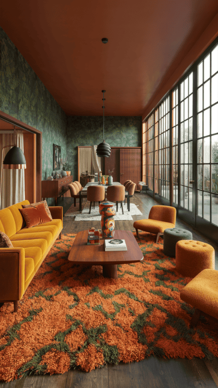
Quick Answer: 70s home decor works best when you combine earthy color, tactile materials, rounded shapes, and warm lighting, then edit the room so it feels collected rather than costume-like. Start with one strong retro anchor, such as a rattan chair, mushroom lamp, shag rug, low wood coffee table, or velvet sofa, then support it with rust, avocado, mustard, chocolate, cream, smoked glass, and brass. The modern version is not a full time capsule. It is a relaxed, social, texture-rich home with a few unmistakable 1970s notes.
70S Home Decor can go wrong when it is treated as a shopping list instead of a feeling. The better approach starts with atmosphere: the colors, materials, light, scale, and small rituals that make the room work in real life.
For this rewrite, the strongest direction is practical and editorial at once. The room should look considered, but it still has to support daily life, whether that means hosting friends, getting ready in the morning, cooking dinner, working from home, or simply making a small apartment feel more like yours.
The ideas below are designed to be specific enough to act on and flexible enough to adapt. Use them as a menu, not a mandate. One or two strong changes can shift the whole room when the palette, texture, and layout are working together.
Want your 70s home decor to feel pulled together instead of pieced together?
The Aesthetic Apartment Makeover Guide helps you choose a palette, layer texture, and style rooms in the right order, so each update feels intentional rather than random.

Recommended 70s Home Decor Finds
The most useful products for 70s home decor are the pieces that change the mood and still earn their place: lighting, textiles, storage, table pieces, art, and tactile materials that support the style without cluttering the room.


Recommended blogs to read:
- 70s living room furniture ideas
- 70s lighting ideas
- 70s rug ideas
- 70s wall decor ideas
- 70s kitchen decor ideas
- 70s entryway decor ideas
Create a Vintage Look with 70’s Home Decor Ideas
The research pattern for this topic is clear: earth tones: rust, avocado, mustard, chocolate, cream, tactile materials: rattan, cane, velvet, shag, macrame, wood, smoked glass, social layouts: low seating, conversation-friendly lighting, layered rugs. The gap is just as clear. Most inspiration stops at pretty objects, while a useful room guide explains proportion, restraint, and how the pieces behave together.
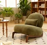
1. Rattan Accent Chair


This is where the room starts to feel edited rather than simply filled. Let a rattan accent chair bring in the decade through color, curve, or material rather than turning the room into a time capsule. The practical test is simple: the idea should make the space easier, prettier, or warmer. If it does all three, it deserves to stay.
A little restraint keeps the look current. Pair bolder color with plain upholstery, let brass or smoked glass show up only once or twice, and keep enough open space around the strongest piece so it feels chosen instead of crowded. For a related next step, read 70s living room furniture ideas.
2. Mushroom Table Lamp


A small change can shift the mood when the placement feels deliberate. The best retro detail feels collected, so a mushroom table lamp should sit beside at least one cleaner modern piece. Look at the nearest surface before adding anything else. If it already has color, pattern, or height, keep this layer quieter so the whole area feels intentional.
A little restraint keeps the look current. Pair bolder color with plain upholstery, let brass or smoked glass show up only once or twice, and keep enough open space around the strongest piece so it feels chosen instead of crowded. For a related next step, read 70s lighting ideas.
3. Rust and Avocado Palette


The detail works best when it solves a real problem in the room. Use a rust and avocado palette to add personality, then keep the surrounding palette grounded in cream, walnut, rust, olive, or amber. Look at the nearest surface before adding anything else. If it already has color, pattern, or height, keep this layer quieter so the whole area feels intentional.
A little restraint keeps the look current. Pair bolder color with plain upholstery, let brass or smoked glass show up only once or twice, and keep enough open space around the strongest piece so it feels chosen instead of crowded. For a related next step, read 70s rug ideas.
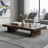
4. Low Wood Coffee Table


Think of this as part of the atmosphere, not a separate decorative announcement. A 70s room needs rhythm, and a low wood coffee table can become one beat in a larger mix of wood, glass, textiles, and glow. Try the arrangement in daylight and again at night. A detail that looks beautiful in both kinds of light is much more likely to stay.
A little restraint keeps the look current. Pair bolder color with plain upholstery, let brass or smoked glass show up only once or twice, and keep enough open space around the strongest piece so it feels chosen instead of crowded. A final edit helps here: step back, remove one piece that feels too loud, and let the strongest material or color carry the idea. For a related next step, read 70s wall decor ideas.
5. Shag Rug Moment

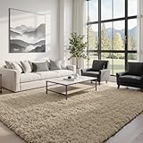

The most polished version leaves a little breathing room around the idea. With a shag rug moment, the 70s feeling comes from warmth and shape before it comes from nostalgia. The practical test is simple: the idea should make the space easier, prettier, or warmer. If it does all three, it deserves to stay.
A little restraint keeps the look current. Pair bolder color with plain upholstery, let brass or smoked glass show up only once or twice, and keep enough open space around the strongest piece so it feels chosen instead of crowded. For a related next step, read 70s kitchen decor ideas.
6. Macrame Wall Hanging


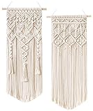
This is a good place to choose texture over visual noise. Let a macrame wall hanging bring in the decade through color, curve, or material rather than turning the room into a time capsule. The practical test is simple: the idea should make the space easier, prettier, or warmer. If it does all three, it deserves to stay.
A little restraint keeps the look current. Pair bolder color with plain upholstery, let brass or smoked glass show up only once or twice, and keep enough open space around the strongest piece so it feels chosen instead of crowded.
7. Smoked Glass Vase


A softer room often begins with one practical swap that looks better than what it replaced. The best retro detail feels collected, so a smoked glass vase should sit beside at least one cleaner modern piece. If the room starts to feel themed, remove the smallest novelty piece first. The stronger materials and colors will usually carry the mood on their own.
A little restraint keeps the look current. Pair bolder color with plain upholstery, let brass or smoked glass show up only once or twice, and keep enough open space around the strongest piece so it feels chosen instead of crowded.
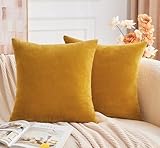
8. Velvet Sofa or Chair


The idea feels more expensive when it looks relaxed rather than overly arranged. Use a velvet sofa or chair to add personality, then keep the surrounding palette grounded in cream, walnut, rust, olive, or amber. The finish should relate to something else in the room, even loosely. A repeated wood tone, a matching metal, or a nearby fabric color is enough to make the choice feel connected.
A little restraint keeps the look current. Pair bolder color with plain upholstery, let brass or smoked glass show up only once or twice, and keep enough open space around the strongest piece so it feels chosen instead of crowded. A final edit helps here: step back, remove one piece that feels too loud, and let the strongest material or color carry the idea.
9. Patterned Curtains


Scale matters here, because the right amount feels charming and too much feels busy. A 70s room needs rhythm, and the patterned curtains can become one beat in a larger mix of wood, glass, textiles, and glow. Look at the nearest surface before adding anything else. If it already has color, pattern, or height, keep this layer quieter so the whole area feels intentional.
A little restraint keeps the look current. Pair bolder color with plain upholstery, let brass or smoked glass show up only once or twice, and keep enough open space around the strongest piece so it feels chosen instead of crowded.
10. Brass Arc Floor Lamp


The easiest rooms to love usually have one quiet decision doing more work than expected. With the brass arc floor lamp, the 70s feeling comes from warmth and shape before it comes from nostalgia. Try the arrangement in daylight and again at night. A detail that looks beautiful in both kinds of light is much more likely to stay.
A little restraint keeps the look current. Pair bolder color with plain upholstery, let brass or smoked glass show up only once or twice, and keep enough open space around the strongest piece so it feels chosen instead of crowded.
11. Modular Shelving


This is where the room starts to feel edited rather than simply filled. Let a modular shelving bring in the decade through color, curve, or material rather than turning the room into a time capsule. The finish should relate to something else in the room, even loosely. A repeated wood tone, a matching metal, or a nearby fabric color is enough to make the choice feel connected.
A little restraint keeps the look current. Pair bolder color with plain upholstery, let brass or smoked glass show up only once or twice, and keep enough open space around the strongest piece so it feels chosen instead of crowded.
12. Ceramic Mushroom Objects


A small change can shift the mood when the placement feels deliberate. The best retro detail feels collected, so the ceramic mushroom objects should sit beside at least one cleaner modern piece. Try the arrangement in daylight and again at night. A detail that looks beautiful in both kinds of light is much more likely to stay.
A little restraint keeps the look current. Pair bolder color with plain upholstery, let brass or smoked glass show up only once or twice, and keep enough open space around the strongest piece so it feels chosen instead of crowded. A final edit helps here: step back, remove one piece that feels too loud, and let the strongest material or color carry the idea.
13. Conversation Corner


The detail works best when it solves a real problem in the room. Use a conversation corner to add personality, then keep the surrounding palette grounded in cream, walnut, rust, olive, or amber. Look at the nearest surface before adding anything else. If it already has color, pattern, or height, keep this layer quieter so the whole area feels intentional.
A little restraint keeps the look current. Pair bolder color with plain upholstery, let brass or smoked glass show up only once or twice, and keep enough open space around the strongest piece so it feels chosen instead of crowded.
14. Graphic Wall Art


Think of this as part of the atmosphere, not a separate decorative announcement. A 70s room needs rhythm, and a graphic wall art can become one beat in a larger mix of wood, glass, textiles, and glow. Try the arrangement in daylight and again at night. A detail that looks beautiful in both kinds of light is much more likely to stay.
A little restraint keeps the look current. Pair bolder color with plain upholstery, let brass or smoked glass show up only once or twice, and keep enough open space around the strongest piece so it feels chosen instead of crowded.
15. Modern Editing


The most polished version leaves a little breathing room around the idea. With a modern editing, the 70s feeling comes from warmth and shape before it comes from nostalgia. If the room starts to feel themed, remove the smallest novelty piece first. The stronger materials and colors will usually carry the mood on their own.
A little restraint keeps the look current. Pair bolder color with plain upholstery, let brass or smoked glass show up only once or twice, and keep enough open space around the strongest piece so it feels chosen instead of crowded.
If the room feels close but not quite finished, look at the order of the layers.
The makeover guide walks through color, layout, texture, and styling so the final room feels cohesive instead of overdecorated.
Frequently Asked Questions
What is the easiest way to start with 70s home decor?
Start with one visible anchor piece, then repeat its color, material, or mood in smaller details. This keeps 70s home decor cohesive without making the room feel overdone.
How do I make 70s home decor look current?
Pair nostalgic or seasonal pieces with cleaner basics, useful storage, and a restrained palette. The room should feel lived-in and edited, not like every idea arrived at once.
What should I buy first for 70s home decor?
Start with the item that changes the most surface area or light: a rug, curtains, bedding, table runner, lamp, or main storage piece. Small accessories work best after the foundation is clear.
Can 70s home decor work in a small space?
Yes. Use fewer pieces with stronger texture, keep the palette tight, and leave negative space around the most important objects so the room feels intentional rather than crowded.
What mistakes should I avoid with 70s home decor?
Avoid buying too many themed accessories before deciding on the palette and layout. Repetition, scale, and useful materials matter more than novelty pieces.
Key Takeaways
- Choose one clear mood before buying decor, then let color, texture, and light support it.
- Use larger functional pieces first, then layer smaller details only where they add warmth or usefulness.
- Keep the palette tight so the room feels collected instead of crowded.
- Natural materials, warm light, and repeated finishes make the final look feel more expensive.
- The best version of this style supports real life instead of only looking good in a photo.
Final Thoughts
70S Home Decor is most successful when it feels personal, edited, and useful. The details should support the way the room is actually lived in, not compete with it. Start with the pieces that affect light, texture, and comfort, then add the smaller accents once the room has a clear direction.
That slower approach is what makes a room feel designed rather than decorated in a hurry. When the palette is tight, the materials repeat, and every object has a little breathing room, the final result feels warm, intentional, and easy to live with.