A japandi color palette is warm, muted, and neutral: oat, clay, soft white, warm grey, and a touch of black. The 15 palettes below come with hex codes and paint names, plus the warm-not-cold rule that defines the look.
Japandi lives or dies on its palette. Get the colors warm and muted and a room feels calm and inviting. Let them drift cold or stark and the same minimalism reads clinical and bare. The whole look hangs on a narrow band of warm neutrals, so getting the palette right is the most important decision in a japandi room.
The 15 palettes below each pair a few warm-neutral colors that work together, with hex codes and real paint names. The section at the end covers the warm-not-cold rule and how to add the one quiet accent a japandi room can take.
Choosing a japandi palette and not sure where to start?
The Aesthetic Apartment Makeover Guide walks you through a room in the right order, so the palette anchors the whole calm scheme rather than fighting it.

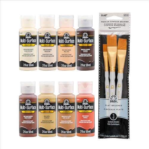
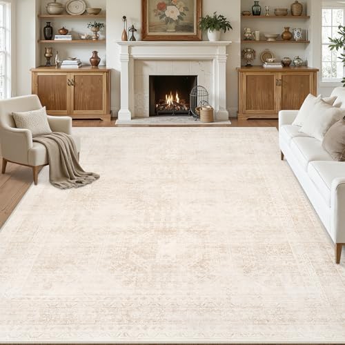
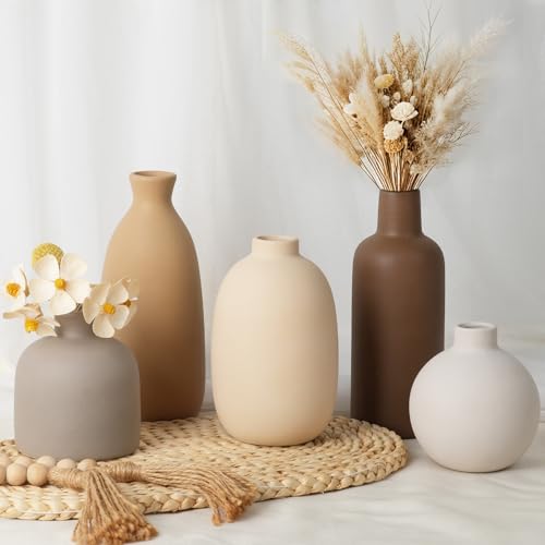
Recommended Japandi Color Decor
Six pieces that carry a japandi palette, from warm-neutral paint to linen textiles.


Recommended blogs to read:
What Makes a Palette Japandi
A japandi palette is warm, muted, and neutral, built from soft earthy tones rather than bright color or stark contrast. The base is oat, clay, soft white, warm grey, mushroom, taupe, and the depth comes from warm wood tones and a single touch of soft black or charcoal. There is no bright color, just a quiet, layered range of warm neutrals.
The palette is also tight, three or four warm neutrals and one dark accent, never a wide spread. It shares a lot with zen color schemes, so our guide to zen modern decor is a useful companion, and the japandi living room guide shows these palettes working in a real room.
One rule before the list: warm undertones, never cool. A grey-leaning or blue-leaning neutral makes japandi read cold and clinical. Every color below has a warm undertone, oat over grey, clay over taupe, warm white over stark white, which is what keeps the calm feeling inviting.
15 Japandi Color Palettes With Hex Codes
Each palette below works as a complete calm scheme. The section after covers the one accent rule.
1. Oat and Warm White

Soft oat (#D8CDB6), warm white (#EFE9DA), and light wood (#C4A878) with a touch of soft black (#2E2B27). This is the quintessential japandi palette, calm, warm, and endlessly liveable, and it suits any room. Try Farrow & Ball School House White or Benjamin Moore White Sand on the walls, with light wood furniture and one black accent for definition.
2. Clay and Cream

Warm clay (#C8A48A), soft cream (#E8E0CE), and mid-tone wood (#A8825C) with charcoal (#3A3631). The clay brings a gentle earthy warmth that keeps the scheme from feeling plain. Benjamin Moore Wenge or Farrow & Ball Jitney give a soft clay tone, balanced with cream walls and warm wood, and a charcoal accent grounds it. Use the clay sparingly, on one wall or in the larger textiles, and let the cream dominate, so the earthy warmth reads as a gentle accent rather than the whole room.
3. Mushroom and Soft White

Warm mushroom (#B8AC9A), soft white (#EFE9DA), and pale wood (#CBB489) with a black accent (#2E2B27). Mushroom is the most versatile japandi neutral, a warm greige that reads calm without going cold. Farrow & Ball Drop Cloth or Benjamin Moore Pashmina give the mushroom, on the walls or as the dominant textile color. Mushroom is the safest choice if you want one warm neutral to carry a whole open-plan space, since it shifts gracefully between rooms and light conditions.
4. Warm Grey and Wood

Warm-leaning grey (#A8A095), oat (#D8CDB6), and warm wood (#B5905E) with soft black (#2E2B27). The trick here is a grey with a clear warm undertone, never a cool blue-grey, so the room stays inviting. Farrow & Ball Elephant’s Breath or Benjamin Moore Revere Pewter give a warm grey that suits japandi. Test the grey against your wood tones before committing, since the right warm grey makes the wood glow while a cool one will fight it and flatten the room.
5. Taupe and Linen

Soft taupe (#B5A48E), linen white (#E8E0CE), and light wood (#C4A878) with charcoal (#3A3631). Taupe and linen make a soft, slightly deeper japandi scheme that still reads light. Benjamin Moore Bleather Saddle Brown in its lightest tint, or Farrow & Ball Smoked Trout, give a warm taupe that works on walls or large textiles. This palette suits a bedroom especially well, where the slightly deeper taupe reads cocooning and calm rather than stark, exactly what a room for rest wants.
6. Sand and Charcoal

Warm sand (#D4C3A3), soft white (#EFE9DA), and mid wood (#A8825C) with a stronger charcoal accent (#33302C). This palette leans a little more contrast than most japandi schemes, the charcoal does more work, which suits a room that needs a bit more definition. Keep the charcoal to small doses, a lamp, a frame, a cushion. Reach for this scheme in a room that feels a little flat, since the stronger charcoal gives the eye the bit of definition that a pure all-neutral palette can lack.
7. Greige and Oak

Warm greige (#BFB4A2), warm white (#EFE9DA), and oak (#C4A878) with soft black (#2E2B27). Greige is the safe, liveable japandi neutral, warmer than grey, cooler than beige, and it pairs naturally with light oak. Farrow & Ball Skimming Stone or Benjamin Moore Edgecomb Gray give a greige that stays warm. Greige and oak is the palette to choose if you want japandi that will still look right in five years, since neither color is tied to a passing trend.
8. Putty and Warm White

Soft putty (#C3B6A1), warm white (#EFE9DA), and pale wood (#CBB489) with charcoal (#3A3631). Putty is a warm, slightly pink-leaning neutral that gives a japandi room a soft, gentle base. Farrow & Ball Oxford Stone or Benjamin Moore Manchester Tan give a putty tone, kept calm with warm white and light wood around it. The faint pink warmth in putty makes it especially flattering in a north-facing room, where cooler neutrals tend to read grey and lifeless.
9. Stone and Black

Warm stone (#C0B5A4), soft white (#EFE9DA), and mid wood (#A8825C) with a clear soft-black accent (#2A2723). This is the most graphic japandi palette, the black is a real presence rather than a whisper, which suits the more Japanese-leaning end of the look. Use the black on a frame, a lamp base, or a single piece of furniture. Use this when you want japandi that leans more Japanese than Scandinavian, since the clear black presence brings the graphic, restrained quality of a Japanese interior.
10. Almond and Wood

Warm almond (#DACEB5), soft cream (#E8E0CE), and light wood (#C4A878) with charcoal (#3A3631). Almond is one of the warmest japandi neutrals, gentle and a little golden, so it suits a north-facing or low-light room that needs warmth. Benjamin Moore Shaker Beige or Farrow & Ball Oxford Stone give an almond tone. Almond is the warmest neutral here, so it suits a room that gets little natural light and needs the palette itself to bring the warmth the windows do not.
11. Pale Sage and Oat

Muted pale sage (#A8AE9C), oat (#D8CDB6), and light wood (#C4A878) with soft black (#2E2B27). Sage is the one quiet color japandi allows, a soft, dusty, almost-neutral green that brings a breath of nature without breaking the calm. Farrow & Ball Cromarty or Benjamin Moore Sea Salt give a sage muted enough to read japandi. Keep the sage genuinely muted and dusty, almost a neutral, since a sage with any real saturation tips the room out of japandi and into something brighter.
12. Warm White Monochrome

Layered warm whites (#EFE9DA, #E8E0CE, #DDD3BE) with light wood (#C4A878) and one soft-black accent (#2E2B27). An all-white japandi scheme works when the whites are warm and layered in slightly different tones, so the room reads soft and textural rather than flat. The wood and the single black accent give it just enough definition. The trick is layering three or four slightly different warm whites, since a single flat white reads cold while layered whites read soft, textural, and intentional.
13. Camel and Cream

Soft camel (#C9A876), warm cream (#E8E0CE), and mid wood (#A8825C) with charcoal (#3A3631). Camel is the warmest, most golden japandi neutral, used in small doses, a chair, a throw, a rug, against a cream base, it brings warmth without becoming a bright color. Keep the camel as an accent rather than a wall color. Keep the camel strictly to accents, a chair, a throw, a rug, since used on the walls it stops being a warm neutral and becomes a bright color the palette cannot hold.
14. Soft Beige and Slate

Warm soft beige (#CFC2A9), warm white (#EFE9DA), and light wood (#C4A878) with a warm slate accent (#5A564E). Swapping the usual black accent for a warm slate softens the contrast, which suits a gentler, more Scandinavian-leaning japandi room. Keep the slate warm-toned so it stays in the palette’s quiet family. This is the gentlest japandi palette, with no hard black anywhere, so it suits anyone who finds the usual black accent too sharp for a calm room.
15. Full Warm-Neutral Layer

Oat (#D8CDB6), clay (#C8A48A), warm white (#EFE9DA), and light wood (#C4A878) with soft black (#2E2B27). The most layered japandi palette uses three or four warm neutrals together, spread across walls, textiles, and furniture, so the room reads rich in texture while staying entirely calm. The single black accent keeps the layered neutrals from blurring together. The single black accent is what stops the layered neutrals from blurring into one soft beige mass, so do not skip it even though everything else stays pale.
Want the palette to tie the whole home together?
The Aesthetic Apartment Makeover Guide breaks the whole home down room by room, so every space ties into one cohesive scheme. Worth every penny at $17, and the price goes up to $27 soon.
How to Add One Quiet Accent
A japandi palette is mostly warm neutrals, but it can take exactly one quiet accent, and knowing how to use it is what separates a calm room from a bland one. The accent is almost always soft black or charcoal, used sparingly, a lamp base, a picture frame, the legs of a chair, a single cushion. It defines the edges of the room and gives the eye a point of focus among all the soft neutrals.
If you want color rather than black, japandi allows one soft, dusty, almost-neutral tone, a muted sage, a warm slate, a faded clay, used in the same restrained way. The rule is one accent, used in small doses, never a second. The warm-not-cold principle holds throughout: even the accent should lean warm. A japandi palette built this way, layered warm neutrals plus one quiet accent, reads calm, warm, and considered. For building it affordably, our guide to japandi on a budget covers the cheap path, and the japandi furniture guide covers the wood tones that complete the palette.
Frequently Asked Questions
What colors are japandi?
Japandi colors are warm, muted neutrals: oat, clay, soft white, warm grey, mushroom, and taupe, with depth from warm wood tones and a single touch of soft black or charcoal. There is no bright color, just a quiet, layered range of warm neutrals.
Is japandi warm or cool?
Warm, always. The whole look depends on warm undertones, oat over grey, clay over taupe, warm white over stark white. A grey-leaning or blue-leaning neutral makes japandi read cold and clinical, so every color in the palette should have a clear warm undertone.
Can japandi use any color?
Sparingly. A japandi palette is mostly warm neutrals plus one quiet accent, usually soft black or charcoal. If you want color, it can take one soft, dusty, almost-neutral tone like muted sage or warm slate, used in small doses. Never a bright color, and never more than one accent.
How do I do a japandi color palette on a budget?
Paint is the cheapest high-impact way in, one warm-neutral can on the walls. If you cannot paint, build the palette through cheap layers instead: warm-neutral linen textiles, an oat-tone rug, ceramic pieces, and one soft-black accent, all in the chosen warm neutrals.
What is the best japandi paint color?
A warm white or soft oat is the most versatile and liveable japandi paint color, Farrow & Ball School House White or Benjamin Moore White Sand both work well. Mushroom and warm greige are strong alternatives, all chosen in their warmest, least grey versions.
Key Takeaways
- A japandi color palette is warm, muted, and neutral: oat, clay, soft white, warm grey, and taupe, with wood tones and one soft-black accent.
- The 15 palettes each pair a few warm neutrals with hex codes and real paint names, from Oat and Warm White to Full Warm-Neutral Layer.
- Warm undertones only, a grey or blue-leaning neutral makes japandi read cold and clinical instead of calm and inviting.
- A japandi palette can take exactly one quiet accent, usually soft black or charcoal, used in small doses, never a second.
- In a rental, the palette lives in the layers, warm-neutral linen textiles, an oat rug, and ceramics instead of paint.
Final Thoughts
A japandi color palette is the calm warm foundation the whole look rests on, oat, clay, soft white, warm grey, layered with wood tones and lifted by a single quiet accent. Keep every undertone warm, keep the palette tight, and add the one black or charcoal accent with restraint. Get the colors right and a japandi room feels calm and inviting rather than cold and bare. When you are ready for the rest of the room, the japandi furniture guide and the japandi wall decor guide cover furniture and walls in full.