A Hollywood Regency color palette is built on high contrast, metallics, and bold jewel tones, the glamour of old Hollywood. The 15 palettes below come with hex codes and paint names, plus where to use bold versus neutral.
Hollywood Regency is decor at its most glamorous and confident, the high-contrast, jewel-toned, metallic look of 1930s and 1940s Hollywood. The color does most of the heavy lifting. A Hollywood Regency room is not subtle, it is dramatic on purpose, and the palette is what makes it read as old-Hollywood glamour rather than just bold.
The 15 palettes below each pair the colors that make a room read Hollywood Regency, with hex codes and real paint names. The section at the end covers where to go bold and where to pull back, so the drama reads glamorous rather than overwhelming.
Choosing a Hollywood Regency palette and not sure where to start?
The Aesthetic Apartment Makeover Guide walks you through a room in the right order, so the palette anchors the whole glamorous scheme rather than fighting it.

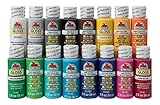
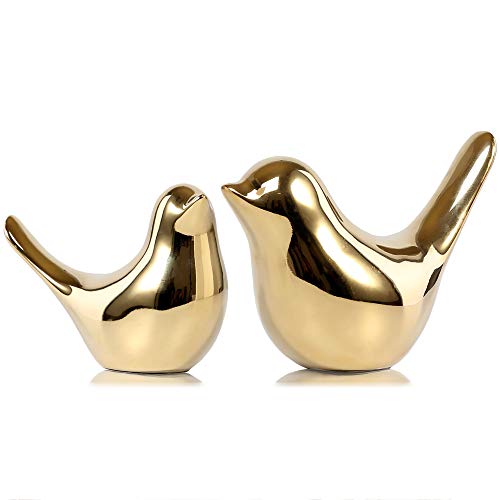
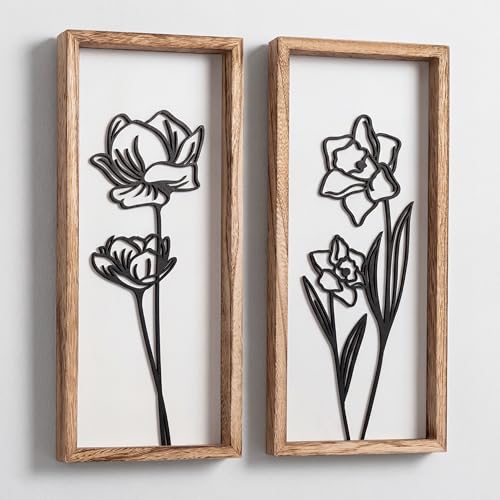
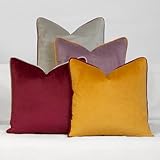
Recommended Hollywood Regency Color Decor
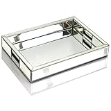
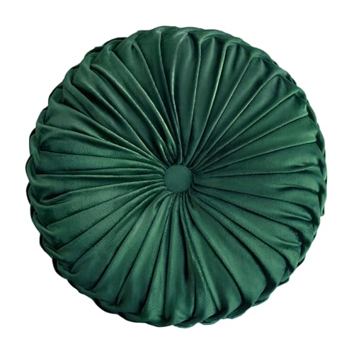
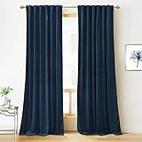
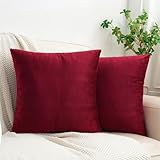
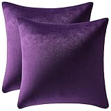
Six pieces that carry a Hollywood Regency palette, from high-gloss paint to mirrored and gold accents.

Recommended blogs to read:
- a bolder maximalist palette
- choosing maximalist furniture
- a mid-century glam crossover
- an old-world country look
- a retro-glam crossover
What Makes a Palette Hollywood Regency
A Hollywood Regency palette is built on three things: high contrast, metallics, and bold jewel tones. The contrast is usually black against white or against a jewel tone, sharp and graphic. The metallics, gold and brass especially, run through the room as a glamorous thread. And the jewel tones, emerald, sapphire, ruby, amethyst, bring saturated, confident color.
The look is unapologetically dramatic, the opposite of muted. It overlaps with maximalism in its love of bold color and confidence, so our guide to a bolder maximalist palette is a useful companion, and the Hollywood Regency furniture guide covers the glamorous pieces these palettes dress.
One rule before the list: contrast plus metal is non-negotiable. A Hollywood Regency room needs the sharp contrast and the metallic thread. The jewel tones can vary, but without the high contrast and the gold the room reads as something else entirely.
15 Hollywood Regency Color Palettes With Hex Codes
Each palette below works as a complete glam scheme. The section after covers where to go bold.
1. Classic Black and White

High-gloss black (#1A1A1A) and crisp white (#F4F2EC) with gold (#C9A24A). The original Hollywood Regency scheme, sharp, graphic, and timeless, often in a bold stripe or a geometric floor. Try Benjamin Moore Black Beauty against Chantilly Lace, with gold accents threaded through. It is the safest place to start, since black, white, and gold flatter any jewel tone you add later.
2. Emerald and Gold


Deep emerald (#1F4D3A), crisp white (#F4F2EC), and gold (#C9A24A) with black accents (#1A1A1A). Emerald is the most glamorous Hollywood Regency jewel tone, rich and theatrical. Farrow & Ball Studio Green in a high-gloss finish or Benjamin Moore Hunter Green give the emerald, lifted with gold and grounded with black for the signature contrast. Use the emerald in a high-gloss finish wherever you can, since the reflective sheen is what separates Hollywood Regency emerald from an ordinary dark green wall.
3. Sapphire and Brass


Deep sapphire blue (#1E3A5F), white (#F4F2EC), and brass (#B08D3C) with black (#1A1A1A). Sapphire brings a cooler but still dramatic jewel tone, glamorous and a little moody. Benjamin Moore Symphony Blue or Farrow & Ball Stiffkey Blue give the sapphire, in a glossy finish for the reflective glamour the look depends on. Sapphire suits a room you mostly use in the evening, since the moody depth reads richest under lamplight rather than bright daylight.
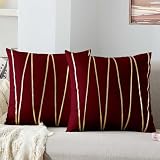
4. Ruby and Black


Deep ruby red (#6E1F2E), high-gloss black (#1A1A1A), and gold (#C9A24A) over white (#F4F2EC). Ruby and black is the most dramatic, theatrical Hollywood Regency scheme, pure old-Hollywood opulence. Benjamin Moore Caliente or Farrow & Ball Incarnadine give the ruby, used on one bold wall or in velvet rather than the whole room. Keep the ruby to one wall or to velvet upholstery rather than wrapping a whole room, since at full strength it reads more opera house than living room.
5. Amethyst and Silver


Deep amethyst purple (#4A3157), white (#F4F2EC), and silver-chrome (#C4C4C4) with black (#1A1A1A). Amethyst is the unexpected jewel tone, regal and a little daring, and here it pairs with cooler silver rather than gold. Farrow & Ball Brinjal or Benjamin Moore Exotic Purple give the amethyst, kept glamorous with reflective silver and chrome. This is the palette for someone who wants the glamour without the expected gold, since the cooler silver gives the same drama with a more modern edge.
6. Blush and Gold


Soft blush pink (#E6C9C0), high-gloss black (#1A1A1A), and gold (#C9A24A) over white (#F4F2EC). The softer, more feminine Hollywood Regency scheme, blush pink still reads glamorous when it is paired with sharp black and gold rather than left alone. Benjamin Moore Love and Happiness or Farrow & Ball Pink Ground give the blush. The sharp black is essential here, since blush on its own drifts toward sweet, and only the black-and-gold contrast keeps it reading as glamour.
7. Navy and Gold


Deep navy (#1B2A4A), white (#F4F2EC), and gold (#C9A24A) with black (#1A1A1A). Navy is the most liveable Hollywood Regency dark, dramatic but versatile, and with gold it reads richly glamorous. Benjamin Moore Hale Navy or Farrow & Ball Hague Blue give the navy, in a high-gloss finish for the signature reflective shine. Navy is the safest jewel-tone entry point, since it behaves almost like a neutral while still bringing the depth and drama the look needs.
8. Charcoal and Chrome


Deep charcoal (#33302C), white (#F4F2EC), and chrome-silver (#C4C4C4) with black (#1A1A1A). A cooler, more modern Hollywood Regency scheme, charcoal and chrome instead of black and gold, sleek and a little sharper. Farrow & Ball Down Pipe or Benjamin Moore Kendall Charcoal give the charcoal, with chrome and mirror for the glam. Choose this when you want Hollywood Regency that leans sleek and contemporary, since chrome and charcoal read sharper and more modern than gold and black.
9. Teal and Gold


Deep teal (#1C4548), white (#F4F2EC), and gold (#C9A24A) with black accents (#1A1A1A). Teal is a peacock-glamorous jewel tone, rich and a little exotic, and gold makes it sing. Farrow & Ball Vardo or Benjamin Moore Mediterranean Teal give the teal, in a glossy finish, used on a feature wall or in lacquered furniture. Teal and gold reads a little exotic and peacock-glamorous, so it suits a room you want to feel like an event rather than a quiet retreat.
10. Black, White, and Emerald


High-gloss black (#1A1A1A), crisp white (#F4F2EC), and emerald (#1F4D3A) with gold (#C9A24A). The full classic Hollywood Regency formula, the graphic black-and-white base with emerald as the jewel-tone accent and gold threaded through. It is the most complete expression of the look, dramatic and balanced, with each color doing a clear job. Because each color has a clear job here, base, contrast, and jewel-tone accent, it is the easiest full scheme to get balanced and right.
11. Cream and Brass


Warm cream (#E8E0CE), high-gloss black (#1A1A1A), and brass (#B08D3C). The most neutral Hollywood Regency scheme, cream instead of stark white softens the look while the black and brass keep the glamour. Benjamin Moore White Sand or Farrow & Ball Matchstick give the cream, a good base if you want the glam without a bold wall color. This is the scheme for renters and the bold-color-shy, since it delivers the glamour entirely through contrast and metal with no daring wall color at all.
12. Hot Pink and Black

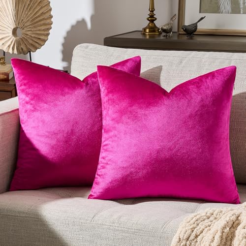

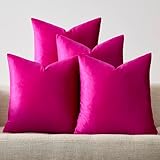
Bold hot pink (#C13B6E), high-gloss black (#1A1A1A), and gold (#C9A24A) over white (#F4F2EC). The most daring Hollywood Regency scheme, a true statement pink against sharp black, used in small but confident doses. Benjamin Moore Springtime Bloom or Farrow & Ball Rangwali give the hot pink, best on one wall or in velvet, not everywhere. Confine the hot pink to one wall, a single sofa, or velvet accents, since at any larger scale it overwhelms the black and gold meant to anchor it.
13. Deep Burgundy and Gold


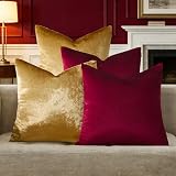
Deep burgundy (#4E2230), white (#F4F2EC), and gold (#C9A24A) with black (#1A1A1A). Burgundy is a softer, more vintage take on the ruby scheme, rich and a little more grown-up. Farrow & Ball Preference Red or Benjamin Moore New York State of Mind give the burgundy, in velvet upholstery or on a single dramatic wall. Burgundy reads a touch more vintage and grown-up than ruby, so it suits a study, a dining room, or any space you want to feel a little established.
14. Monochrome Glam


High-gloss black (#1A1A1A), crisp white (#F4F2EC), and grey (#9A968E) with both gold and chrome (#C9A24A, #C4C4C4). The most graphic, color-free Hollywood Regency scheme, pure black, white, and grey with the metallics carrying all the warmth. It is dramatic and timeless, and it reads glamorous through contrast and shine alone, no jewel tone needed. The metallics carry all the warmth in this scheme, so do not skimp on the gold and chrome, since without them the black, white, and grey reads cold.
15. Full Jewel-Box


Emerald (#1F4D3A), sapphire (#1E3A5F), and ruby (#6E1F2E) with black (#1A1A1A), white (#F4F2EC), and gold (#C9A24A). The most maximal Hollywood Regency palette uses several jewel tones together, spread across rooms or layered in velvet and lacquer, with the black-white-gold framework holding the rich mix together so it reads glamorous rather than chaotic. The black-white-gold framework is doing the real work here, holding three jewel tones together, so keep it strong or the rich mix tips into chaos.
Want the palette to tie the whole home together?
The Aesthetic Apartment Makeover Guide breaks the whole home down room by room, so every space ties into one cohesive scheme. Worth every penny at $17, and the price goes up to $27 soon.
Where to Use Bold vs. Neutral
The thing that keeps Hollywood Regency glamorous rather than overwhelming is knowing where to go bold and where to pull back. Go bold on the things that can carry it, one feature wall, the upholstery, the floor, a lacquered statement piece, and let those moments be genuinely dramatic. Then keep the surrounding surfaces calmer, white or cream walls, simple ceilings, so the bold moments have room to land.
The metallics are the exception, gold, brass, and chrome can run everywhere as the connecting thread, since their job is to tie the scheme together rather than compete. The contrast does the rest: even a mostly neutral Hollywood Regency room reads glamorous if the black-and-white contrast is sharp and the metals are present. Bold where it counts, neutral around it, metal throughout, that is the formula. For the furniture that fills these palettes, our Hollywood Regency furniture guide covers the glamorous pieces.
Frequently Asked Questions
What colors are Hollywood Regency?
Hollywood Regency colors are built on high contrast, metallics, and bold jewel tones. The base is usually sharp black against white, the metals are gold, brass, and chrome, and the jewel tones are emerald, sapphire, ruby, and amethyst. The look is dramatic and unapologetically glamorous.
Does Hollywood Regency have to be black and white?
No, but it needs high contrast and metallics. Black and white is the classic base, but you can build the scheme on a jewel tone instead, emerald and gold, sapphire and brass, ruby and black. The non-negotiables are sharp contrast and a metallic thread, not black and white specifically.
How do I use bold color without it being too much?
Go bold on the things that can carry it, one feature wall, the upholstery, the floor, a lacquered statement piece, and keep the surrounding surfaces calmer with white or cream. Let the metallics run throughout as the connecting thread. Bold where it counts, neutral around it.
How do I do a Hollywood Regency color palette on a budget?
Paint is the cheapest high-impact way in, one bold or high-gloss can on a feature wall. If you cannot paint, build the palette through layers, jewel-tone velvet cushions, gold and mirrored accents, black-and-white decor, all in the chosen contrasting colors.
What is the best Hollywood Regency paint color?
High-gloss black is the most iconic and versatile Hollywood Regency paint color, sharp against white and flattering to every jewel tone. Emerald and navy are strong jewel-tone alternatives. Whatever you choose, a high-gloss finish adds the reflective glamour the look depends on.
Key Takeaways
- A Hollywood Regency color palette is built on high contrast, metallics, and bold jewel tones, the glamour of old Hollywood.
- The 15 palettes each pair contrasting glam colors with hex codes and paint names, from Classic Black and White to Full Jewel-Box.
- Contrast plus metal is non-negotiable, the jewel tones can vary but the sharp contrast and gold thread must be there.
- Go bold on a feature wall, the upholstery, or a statement piece, and keep the surrounding surfaces calmer so the drama lands.
- A high-gloss finish adds the reflective glamour the look depends on, so paint bold colors glossy rather than matte.
Final Thoughts
A Hollywood Regency color palette is glamour through contrast, metal, and jewel-toned confidence, the look of old Hollywood at its most dramatic. Build it on sharp contrast, run gold or chrome through as the connecting thread, and add a jewel tone where a room can carry it. Go bold where it counts and keep the rest calmer, and the room reads glamorous rather than overwhelming. When you are ready for the pieces, the Hollywood Regency furniture guide covers the glam, dramatic furniture in full.
To take the glamour through the rest of the home, Hollywood Regency on a budget, an Art Deco color palette, Hollywood Regency lighting ideas, and Hollywood Regency wall decor ideas carry the same jewel-toned, high-contrast confidence.